Beginners Guide to TikTok for Search - Rachel Pearson - We are Tilt __ Bright...
Bbc 2 typossss
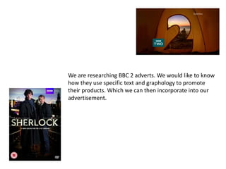
1. We are researching BBC 2 adverts. We would like to know
how they use specific text and graphology to promote
their products. Which we can then incorporate into our
advertisement.
2. BBC 2
The BBC do not often use double page
spreads, however we will still be using
their graphological techniques and style
to create their image and identity.
Their identity is important because it is
what separates them from other
channels.
3. Guidelines
BBC One / BBC Two / BBC Three / BBC Four programmes
The BBC corporate logo must appear in the opening sequence of all in-house
and co-produced programmes except when "BBC" is part of the programme
name.
The logo must:
• Be static and either cut or mixed on and off
• Be white or black only
• Not appear in the first two seconds of the programme but it can appear at
any other point in the title or pre-title sequence
• Be held for a minimum of three seconds
• Appear within the grid for front credits
• Be centered wherever possible
• Not use a dropped shadow
4. BBC 2
Picture Safe Areas
Electronic versions of the artwork The BBC logo must
have been lined up to a centre grid.
This is to ensure visual continuity appear within the
throughout all on-screening titling.
The percentages are expressed as
LOGO SAFE grid.
part of the 16:9 screen area.
6. BBC 2
We can see that the BBC follows a certain
pattern to when they advertise programmes. For
example Natural World has sharp elongated
letters, to prove that this is similar Sherlock
Holmes has roughly the same technique.