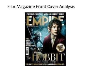
2. The magazine includes their web
address so that their target
audience can visit the website to
find out more information,
exclusives and so on.
Additionally, the website is
displayed obviously so that any
possible complaints readers have
they know to go to the website
to do so.
The price is displayed obviously above
the “M” in the masthead. The text is
contrastingly white making it obvious
to the reader. The price for this
particular magazine is £3.99, quite
expensive for a magazine however
this price suggests higher quality,
more content and simply a more
enjoyable experience. A cheap
magazine may beg the question as to
“why is it so cheap?” Is it poor
quality? Is it sloppily written?
A barcode is essential and will be
found on any genre of magazine.
It is used so that machines can
process the magazine when
being purchased in shops.
The date is also shown in bold white
capitals. The fact it only shows the
month and the year suggests EMPIRE
is a monthly issued magazine .
3. The boxed-out text is used to create a readable surface to place
important text. It attracts the eye and forces the reader into reading this
bit of text. If the reader likes what he/she reads, they may buy the
magazine.
The tagline of the magazine reads
‘The shires’s biggest movie magazine’
not only suggests guaranteed quality
but also jokes with the contents of
this specific magazine based on ‘The
Hobbit.’ Any serious film fanatic will
be amused by such little details.
The masthead is in bold gold
text taking up a large part of
the page as it is important to
ensure readers know that this
is an ‘EMPIRE’ magazine.
However, the face of the
model covers some of the
masthead. This can be
interpreted as almost cocky in
the sense that it assumes that
readers know the magazine is
‘EMPIRE’ without having to
make it explicitly obvious.
In addition to the exclusives on the, at
the time, new film The Hobbit the
magazine has much more content. It
shows this on the front cover by
listing some more content to be found
in the magazine and aim to further
interest some sceptical readers. By
showing more content some readers
not interested in The Hobbit may be
interested in Dredd for example and
continue to buy this months addition
of EMPIRE.
4. “EXCLUSIVE” – the use of a ‘buzz word’ aimed at
attracting people to their magazine as oppose to
other similar ones of the same shelf. If one
magazine has an EXCLUSIVE and the other
doesn’t then it is likely the reader will favour the
one with unseen content.
The use of the term “finest coverage” is another
example of the magazine deliberately trying to subtly
get one up on the other rival magazines. By claiming
that their coverage is the ‘finest’ it forces the reader
to assume that this is the best magazine, the best
value for money, the best content etc.
“The Hobbit” is written in large golden text,
similar to that of the masthead to give readers
detail as to the main story in the magazine. At
the time of release, The Hobbit was a big film
being released that would undoubtedly attract
interest due to the success of the Lord of The
Rings trilogy. By picking this story they are
guaranteeing some sales to The Hobbit fans.
5. The photo used for the background of the magazine consists of
two models, the character Bilbo Baggins and Gollum. Notice the
light shining on Bilbo Baggins portraying him as a “good guy” and
the darkness on Gollum portraying him as a “bad guy.” The picture
aims to show a bit of the film plot with Bilbo looking around with a
scared look on his face with Gollum crawling around in the
darkness following him. This eerie photo is effective yet also breaks
codes and conventions. It is effective in the sense of using the rule
of thirds. It places two characters both on the left and right hand
side of the screen, not the middle. This is a concept that suggests
the human eye is automatically going to look at each side of the
page not the direct centre (hence the reason the centre is blank
from text or any models.) However, it does break codes and
conventions as usually on the cover of magazines there is eye
contact between the reader and the model to create a sense of
intimacy between the two, hopefully resulting in the reader picking
to purchase that magazine over some of the competitors. This
particularly magazine cover has decided to go against this common
convention, perhaps to show an exclusive scene from the film that
will interest readers?
6. The photo used for the background of the magazine consists of
two models, the character Bilbo Baggins and Gollum. Notice the
light shining on Bilbo Baggins portraying him as a “good guy” and
the darkness on Gollum portraying him as a “bad guy.” The picture
aims to show a bit of the film plot with Bilbo looking around with a
scared look on his face with Gollum crawling around in the
darkness following him. This eerie photo is effective yet also breaks
codes and conventions. It is effective in the sense of using the rule
of thirds. It places two characters both on the left and right hand
side of the screen, not the middle. This is a concept that suggests
the human eye is automatically going to look at each side of the
page not the direct centre (hence the reason the centre is blank
from text or any models.) However, it does break codes and
conventions as usually on the cover of magazines there is eye
contact between the reader and the model to create a sense of
intimacy between the two, hopefully resulting in the reader picking
to purchase that magazine over some of the competitors. This
particularly magazine cover has decided to go against this common
convention, perhaps to show an exclusive scene from the film that
will interest readers?