
Recommended
More Related Content
What's hot
What's hot (20)
Viewers also liked
Viewers also liked (14)
Similar to The Twilight Saga: Breaking Dawn Opening Scene Analysis
Similar to The Twilight Saga: Breaking Dawn Opening Scene Analysis (20)
More from julianna321
More from julianna321 (20)
Recently uploaded
Recently uploaded (20)
The Twilight Saga: Breaking Dawn Opening Scene Analysis
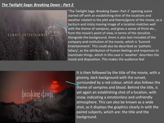
- 1. The Twilight Saga: Breaking Dawn - Part 2 ‘The Twilight Saga: Breaking Dawn- Part 2’ opening scene started off with an establishing shot of the locations and weather related to the plot and theme/genre of the movie, as a taciturn and misty moving image of a location matches well with the theme of vampires, and gives a sense of thirst etc., from the movie’s point of view, in terms of the storyline. Alongside the background, there is also text included of the company and institution of the movie, which is ‘Summit Entertainment’. This could also be described as ‘pathetic fallacy’, as the attribution of human feelings and responses to inanimate things, which in this case is ‘weather’ describes the mood and disposition. This makes the audience feel It is then followed by the title of the movie, with a gloomy, dark background with the sunset, surrounded by a red colour, which also follows the theme of vampires and blood. Behind the title, is yet again an establishing shot of a location, with snow, indicating a emotionless and unfriendly atmosphere. This can also be known as a wide shot, as it displays the graphics clearly in with the paired subjects, which are: the title and the background.
- 2. These three images illustrate and display different establishing shots of location and weather etc. However, as the backgrounds change, so do the names of people, for instance the cast or producer etc. The first one has a different background with person’s name who is one of the main characters. The next image has another character’s name, but this time with a different background of a misty and cloudy mountain area. The third image displays another name, but with an extreme close-up of a leaf; this yet again is trying to depict nature and climate. This camera shot type is used to add a variety of shot types, as it makes it interesting and engaging for the audience to watch. This could be related and compared to the audience theory of ‘Richard Dyer’s utopian theory’ (1977). It is specifically compared to one of the words stated in this theory which is “Dreariness” this makes the audience ‘alert’ as these images clearly give a sense of it being a lonesome and isolated atmosphere. Furthermore, these images would be described using words such as: gloomy, dismal, mysterious, melancholy etc.
- 3. Two mid-shots are cross dissolved to give a sensation of softness. This, along with the soft, low- key lighting and calm music encourage the audience to see the movie’s opening scene in a positive way. This contrasts with the use of harsh jump-cuts and sinister music when the background landscapes change; we are supposed to view this close-up shot of the text and the background as a comparison, as the visuals of the text/font and background (red) images, match and synchronize well. The conventions of horror include colours such as red and black. Red is a typical convention of horror as it connotes danger, blood etc. This makes the audience feel secure because they are able to recognise the genre horror, and therefore know what to expect. This could be related to the audience theory “Advertisers segment audiences on the basis of ‘socio-economic values’ such as: ‘Survivors’. This is for people who want security and prefer routine; this relates to the fact that the colour red immediately makes the audience aware that this is going to be a movie associated with forms of horror or thriller and prepares them for the movie and to continue watching further on.
- 4. Both these camera shots are close-up shots of snow and blood. In the second image, there is an editing technique used which is called ‘pulling focus’, which is when the camera blurs out of a certain part of the action, and focuses on another part. This can also be called zoom, as the camera lens moves in, and concentrates on a certain part. This is clearly displayed in both images. These graphics could somehow be compared/related to the audience theory called ‘Uses and gratifications theory blumler and katz, which stated ‘diversion as being a form of escape from everyday. This could make the audience feel creative and artistic; as there are several graphics and moving images used that were quite pure and clean etc., as quite a cold atmosphere is displayed in this opening scene, which included frost/snow etc. This part if clearly shown. This part is blurred. This part is blurred. Extreme close-up shot.
- 5. This shot is shown towards the end of the opening scene, it is an extreme close-up shot of an eye. It is a clear shot of the eye, displaying every detail of the eye and the eye pupils. This shot type is used to make it suspenseful for the audience to know who’s eye it is. In the second image, the eye begins to display a red colour (blood) spreading across the eye, followed by the name of the director, with the background of the eye still supporting the text behind. This technique of paring the name and background of the eye together makes it interesting and amusing for the audience, as when seeing this part in the movie, it makes the audience excited for the movie to begin. The director’s name is displayed towards the end of the opening scene, to leave the best for last with the director’s name, who is the person who created the storyline, opening scene, etc.
- 6. Lastly and finally comes an extreme close-up shot, followed short after the extreme close-up of just one of her eyes (on the previous slide). This camera shot is used to put emphasis on the character that is being introduced. As she is a main character, people already most probably know who it is, but to start of by displaying just the eyes, makes it more exciting for the audience, and this makes it easier to begin the movie, as the characters/protagonists are already being presented. This could be related to the audience theory called ‘Richard Dyer’s utopian theory (1977), which stated one the words ‘Intensity’, this image of just the eyes displayed creates that tension and intensity for the audience, as they are anxious and eager to find out who this is. Regardless of the fact that they are most likely to know it is already, as the actors/actresses (cast) in this movie are very popular and known.