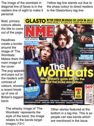
1. The image of the wombats in Yellow tag line stands out due to
diagonal line of faces is in the the sharp colour to direct readers
readers line of sight to make it to the Glastonbury tag line.
personal
Bold, primary
colours allows
the title to come
out of the page.
Headlines
create a border
around the
image of ‘The
Wombats’.
Makes them the
main image of
the cover.
The pug appeals
and pops out to
the readers with
contrast of
colours, showing
a recent break
up of one of
Britain's biggest
band.
The whacky image of ‘The Other stories featured at the
Wombats’ represents the bottom in a tag line. This is so
style of the band, the image people can see bands which
relates to the bands target are mentioned in the issue.
images (13+)
2. Putting the masthead behind the medium close
The colours in the up image shows the confidence and popularity of
‘Rolling Stone’ front the magazine yet also allows the reader to see
cover reoccurs the full image of the person featured to show she
through many of the is the main headline. Putting the masthead
other covers this behind the image is very common for ‘Rolling
allows the readers Stone’ magazine.
to relate to the other
issues., the primary
colours are also
very basic but
contrast with the
white back ground
which allows the
headlines to stand
out.
Shows the
tours as
subheadings
so people can
see if their
favourite band
is included in
the magazine.
She is looking
directly into the
camera which
makes the reader
feel more
personal and The medium close up shows the
almost in touch majority of Amy Winehouse’s Tattoos.
with Amy It also shows her beehive hair which
Winehouse. she was known for.
3. The change of the The red logo of Q contrasts with the
common ‘Q’ logo other colours which almost allows the
shows the special logo to jump off the page.
edition before
reading the text
around it.
The image of ‘Liam
Gallagher’ and ‘Noel
Gallagher’ touching
heads shows the
brotherly bond
between the
Gallagher brothers.
Both of them
wearing glasses
shows the
similarities
between the
brothers.
The direct eye
contact draws
you straight to
the image.
The simplicity of the
magazine gives it a
The simple, basic colour scheme
great effect and
gives the magazine a mature feel.
allows the white
This appeals to the older
headings to stand
generation of the ‘OASIS’ fans.
out.