
Recommended
More Related Content
More from jasminelecomber
More from jasminelecomber (8)
Recently uploaded
Recently uploaded (14)
Saul bass 1920 1996
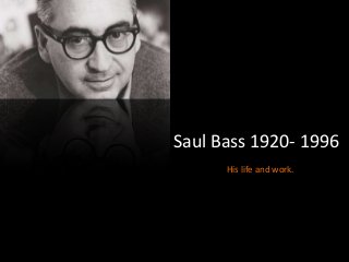
- 1. Saul Bass 1920- 1996 His life and work.
- 2. Saul Bass’s early life and start of his career •Saul Bass was an American Graphic designer who became famous for his work on title sequences and logo designs in films. He studied at the Art Students League until attending Brooklyn College. His career really began in the 1940’s in Hollywood where he would deign print advertisements for films. His big break was when he designed the film poster for the 1954 film Carmen Jones; director Preminger was so impressed he ask Bass to produce the title sequence as well. This is when it became apparent that Bass had a unique and creative style never seen before and this would be the start of many title sequences that would revolutionise the approach to the design of title sequences. “I want to make beautiful things, even if nobody cares, as opposed to ugly things. That’s my intent”
- 3. Bass’ used simplistic techniques in many of his title sequences, lets look at ‘The Man With The Golden Arm’ for example: The lines here are very simplistic, there’s not actually much too them but this is what creates the beauty and it means it’s not too over complicated. The colours are simply monochrome, this sets a serious tone and means the contrast between the lines and background stands out. Therefore, the audience are drawn to the white lines and text. The crippled arm is actually symbolic for The track used in this title sequence is in time with how the lines and credits appear; the sound is in sync with the visuals. Bass’ work- The Man With The Golden Arm(1955)
- 4. Anatomy of a Murder (1959) This title sequence also has simplistic aspects all the way through. However, the shapes are more detailed; Here, Bass has used silhouette shapes of body parts . This links to the title of the film ‘Anatomy of a murder’ it’s clear in this title sequence the genre is going to be crime and it creates an enigma of ‘what type of murder will this be?’ Similar to ‘The Man With the Golden Arm’, the music comes in time with the credits and shapes and so the sequence flows, it’s in sync with the credits. Bass has used simple colours; grey, black and white. The use of these colours keeps the sequence simple and focuses on the main idea which is crime and murder.
- 5. What Bass has influenced Catch Me If You Can (2002) Catch Me If You Can is a biographical crime drama based on a con artist. The sequence has taken the style of Saul Bass and transposed it into something more contemporary. Like in ‘The Man With The Golden Arm’, Kuntzel and Deygas use lines throughout the sequence, flowing with the movement of the people and credits. Like Bass, Kuntzel and Deygas have used shapes of people and objects that lack detail, creating simplicity.
- 6. Kiss Kiss Bang Bang (2005) Kiss Kiss Bang Bang is an American crime-comedy film. Like Bass, Danny Yount has used shapes of people that lack detail creating simplicity but not moving away from the ideas of the film. Danny Yount has chose 4 colours too be used throughout the sequence. They’re mainly Black, red and white, these colours can connote danger and blood and so linking to the genre of ‘crime’.