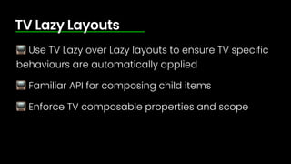
SlideShare a Scribd company logo
1 of 111
Download to read offline
Kicking Back with Compose
for Android TV
Joe Birch @HiThereJoe
Android @ Bu
ff
er
Running @ Droid.Academy
👋
What we’ll learn
📺 Foundations of Android TV
📺 Layout Composables for Android TV
📺 Material Composables for Android TV
📺 Sharing composables across TV and Mobile
150 million
monthly active devices
running Android TV
(smart TVs and chromecast devices)
Android TV
Navigation
Focus
Immersive
Compose, as you know it
implementation 'androidx.tv:tv-foundation:1.0.0-alpha07'
implementation ‘androidx.tv:tv-material:1.0.0-alpha07'
Lazy Layouts
TV Lazy Row
@Composable
fun TvLazyRow(
modifier: Modifier = Modifier,
state: TvLazyListState = rememberTvLazyListState(),
contentPadding: PaddingValues = PaddingValues(0.dp),
reverseLayout: Boolean = false,
horizontalArrangement: Arrangement.Horizontal =
if (!reverseLayout) Arrangement.Start else Arrangement.End,
verticalAlignment: Alignment.Vertical = Alignment.Top,
userScrollEnabled: Boolean = true,
pivotOffsets: PivotOffsets = PivotOffsets(),
content: TvLazyListScope.() -> Unit
)
TvLazyRow(
contentPadding = PaddingValues(16.dp),
horizontalArrangement = Arrangement.spacedBy(18.dp)
) {
items(data) { cardItem ->
...
}
}
📺 Display horizontally scrolling content
📺 Use to display content in feeds
📺 In most cases, prioritise Row over Column for
content browsing
TV Lazy Row
📺 Display horizontally scrolling content
📺 Use to display content in feeds
📺 In most cases, prioritise Row over Column for
content browsing
TV Lazy Row
📺 Display horizontally scrolling content
📺 Use to display content in feeds
📺 In most cases, prioritise Row over Column for
content browsing
TV Lazy Row
TV Lazy Column
@Composable
fun TvLazyColumn(
modifier: Modifier = Modifier,
state: TvLazyListState = rememberTvLazyListState(),
contentPadding: PaddingValues = PaddingValues(0.dp),
reverseLayout: Boolean = false,
verticalArrangement: Arrangement.Vertical =
if (!reverseLayout) Arrangement.Top else Arrangement.Bottom,
horizontalAlignment: Alignment.Horizontal = Alignment.Start,
userScrollEnabled: Boolean = true,
pivotOffsets: PivotOffsets = PivotOffsets(),
content: TvLazyListScope.() -> Unit
)
TvLazyColumn(
contentPadding = PaddingValues(16.dp),
verticalArrangement = Arrangement.spacedBy(18.dp)
) {
items(data) { cardItem ->
...
}
}
TV Lazy or Lazy 🤔
@Composable
fun TvLazyColumn(
modifier: Modifier = Modifier,
state: TvLazyListState = rememberTvLazyListState(),
contentPadding: PaddingValues = PaddingValues(0.dp),
reverseLayout: Boolean = false,
verticalArrangement: Arrangement.Vertical = …,
horizontalAlignment: Alignment.Horizontal = Alignment.Start,
userScrollEnabled: Boolean = true,
pivotOffsets: PivotOffsets = PivotOffsets(),
content: TvLazyListScope.() -> Unit
)
@Composable
fun LazyColumn(
modifier: Modifier = Modifier,
state: LazyListState = rememberLazyListState(),
contentPadding: PaddingValues = PaddingValues(0.dp),
reverseLayout: Boolean = false,
verticalArrangement: Arrangement.Vertical = …,
horizontalAlignment: Alignment.Horizontal = Alignment.Start,
flingBehavior: FlingBehavior = ScrollableDefaults.flingBehavior(),
userScrollEnabled: Boolean = true,
content: LazyListScope.() -> Unit
)
@Composable
fun TvLazyColumn(
modifier: Modifier = Modifier,
state: TvLazyListState = rememberTvLazyListState(),
contentPadding: PaddingValues = PaddingValues(0.dp),
reverseLayout: Boolean = false,
verticalArrangement: Arrangement.Vertical = …,
horizontalAlignment: Alignment.Horizontal = Alignment.Start,
userScrollEnabled: Boolean = true,
pivotOffsets: PivotOffsets = PivotOffsets(),
content: TvLazyListScope.() -> Unit
)
@Composable
fun LazyColumn(
modifier: Modifier = Modifier,
state: LazyListState = rememberLazyListState(),
contentPadding: PaddingValues = PaddingValues(0.dp),
reverseLayout: Boolean = false,
verticalArrangement: Arrangement.Vertical = …,
horizontalAlignment: Alignment.Horizontal = Alignment.Start,
flingBehavior: FlingBehavior = ScrollableDefaults.flingBehavior(),
userScrollEnabled: Boolean = true,
content: LazyListScope.() -> Unit
)
Lazy Row
TV Lazy Row
Lazy Row
TV Lazy Row
📺 Use TV Lazy over Lazy layouts to ensure TV specific
behaviours are automatically applied
📺 Familiar API for composing child items
📺 Enforce TV composable properties and scope
TV Lazy Layouts
📺 Use TV Lazy over Lazy layouts to ensure TV specific
behaviours are automatically applied
📺 Familiar API for composing child items
📺 Enforce TV composable properties and scope
TV Lazy Layouts
📺 Use TV Lazy over Lazy layouts to ensure TV specific
behaviours are automatically applied
📺 Familiar API for composing child items
📺 Enforce TV composable properties and scope
TV Lazy Layouts
Lazy Grids
@Composable
fun TvLazyVerticalGrid(
columns: TvGridCells,
modifier: Modifier = Modifier,
state: TvLazyGridState = rememberTvLazyGridState(),
contentPadding: PaddingValues = PaddingValues(0.dp),
reverseLayout: Boolean = false,
verticalArrangement: Arrangement.Vertical =
if (!reverseLayout) Arrangement.Top else Arrangement.Bottom,
horizontalArrangement: Arrangement.Horizontal = Arrangement.Start,
userScrollEnabled: Boolean = true,
pivotOffsets: PivotOffsets = PivotOffsets(),
content: TvLazyGridScope.() -> Unit
)
TvLazyVerticalGrid(
columns = TvGridCells.Fixed(6),
verticalArrangement = Arrangement.spacedBy(16.dp),
horizontalArrangement = Arrangement.spacedBy(16.dp),
contentPadding = PaddingValues(16.dp)
) {
items(items) {
…
}
}
TvLazyVerticalGrid(
columns = TvGridCells.Fixed(6),
verticalArrangement = Arrangement.spacedBy(16.dp),
horizontalArrangement = Arrangement.spacedBy(16.dp),
contentPadding = PaddingValues(16.dp)
)
TvLazyVerticalGrid(
columns = TvGridCells.Adaptive(120.dp),
verticalArrangement = Arrangement.spacedBy(16.dp),
horizontalArrangement = Arrangement.spacedBy(16.dp),
contentPadding = PaddingValues(16.dp)
)
TvLazyHorizontalGrid(
Rows = TvGridCells.Fixed(3),
verticalArrangement = Arrangement.spacedBy(16.dp),
horizontalArrangement = Arrangement.spacedBy(16.dp),
contentPadding = PaddingValues(16.dp)
) {
…
}
📺 Display large collections of related content
📺 Use tabs to offer content filtering
📺 Use adaptive cell sizing to scale based on available
space
TV Grids
📺 Display large collections of related content
📺 Use tabs to offer content filtering
📺 Use adaptive cell sizing to scale based on available
space
TV Grids
📺 Display large collections of related content
📺 Use tabs to offer content filtering
📺 Use adaptive cell sizing to scale based on available
space
TV Grids
Carousels
@Composable
fun Carousel(
itemCount: Int,
modifier: Modifier = Modifier,
carouselState: CarouselState = remember { CarouselState() },
autoScrollDurationMillis: Long = CarouselDefaults.TimeToDisplayItemMillis,
contentTransformStartToEnd: ContentTransform = CarouselDefaults.contentTransform,
contentTransformEndToStart: ContentTransform = CarouselDefaults.contentTransform,
carouselIndicator:
@Composable BoxScope.() -> Unit = {
…
},
content: @Composable AnimatedContentScope.(index: Int) -> Unit
)
@Composable
fun Carousel(
itemCount: Int,
modifier: Modifier = Modifier,
carouselState: CarouselState = remember { CarouselState() },
autoScrollDurationMillis: Long = CarouselDefaults.TimeToDisplayItemMillis,
contentTransformStartToEnd: ContentTransform = CarouselDefaults.contentTransform,
contentTransformEndToStart: ContentTransform = CarouselDefaults.contentTransform,
carouselIndicator:
@Composable BoxScope.() -> Unit = {
CarouselDefaults.IndicatorRow(
itemCount = itemCount,
activeItemIndex = carouselState.activeItemIndex,
modifier = Modifier
.align(Alignment.BottomEnd)
.padding(16.dp),
)
},
content: @Composable AnimatedContentScope.(index: Int) -> Unit
)
Carousel(
itemCount = backgrounds.size,
modifier = Modifier
.fillMaxWidth()
.padding(horizontal = 100.dp, vertical = 80.dp)
.height(280.dp)
.border(1.dp, Color.LightGray, RoundedCornerShape(16.dp))
) { itemIndex ->
…
}
📺 Highlight featured content
📺 Always provide a way to access the content
📺 Not a replacement for content feeds
Carousel
📺 Highlight featured content
📺 Always provide a way to access the content
📺 Not a replacement for content feeds
Carousel
📺 Highlight featured content
📺 Always provide a way to access the content
📺 Not a replacement for content feeds
Carousel
Immersive Lists
@Composable
fun ImmersiveList(
background:
@Composable ImmersiveListBackgroundScope.(index: Int, listHasFocus: Boolean) -> Unit,
modifier: Modifier = Modifier,
listAlignment: Alignment = Alignment.BottomEnd,
list: @Composable ImmersiveListScope.() -> Unit,
)
ImmersiveList(
modifier = Modifier
.height(immersiveListHeight + cardHeight / 2)
.fillMaxWidth(),
background = { index, _ ->
…
}
) {
}
ImmersiveList(
modifier = Modifier
.height(immersiveListHeight + cardHeight / 2)
.fillMaxWidth(),
background = { index, _ ->
…
}
) {
TvLazyRow {
backgrounds.forEachIndexed { index, backgroundColor ->
item {
Box(
modifier = Modifier
…
.immersiveListItem(index)
)
}
}
}
}
ImmersiveList(
modifier = Modifier
.height(immersiveListHeight + cardHeight / 2)
.fillMaxWidth(),
background = { index, _ ->
…
}
) {
TvLazyRow {
backgrounds.forEachIndexed { index, backgroundColor ->
item {
Box(
modifier = Modifier
…
.immersiveListItem(index)
)
}
}
}
}
📺 Give immersive focus to a selected item
📺 Show more information for content
📺 Greater efficiency for the user
Immersive List
📺 Give immersive focus to a selected item
📺 Show more information for content
📺 Greater efficiency for the user
Immersive List
📺 Give immersive focus to a selected item
📺 Show more information for content
📺 Greater efficiency for the user
Immersive List
Navigation
Navigation Drawer
@Composable
fun NavigationDrawer(
drawerContent: @Composable (DrawerValue) -> Unit,
modifier: Modifier = Modifier,
drawerState: DrawerState = rememberDrawerState(DrawerValue.Closed),
content: @Composable () -> Unit
)
Modal Navigation Drawer
@Composable
fun ModalNavigationDrawer(
drawerContent: @Composable (DrawerValue) -> Unit,
modifier: Modifier = Modifier,
drawerState: DrawerState = rememberDrawerState(DrawerValue.Closed),
scrimColor: Color = LocalColorScheme.current.scrim.copy(alpha = 0.5f),
content: @Composable () -> Unit
)
Tabs
@Composable
fun TabRow(
selectedTabIndex: Int,
modifier: Modifier = Modifier,
containerColor: Color = TabRowDefaults.ContainerColor,
contentColor: Color = TabRowDefaults.contentColor(),
separator: @Composable () -> Unit = { TabRowDefaults.TabSeparator() },
indicator: @Composable …,
tabs: @Composable () -> Unit
)
@Composable
fun Tab(
selected: Boolean,
onFocus: () -> Unit,
modifier: Modifier = Modifier,
onClick: () -> Unit = { },
enabled: Boolean = true,
colors: TabColors = TabDefaults.pillIndicatorTabColors(),
interactionSource: MutableInteractionSource = remember { MutableInteractionSource() },
content: @Composable RowScope.() -> Unit
)
val tabs = listOf("View All", "Action", "Sci-Fi", "Drama", "Thriller")
var selectedTabIndex by remember { mutableIntStateOf(0) }
TabRow(
selectedTabIndex = selectedTabIndex
) {
tabs.forEachIndexed { index, tab ->
Tab(
selected = selectedTabIndex == index,
onFocus = {
selectedTabIndex = index
},
) {
Text(…)
}
}
}
Material Components
Card
@Composable
fun WideCardLayout(
imageCard: @Composable (interactionSource: MutableInteractionSource) -> Unit,
title: @Composable () -> Unit,
modifier: Modifier = Modifier,
subtitle: @Composable () -> Unit = {},
description: @Composable () -> Unit = {},
contentColor: CardLayoutColors = CardLayoutDefaults.contentColor(),
interactionSource: MutableInteractionSource = remember { MutableInteractionSource() }
)
@Composable
fun StandardCardLayout(
imageCard: @Composable (interactionSource: MutableInteractionSource) -> Unit,
title: @Composable () -> Unit,
modifier: Modifier = Modifier,
subtitle: @Composable () -> Unit = {},
description: @Composable () -> Unit = {},
contentColor: CardLayoutColors = CardLayoutDefaults.contentColor(),
interactionSource: MutableInteractionSource = remember { MutableInteractionSource() }
)
@Composable
fun ClassicCard(
onClick: () -> Unit,
image: @Composable BoxScope.() -> Unit,
title: @Composable () -> Unit,
modifier: Modifier = Modifier,
onLongClick: (() -> Unit)? = null,
subtitle: @Composable () -> Unit = {},
description: @Composable () -> Unit = {},
shape: CardShape = CardDefaults.shape(),
colors: CardColors = CardDefaults.colors(),
scale: CardScale = CardDefaults.scale(),
border: CardBorder = CardDefaults.border(),
glow: CardGlow = CardDefaults.glow(),
contentPadding: PaddingValues = PaddingValues(),
interactionSource: MutableInteractionSource = remember { MutableInteractionSource() }
)
@Composable
fun WideClassicCard(
onClick: () -> Unit,
image: @Composable BoxScope.() -> Unit,
title: @Composable () -> Unit,
modifier: Modifier = Modifier,
onLongClick: (() -> Unit)? = null,
subtitle: @Composable () -> Unit = {},
description: @Composable () -> Unit = {},
shape: CardShape = CardDefaults.shape(),
colors: CardColors = CardDefaults.colors(),
scale: CardScale = CardDefaults.scale(),
border: CardBorder = CardDefaults.border(),
glow: CardGlow = CardDefaults.glow(),
contentPadding: PaddingValues = PaddingValues(),
interactionSource: MutableInteractionSource = remember { MutableInteractionSource() }
)
Surface
@Composable
fun Surface(
checked: Boolean,
onCheckedChange: (Boolean) -> Unit,
modifier: Modifier = Modifier,
enabled: Boolean = true,
onLongClick: (() -> Unit)? = null,
tonalElevation: Dp = Elevation.Level0,
shape: ToggleableSurfaceShape = ToggleableSurfaceDefaults.shape(),
colors: ToggleableSurfaceColors = ToggleableSurfaceDefaults.colors(),
scale: ToggleableSurfaceScale = ToggleableSurfaceDefaults.scale(),
border: ToggleableSurfaceBorder = ToggleableSurfaceDefaults.border(),
glow: ToggleableSurfaceGlow = ToggleableSurfaceDefaults.glow(),
interactionSource: MutableInteractionSource = remember { MutableInteractionSource() },
content: @Composable (BoxScope.() -> Unit)
)
Switch
@Composable
fun Switch(
checked: Boolean,
onCheckedChange: ((Boolean) -> Unit)?,
modifier: Modifier = Modifier,
thumbContent: (@Composable () -> Unit)? = null,
enabled: Boolean = true,
colors: SwitchColors = SwitchDefaults.colors(),
interactionSource: MutableInteractionSource = remember { MutableInteractionSource() },
)
📺 Button
📺 Checkbox
📺 Radio Button
📺 Wide Button
Material Components
Reusing Composables
Mobile App
Component
Library
Material Card
Mobile App
Component
Library
Material Card
TV App
Material TV Card
TV App
Material TV Card
Mobile App
Material Card
Component
Library
Card Content
TV App
Material TV Card
Mobile App
Material Card
Component
Library
Card Content
@Composable
fun TvMovieCard() {
Card(...) {
MySharedContent()
}
}
@Composable
fun MovieCard() {
Card(...) {
MySharedContent()
}
}
@Composable
fun MySharedContent() {
...
}
That’s all
Practical Jetpack Compose
Build 12 independent projects, interacting
with a vast range of essential Compose
APIs.
ComposeBook.com
25% o
ff
using code DROIDCON

More Related Content

Recently uploaded

Thermal Engineering Unit - I & II . ppt
Thermal Engineering  Unit - I & II . pptThermal Engineering  Unit - I & II . ppt
Thermal Engineering Unit - I & II . pptDineshKumar4165
 
kiln thermal load.pptx kiln tgermal load
kiln thermal load.pptx kiln tgermal loadkiln thermal load.pptx kiln tgermal load
kiln thermal load.pptx kiln tgermal loadhamedmustafa094
 
Double Revolving field theory-how the rotor develops torque
Double Revolving field theory-how the rotor develops torqueDouble Revolving field theory-how the rotor develops torque
Double Revolving field theory-how the rotor develops torqueBhangaleSonal
 
DC MACHINE-Motoring and generation, Armature circuit equation
DC MACHINE-Motoring and generation, Armature circuit equationDC MACHINE-Motoring and generation, Armature circuit equation
DC MACHINE-Motoring and generation, Armature circuit equationBhangaleSonal
 
Work-Permit-Receiver-in-Saudi-Aramco.pptx
Work-Permit-Receiver-in-Saudi-Aramco.pptxWork-Permit-Receiver-in-Saudi-Aramco.pptx
Work-Permit-Receiver-in-Saudi-Aramco.pptxJuliansyahHarahap1
 
Navigating Complexity: The Role of Trusted Partners and VIAS3D in Dassault Sy...
Navigating Complexity: The Role of Trusted Partners and VIAS3D in Dassault Sy...Navigating Complexity: The Role of Trusted Partners and VIAS3D in Dassault Sy...
Navigating Complexity: The Role of Trusted Partners and VIAS3D in Dassault Sy...Arindam Chakraborty, Ph.D., P.E. (CA, TX)
 
Thermal Engineering -unit - III & IV.ppt
Thermal Engineering -unit - III & IV.pptThermal Engineering -unit - III & IV.ppt
Thermal Engineering -unit - III & IV.pptDineshKumar4165
 
School management system project Report.pdf
School management system project Report.pdfSchool management system project Report.pdf
School management system project Report.pdfKamal Acharya
 
S1S2 B.Arch MGU - HOA1&2 Module 3 -Temple Architecture of Kerala.pptx
S1S2 B.Arch MGU - HOA1&2 Module 3 -Temple Architecture of Kerala.pptxS1S2 B.Arch MGU - HOA1&2 Module 3 -Temple Architecture of Kerala.pptx
S1S2 B.Arch MGU - HOA1&2 Module 3 -Temple Architecture of Kerala.pptxSCMS School of Architecture
 
Online electricity billing project report..pdf
Online electricity billing project report..pdfOnline electricity billing project report..pdf
Online electricity billing project report..pdfKamal Acharya
 
COST-EFFETIVE and Energy Efficient BUILDINGS ptx
COST-EFFETIVE  and Energy Efficient BUILDINGS ptxCOST-EFFETIVE  and Energy Efficient BUILDINGS ptx
COST-EFFETIVE and Energy Efficient BUILDINGS ptxJIT KUMAR GUPTA
 
Bridge Jacking Design Sample Calculation.pptx
Bridge Jacking Design Sample Calculation.pptxBridge Jacking Design Sample Calculation.pptx
Bridge Jacking Design Sample Calculation.pptxnuruddin69
 
+97470301568>> buy weed in qatar,buy thc oil qatar,buy weed and vape oil in d...
+97470301568>> buy weed in qatar,buy thc oil qatar,buy weed and vape oil in d...+97470301568>> buy weed in qatar,buy thc oil qatar,buy weed and vape oil in d...
+97470301568>> buy weed in qatar,buy thc oil qatar,buy weed and vape oil in d...Health
 
XXXXXXXXXXXXXXXXXXXXXXXXXXXXXXXXXXXXXXXXXXXXXXXXXXXX
XXXXXXXXXXXXXXXXXXXXXXXXXXXXXXXXXXXXXXXXXXXXXXXXXXXXXXXXXXXXXXXXXXXXXXXXXXXXXXXXXXXXXXXXXXXXXXXXXXXXXXXX
XXXXXXXXXXXXXXXXXXXXXXXXXXXXXXXXXXXXXXXXXXXXXXXXXXXXssuser89054b
 
Thermal Engineering-R & A / C - unit - V
Thermal Engineering-R & A / C - unit - VThermal Engineering-R & A / C - unit - V
Thermal Engineering-R & A / C - unit - VDineshKumar4165
 
HAND TOOLS USED AT ELECTRONICS WORK PRESENTED BY KOUSTAV SARKAR
HAND TOOLS USED AT ELECTRONICS WORK PRESENTED BY KOUSTAV SARKARHAND TOOLS USED AT ELECTRONICS WORK PRESENTED BY KOUSTAV SARKAR
HAND TOOLS USED AT ELECTRONICS WORK PRESENTED BY KOUSTAV SARKARKOUSTAV SARKAR
 
Design For Accessibility: Getting it right from the start
Design For Accessibility: Getting it right from the startDesign For Accessibility: Getting it right from the start
Design For Accessibility: Getting it right from the startQuintin Balsdon
 
Computer Networks Basics of Network Devices
Computer Networks  Basics of Network DevicesComputer Networks  Basics of Network Devices
Computer Networks Basics of Network DevicesChandrakantDivate1
 

Recently uploaded (20)

Thermal Engineering Unit - I & II . ppt
Thermal Engineering  Unit - I & II . pptThermal Engineering  Unit - I & II . ppt
Thermal Engineering Unit - I & II . ppt
 
kiln thermal load.pptx kiln tgermal load
kiln thermal load.pptx kiln tgermal loadkiln thermal load.pptx kiln tgermal load
kiln thermal load.pptx kiln tgermal load
 
Double Revolving field theory-how the rotor develops torque
Double Revolving field theory-how the rotor develops torqueDouble Revolving field theory-how the rotor develops torque
Double Revolving field theory-how the rotor develops torque
 
Call Girls in South Ex (delhi) call me [🔝9953056974🔝] escort service 24X7
Call Girls in South Ex (delhi) call me [🔝9953056974🔝] escort service 24X7Call Girls in South Ex (delhi) call me [🔝9953056974🔝] escort service 24X7
Call Girls in South Ex (delhi) call me [🔝9953056974🔝] escort service 24X7
 
DC MACHINE-Motoring and generation, Armature circuit equation
DC MACHINE-Motoring and generation, Armature circuit equationDC MACHINE-Motoring and generation, Armature circuit equation
DC MACHINE-Motoring and generation, Armature circuit equation
 
Work-Permit-Receiver-in-Saudi-Aramco.pptx
Work-Permit-Receiver-in-Saudi-Aramco.pptxWork-Permit-Receiver-in-Saudi-Aramco.pptx
Work-Permit-Receiver-in-Saudi-Aramco.pptx
 
Navigating Complexity: The Role of Trusted Partners and VIAS3D in Dassault Sy...
Navigating Complexity: The Role of Trusted Partners and VIAS3D in Dassault Sy...Navigating Complexity: The Role of Trusted Partners and VIAS3D in Dassault Sy...
Navigating Complexity: The Role of Trusted Partners and VIAS3D in Dassault Sy...
 
Thermal Engineering -unit - III & IV.ppt
Thermal Engineering -unit - III & IV.pptThermal Engineering -unit - III & IV.ppt
Thermal Engineering -unit - III & IV.ppt
 
School management system project Report.pdf
School management system project Report.pdfSchool management system project Report.pdf
School management system project Report.pdf
 
S1S2 B.Arch MGU - HOA1&2 Module 3 -Temple Architecture of Kerala.pptx
S1S2 B.Arch MGU - HOA1&2 Module 3 -Temple Architecture of Kerala.pptxS1S2 B.Arch MGU - HOA1&2 Module 3 -Temple Architecture of Kerala.pptx
S1S2 B.Arch MGU - HOA1&2 Module 3 -Temple Architecture of Kerala.pptx
 
Online electricity billing project report..pdf
Online electricity billing project report..pdfOnline electricity billing project report..pdf
Online electricity billing project report..pdf
 
COST-EFFETIVE and Energy Efficient BUILDINGS ptx
COST-EFFETIVE  and Energy Efficient BUILDINGS ptxCOST-EFFETIVE  and Energy Efficient BUILDINGS ptx
COST-EFFETIVE and Energy Efficient BUILDINGS ptx
 
Bridge Jacking Design Sample Calculation.pptx
Bridge Jacking Design Sample Calculation.pptxBridge Jacking Design Sample Calculation.pptx
Bridge Jacking Design Sample Calculation.pptx
 
+97470301568>> buy weed in qatar,buy thc oil qatar,buy weed and vape oil in d...
+97470301568>> buy weed in qatar,buy thc oil qatar,buy weed and vape oil in d...+97470301568>> buy weed in qatar,buy thc oil qatar,buy weed and vape oil in d...
+97470301568>> buy weed in qatar,buy thc oil qatar,buy weed and vape oil in d...
 
XXXXXXXXXXXXXXXXXXXXXXXXXXXXXXXXXXXXXXXXXXXXXXXXXXXX
XXXXXXXXXXXXXXXXXXXXXXXXXXXXXXXXXXXXXXXXXXXXXXXXXXXXXXXXXXXXXXXXXXXXXXXXXXXXXXXXXXXXXXXXXXXXXXXXXXXXXXXX
XXXXXXXXXXXXXXXXXXXXXXXXXXXXXXXXXXXXXXXXXXXXXXXXXXXX
 
Thermal Engineering-R & A / C - unit - V
Thermal Engineering-R & A / C - unit - VThermal Engineering-R & A / C - unit - V
Thermal Engineering-R & A / C - unit - V
 
HAND TOOLS USED AT ELECTRONICS WORK PRESENTED BY KOUSTAV SARKAR
HAND TOOLS USED AT ELECTRONICS WORK PRESENTED BY KOUSTAV SARKARHAND TOOLS USED AT ELECTRONICS WORK PRESENTED BY KOUSTAV SARKAR
HAND TOOLS USED AT ELECTRONICS WORK PRESENTED BY KOUSTAV SARKAR
 
Design For Accessibility: Getting it right from the start
Design For Accessibility: Getting it right from the startDesign For Accessibility: Getting it right from the start
Design For Accessibility: Getting it right from the start
 
Computer Networks Basics of Network Devices
Computer Networks  Basics of Network DevicesComputer Networks  Basics of Network Devices
Computer Networks Basics of Network Devices
 
Cara Menggugurkan Sperma Yang Masuk Rahim Biyar Tidak Hamil
Cara Menggugurkan Sperma Yang Masuk Rahim Biyar Tidak HamilCara Menggugurkan Sperma Yang Masuk Rahim Biyar Tidak Hamil
Cara Menggugurkan Sperma Yang Masuk Rahim Biyar Tidak Hamil
 

Featured

2024 State of Marketing Report – by Hubspot
2024 State of Marketing Report – by Hubspot2024 State of Marketing Report – by Hubspot
2024 State of Marketing Report – by HubspotMarius Sescu
 
Everything You Need To Know About ChatGPT
Everything You Need To Know About ChatGPTEverything You Need To Know About ChatGPT
Everything You Need To Know About ChatGPTExpeed Software
 
Product Design Trends in 2024 | Teenage Engineerings
Product Design Trends in 2024 | Teenage EngineeringsProduct Design Trends in 2024 | Teenage Engineerings
Product Design Trends in 2024 | Teenage EngineeringsPixeldarts
 
How Race, Age and Gender Shape Attitudes Towards Mental Health
How Race, Age and Gender Shape Attitudes Towards Mental HealthHow Race, Age and Gender Shape Attitudes Towards Mental Health
How Race, Age and Gender Shape Attitudes Towards Mental HealthThinkNow
 
AI Trends in Creative Operations 2024 by Artwork Flow.pdf
AI Trends in Creative Operations 2024 by Artwork Flow.pdfAI Trends in Creative Operations 2024 by Artwork Flow.pdf
AI Trends in Creative Operations 2024 by Artwork Flow.pdfmarketingartwork
 
PEPSICO Presentation to CAGNY Conference Feb 2024
PEPSICO Presentation to CAGNY Conference Feb 2024PEPSICO Presentation to CAGNY Conference Feb 2024
PEPSICO Presentation to CAGNY Conference Feb 2024Neil Kimberley
 
Content Methodology: A Best Practices Report (Webinar)
Content Methodology: A Best Practices Report (Webinar)Content Methodology: A Best Practices Report (Webinar)
Content Methodology: A Best Practices Report (Webinar)contently
 
How to Prepare For a Successful Job Search for 2024
How to Prepare For a Successful Job Search for 2024How to Prepare For a Successful Job Search for 2024
How to Prepare For a Successful Job Search for 2024Albert Qian
 
Social Media Marketing Trends 2024 // The Global Indie Insights
Social Media Marketing Trends 2024 // The Global Indie InsightsSocial Media Marketing Trends 2024 // The Global Indie Insights
Social Media Marketing Trends 2024 // The Global Indie InsightsKurio // The Social Media Age(ncy)
 
Trends In Paid Search: Navigating The Digital Landscape In 2024
Trends In Paid Search: Navigating The Digital Landscape In 2024Trends In Paid Search: Navigating The Digital Landscape In 2024
Trends In Paid Search: Navigating The Digital Landscape In 2024Search Engine Journal
 
5 Public speaking tips from TED - Visualized summary
5 Public speaking tips from TED - Visualized summary5 Public speaking tips from TED - Visualized summary
5 Public speaking tips from TED - Visualized summarySpeakerHub
 
ChatGPT and the Future of Work - Clark Boyd
ChatGPT and the Future of Work - Clark Boyd ChatGPT and the Future of Work - Clark Boyd
ChatGPT and the Future of Work - Clark Boyd Clark Boyd
 
Getting into the tech field. what next
Getting into the tech field. what next Getting into the tech field. what next
Getting into the tech field. what next Tessa Mero
 
Google's Just Not That Into You: Understanding Core Updates & Search Intent
Google's Just Not That Into You: Understanding Core Updates & Search IntentGoogle's Just Not That Into You: Understanding Core Updates & Search Intent
Google's Just Not That Into You: Understanding Core Updates & Search IntentLily Ray
 
Time Management & Productivity - Best Practices
Time Management & Productivity -  Best PracticesTime Management & Productivity -  Best Practices
Time Management & Productivity - Best PracticesVit Horky
 
The six step guide to practical project management
The six step guide to practical project managementThe six step guide to practical project management
The six step guide to practical project managementMindGenius
 
Beginners Guide to TikTok for Search - Rachel Pearson - We are Tilt __ Bright...
Beginners Guide to TikTok for Search - Rachel Pearson - We are Tilt __ Bright...Beginners Guide to TikTok for Search - Rachel Pearson - We are Tilt __ Bright...
Beginners Guide to TikTok for Search - Rachel Pearson - We are Tilt __ Bright...RachelPearson36
 

Featured (20)

2024 State of Marketing Report – by Hubspot
2024 State of Marketing Report – by Hubspot2024 State of Marketing Report – by Hubspot
2024 State of Marketing Report – by Hubspot
 
Everything You Need To Know About ChatGPT
Everything You Need To Know About ChatGPTEverything You Need To Know About ChatGPT
Everything You Need To Know About ChatGPT
 
Product Design Trends in 2024 | Teenage Engineerings
Product Design Trends in 2024 | Teenage EngineeringsProduct Design Trends in 2024 | Teenage Engineerings
Product Design Trends in 2024 | Teenage Engineerings
 
How Race, Age and Gender Shape Attitudes Towards Mental Health
How Race, Age and Gender Shape Attitudes Towards Mental HealthHow Race, Age and Gender Shape Attitudes Towards Mental Health
How Race, Age and Gender Shape Attitudes Towards Mental Health
 
AI Trends in Creative Operations 2024 by Artwork Flow.pdf
AI Trends in Creative Operations 2024 by Artwork Flow.pdfAI Trends in Creative Operations 2024 by Artwork Flow.pdf
AI Trends in Creative Operations 2024 by Artwork Flow.pdf
 
Skeleton Culture Code
Skeleton Culture CodeSkeleton Culture Code
Skeleton Culture Code
 
PEPSICO Presentation to CAGNY Conference Feb 2024
PEPSICO Presentation to CAGNY Conference Feb 2024PEPSICO Presentation to CAGNY Conference Feb 2024
PEPSICO Presentation to CAGNY Conference Feb 2024
 
Content Methodology: A Best Practices Report (Webinar)
Content Methodology: A Best Practices Report (Webinar)Content Methodology: A Best Practices Report (Webinar)
Content Methodology: A Best Practices Report (Webinar)
 
How to Prepare For a Successful Job Search for 2024
How to Prepare For a Successful Job Search for 2024How to Prepare For a Successful Job Search for 2024
How to Prepare For a Successful Job Search for 2024
 
Social Media Marketing Trends 2024 // The Global Indie Insights
Social Media Marketing Trends 2024 // The Global Indie InsightsSocial Media Marketing Trends 2024 // The Global Indie Insights
Social Media Marketing Trends 2024 // The Global Indie Insights
 
Trends In Paid Search: Navigating The Digital Landscape In 2024
Trends In Paid Search: Navigating The Digital Landscape In 2024Trends In Paid Search: Navigating The Digital Landscape In 2024
Trends In Paid Search: Navigating The Digital Landscape In 2024
 
5 Public speaking tips from TED - Visualized summary
5 Public speaking tips from TED - Visualized summary5 Public speaking tips from TED - Visualized summary
5 Public speaking tips from TED - Visualized summary
 
ChatGPT and the Future of Work - Clark Boyd
ChatGPT and the Future of Work - Clark Boyd ChatGPT and the Future of Work - Clark Boyd
ChatGPT and the Future of Work - Clark Boyd
 
Getting into the tech field. what next
Getting into the tech field. what next Getting into the tech field. what next
Getting into the tech field. what next
 
Google's Just Not That Into You: Understanding Core Updates & Search Intent
Google's Just Not That Into You: Understanding Core Updates & Search IntentGoogle's Just Not That Into You: Understanding Core Updates & Search Intent
Google's Just Not That Into You: Understanding Core Updates & Search Intent
 
How to have difficult conversations
How to have difficult conversations How to have difficult conversations
How to have difficult conversations
 
Introduction to Data Science
Introduction to Data ScienceIntroduction to Data Science
Introduction to Data Science
 
Time Management & Productivity - Best Practices
Time Management & Productivity -  Best PracticesTime Management & Productivity -  Best Practices
Time Management & Productivity - Best Practices
 
The six step guide to practical project management
The six step guide to practical project managementThe six step guide to practical project management
The six step guide to practical project management
 
Beginners Guide to TikTok for Search - Rachel Pearson - We are Tilt __ Bright...
Beginners Guide to TikTok for Search - Rachel Pearson - We are Tilt __ Bright...Beginners Guide to TikTok for Search - Rachel Pearson - We are Tilt __ Bright...
Beginners Guide to TikTok for Search - Rachel Pearson - We are Tilt __ Bright...
 

Kicking Back with Compose for Android TV

  • 1. Kicking Back with Compose for Android TV
  • 2. Joe Birch @HiThereJoe Android @ Bu ff er Running @ Droid.Academy 👋
  • 3. What we’ll learn 📺 Foundations of Android TV 📺 Layout Composables for Android TV 📺 Material Composables for Android TV 📺 Sharing composables across TV and Mobile
  • 4. 150 million monthly active devices running Android TV (smart TVs and chromecast devices)
  • 7.
  • 8.
  • 9.
  • 10. Focus
  • 11.
  • 12.
  • 13.
  • 14.
  • 16.
  • 17.
  • 18.
  • 19.
  • 20.
  • 21. Compose, as you know it implementation 'androidx.tv:tv-foundation:1.0.0-alpha07' implementation ‘androidx.tv:tv-material:1.0.0-alpha07'
  • 22.
  • 25.
  • 26. @Composable fun TvLazyRow( modifier: Modifier = Modifier, state: TvLazyListState = rememberTvLazyListState(), contentPadding: PaddingValues = PaddingValues(0.dp), reverseLayout: Boolean = false, horizontalArrangement: Arrangement.Horizontal = if (!reverseLayout) Arrangement.Start else Arrangement.End, verticalAlignment: Alignment.Vertical = Alignment.Top, userScrollEnabled: Boolean = true, pivotOffsets: PivotOffsets = PivotOffsets(), content: TvLazyListScope.() -> Unit )
  • 27. TvLazyRow( contentPadding = PaddingValues(16.dp), horizontalArrangement = Arrangement.spacedBy(18.dp) ) { items(data) { cardItem -> ... } }
  • 28. 📺 Display horizontally scrolling content 📺 Use to display content in feeds 📺 In most cases, prioritise Row over Column for content browsing TV Lazy Row
  • 29. 📺 Display horizontally scrolling content 📺 Use to display content in feeds 📺 In most cases, prioritise Row over Column for content browsing TV Lazy Row
  • 30. 📺 Display horizontally scrolling content 📺 Use to display content in feeds 📺 In most cases, prioritise Row over Column for content browsing TV Lazy Row
  • 32.
  • 33. @Composable fun TvLazyColumn( modifier: Modifier = Modifier, state: TvLazyListState = rememberTvLazyListState(), contentPadding: PaddingValues = PaddingValues(0.dp), reverseLayout: Boolean = false, verticalArrangement: Arrangement.Vertical = if (!reverseLayout) Arrangement.Top else Arrangement.Bottom, horizontalAlignment: Alignment.Horizontal = Alignment.Start, userScrollEnabled: Boolean = true, pivotOffsets: PivotOffsets = PivotOffsets(), content: TvLazyListScope.() -> Unit )
  • 34. TvLazyColumn( contentPadding = PaddingValues(16.dp), verticalArrangement = Arrangement.spacedBy(18.dp) ) { items(data) { cardItem -> ... } }
  • 35. TV Lazy or Lazy 🤔
  • 36. @Composable fun TvLazyColumn( modifier: Modifier = Modifier, state: TvLazyListState = rememberTvLazyListState(), contentPadding: PaddingValues = PaddingValues(0.dp), reverseLayout: Boolean = false, verticalArrangement: Arrangement.Vertical = …, horizontalAlignment: Alignment.Horizontal = Alignment.Start, userScrollEnabled: Boolean = true, pivotOffsets: PivotOffsets = PivotOffsets(), content: TvLazyListScope.() -> Unit ) @Composable fun LazyColumn( modifier: Modifier = Modifier, state: LazyListState = rememberLazyListState(), contentPadding: PaddingValues = PaddingValues(0.dp), reverseLayout: Boolean = false, verticalArrangement: Arrangement.Vertical = …, horizontalAlignment: Alignment.Horizontal = Alignment.Start, flingBehavior: FlingBehavior = ScrollableDefaults.flingBehavior(), userScrollEnabled: Boolean = true, content: LazyListScope.() -> Unit )
  • 37. @Composable fun TvLazyColumn( modifier: Modifier = Modifier, state: TvLazyListState = rememberTvLazyListState(), contentPadding: PaddingValues = PaddingValues(0.dp), reverseLayout: Boolean = false, verticalArrangement: Arrangement.Vertical = …, horizontalAlignment: Alignment.Horizontal = Alignment.Start, userScrollEnabled: Boolean = true, pivotOffsets: PivotOffsets = PivotOffsets(), content: TvLazyListScope.() -> Unit ) @Composable fun LazyColumn( modifier: Modifier = Modifier, state: LazyListState = rememberLazyListState(), contentPadding: PaddingValues = PaddingValues(0.dp), reverseLayout: Boolean = false, verticalArrangement: Arrangement.Vertical = …, horizontalAlignment: Alignment.Horizontal = Alignment.Start, flingBehavior: FlingBehavior = ScrollableDefaults.flingBehavior(), userScrollEnabled: Boolean = true, content: LazyListScope.() -> Unit )
  • 38. @Composable fun TvLazyColumn( modifier: Modifier = Modifier, state: TvLazyListState = rememberTvLazyListState(), contentPadding: PaddingValues = PaddingValues(0.dp), reverseLayout: Boolean = false, verticalArrangement: Arrangement.Vertical = …, horizontalAlignment: Alignment.Horizontal = Alignment.Start, userScrollEnabled: Boolean = true, pivotOffsets: PivotOffsets = PivotOffsets(), content: TvLazyListScope.() -> Unit ) @Composable fun LazyColumn( modifier: Modifier = Modifier, state: LazyListState = rememberLazyListState(), contentPadding: PaddingValues = PaddingValues(0.dp), reverseLayout: Boolean = false, verticalArrangement: Arrangement.Vertical = …, horizontalAlignment: Alignment.Horizontal = Alignment.Start, flingBehavior: FlingBehavior = ScrollableDefaults.flingBehavior(), userScrollEnabled: Boolean = true, content: LazyListScope.() -> Unit )
  • 41. 📺 Use TV Lazy over Lazy layouts to ensure TV specific behaviours are automatically applied 📺 Familiar API for composing child items 📺 Enforce TV composable properties and scope TV Lazy Layouts
  • 42. 📺 Use TV Lazy over Lazy layouts to ensure TV specific behaviours are automatically applied 📺 Familiar API for composing child items 📺 Enforce TV composable properties and scope TV Lazy Layouts
  • 43. 📺 Use TV Lazy over Lazy layouts to ensure TV specific behaviours are automatically applied 📺 Familiar API for composing child items 📺 Enforce TV composable properties and scope TV Lazy Layouts
  • 45. @Composable fun TvLazyVerticalGrid( columns: TvGridCells, modifier: Modifier = Modifier, state: TvLazyGridState = rememberTvLazyGridState(), contentPadding: PaddingValues = PaddingValues(0.dp), reverseLayout: Boolean = false, verticalArrangement: Arrangement.Vertical = if (!reverseLayout) Arrangement.Top else Arrangement.Bottom, horizontalArrangement: Arrangement.Horizontal = Arrangement.Start, userScrollEnabled: Boolean = true, pivotOffsets: PivotOffsets = PivotOffsets(), content: TvLazyGridScope.() -> Unit )
  • 46. TvLazyVerticalGrid( columns = TvGridCells.Fixed(6), verticalArrangement = Arrangement.spacedBy(16.dp), horizontalArrangement = Arrangement.spacedBy(16.dp), contentPadding = PaddingValues(16.dp) ) { items(items) { … } }
  • 47.
  • 48. TvLazyVerticalGrid( columns = TvGridCells.Fixed(6), verticalArrangement = Arrangement.spacedBy(16.dp), horizontalArrangement = Arrangement.spacedBy(16.dp), contentPadding = PaddingValues(16.dp) )
  • 49.
  • 50. TvLazyVerticalGrid( columns = TvGridCells.Adaptive(120.dp), verticalArrangement = Arrangement.spacedBy(16.dp), horizontalArrangement = Arrangement.spacedBy(16.dp), contentPadding = PaddingValues(16.dp) )
  • 51.
  • 52. TvLazyHorizontalGrid( Rows = TvGridCells.Fixed(3), verticalArrangement = Arrangement.spacedBy(16.dp), horizontalArrangement = Arrangement.spacedBy(16.dp), contentPadding = PaddingValues(16.dp) ) { … }
  • 53.
  • 54. 📺 Display large collections of related content 📺 Use tabs to offer content filtering 📺 Use adaptive cell sizing to scale based on available space TV Grids
  • 55. 📺 Display large collections of related content 📺 Use tabs to offer content filtering 📺 Use adaptive cell sizing to scale based on available space TV Grids
  • 56. 📺 Display large collections of related content 📺 Use tabs to offer content filtering 📺 Use adaptive cell sizing to scale based on available space TV Grids
  • 58.
  • 59. @Composable fun Carousel( itemCount: Int, modifier: Modifier = Modifier, carouselState: CarouselState = remember { CarouselState() }, autoScrollDurationMillis: Long = CarouselDefaults.TimeToDisplayItemMillis, contentTransformStartToEnd: ContentTransform = CarouselDefaults.contentTransform, contentTransformEndToStart: ContentTransform = CarouselDefaults.contentTransform, carouselIndicator: @Composable BoxScope.() -> Unit = { … }, content: @Composable AnimatedContentScope.(index: Int) -> Unit )
  • 60. @Composable fun Carousel( itemCount: Int, modifier: Modifier = Modifier, carouselState: CarouselState = remember { CarouselState() }, autoScrollDurationMillis: Long = CarouselDefaults.TimeToDisplayItemMillis, contentTransformStartToEnd: ContentTransform = CarouselDefaults.contentTransform, contentTransformEndToStart: ContentTransform = CarouselDefaults.contentTransform, carouselIndicator: @Composable BoxScope.() -> Unit = { CarouselDefaults.IndicatorRow( itemCount = itemCount, activeItemIndex = carouselState.activeItemIndex, modifier = Modifier .align(Alignment.BottomEnd) .padding(16.dp), ) }, content: @Composable AnimatedContentScope.(index: Int) -> Unit )
  • 61. @Composable fun Carousel( itemCount: Int, modifier: Modifier = Modifier, carouselState: CarouselState = remember { CarouselState() }, autoScrollDurationMillis: Long = CarouselDefaults.TimeToDisplayItemMillis, contentTransformStartToEnd: ContentTransform = CarouselDefaults.contentTransform, contentTransformEndToStart: ContentTransform = CarouselDefaults.contentTransform, carouselIndicator: @Composable BoxScope.() -> Unit = { CarouselDefaults.IndicatorRow( itemCount = itemCount, activeItemIndex = carouselState.activeItemIndex, modifier = Modifier .align(Alignment.BottomEnd) .padding(16.dp), ) }, content: @Composable AnimatedContentScope.(index: Int) -> Unit )
  • 62. @Composable fun Carousel( itemCount: Int, modifier: Modifier = Modifier, carouselState: CarouselState = remember { CarouselState() }, autoScrollDurationMillis: Long = CarouselDefaults.TimeToDisplayItemMillis, contentTransformStartToEnd: ContentTransform = CarouselDefaults.contentTransform, contentTransformEndToStart: ContentTransform = CarouselDefaults.contentTransform, carouselIndicator: @Composable BoxScope.() -> Unit = { CarouselDefaults.IndicatorRow( itemCount = itemCount, activeItemIndex = carouselState.activeItemIndex, modifier = Modifier .align(Alignment.BottomEnd) .padding(16.dp), ) }, content: @Composable AnimatedContentScope.(index: Int) -> Unit )
  • 63. @Composable fun Carousel( itemCount: Int, modifier: Modifier = Modifier, carouselState: CarouselState = remember { CarouselState() }, autoScrollDurationMillis: Long = CarouselDefaults.TimeToDisplayItemMillis, contentTransformStartToEnd: ContentTransform = CarouselDefaults.contentTransform, contentTransformEndToStart: ContentTransform = CarouselDefaults.contentTransform, carouselIndicator: @Composable BoxScope.() -> Unit = { CarouselDefaults.IndicatorRow( itemCount = itemCount, activeItemIndex = carouselState.activeItemIndex, modifier = Modifier .align(Alignment.BottomEnd) .padding(16.dp), ) }, content: @Composable AnimatedContentScope.(index: Int) -> Unit )
  • 64. Carousel( itemCount = backgrounds.size, modifier = Modifier .fillMaxWidth() .padding(horizontal = 100.dp, vertical = 80.dp) .height(280.dp) .border(1.dp, Color.LightGray, RoundedCornerShape(16.dp)) ) { itemIndex -> … }
  • 65. 📺 Highlight featured content 📺 Always provide a way to access the content 📺 Not a replacement for content feeds Carousel
  • 66. 📺 Highlight featured content 📺 Always provide a way to access the content 📺 Not a replacement for content feeds Carousel
  • 67. 📺 Highlight featured content 📺 Always provide a way to access the content 📺 Not a replacement for content feeds Carousel
  • 69.
  • 70. @Composable fun ImmersiveList( background: @Composable ImmersiveListBackgroundScope.(index: Int, listHasFocus: Boolean) -> Unit, modifier: Modifier = Modifier, listAlignment: Alignment = Alignment.BottomEnd, list: @Composable ImmersiveListScope.() -> Unit, )
  • 71. ImmersiveList( modifier = Modifier .height(immersiveListHeight + cardHeight / 2) .fillMaxWidth(), background = { index, _ -> … } ) { }
  • 72. ImmersiveList( modifier = Modifier .height(immersiveListHeight + cardHeight / 2) .fillMaxWidth(), background = { index, _ -> … } ) { TvLazyRow { backgrounds.forEachIndexed { index, backgroundColor -> item { Box( modifier = Modifier … .immersiveListItem(index) ) } } } }
  • 73. ImmersiveList( modifier = Modifier .height(immersiveListHeight + cardHeight / 2) .fillMaxWidth(), background = { index, _ -> … } ) { TvLazyRow { backgrounds.forEachIndexed { index, backgroundColor -> item { Box( modifier = Modifier … .immersiveListItem(index) ) } } } }
  • 74. 📺 Give immersive focus to a selected item 📺 Show more information for content 📺 Greater efficiency for the user Immersive List
  • 75. 📺 Give immersive focus to a selected item 📺 Show more information for content 📺 Greater efficiency for the user Immersive List
  • 76. 📺 Give immersive focus to a selected item 📺 Show more information for content 📺 Greater efficiency for the user Immersive List
  • 79. @Composable fun NavigationDrawer( drawerContent: @Composable (DrawerValue) -> Unit, modifier: Modifier = Modifier, drawerState: DrawerState = rememberDrawerState(DrawerValue.Closed), content: @Composable () -> Unit )
  • 80.
  • 82. @Composable fun ModalNavigationDrawer( drawerContent: @Composable (DrawerValue) -> Unit, modifier: Modifier = Modifier, drawerState: DrawerState = rememberDrawerState(DrawerValue.Closed), scrimColor: Color = LocalColorScheme.current.scrim.copy(alpha = 0.5f), content: @Composable () -> Unit )
  • 83.
  • 84. Tabs
  • 85. @Composable fun TabRow( selectedTabIndex: Int, modifier: Modifier = Modifier, containerColor: Color = TabRowDefaults.ContainerColor, contentColor: Color = TabRowDefaults.contentColor(), separator: @Composable () -> Unit = { TabRowDefaults.TabSeparator() }, indicator: @Composable …, tabs: @Composable () -> Unit ) @Composable fun Tab( selected: Boolean, onFocus: () -> Unit, modifier: Modifier = Modifier, onClick: () -> Unit = { }, enabled: Boolean = true, colors: TabColors = TabDefaults.pillIndicatorTabColors(), interactionSource: MutableInteractionSource = remember { MutableInteractionSource() }, content: @Composable RowScope.() -> Unit )
  • 86. val tabs = listOf("View All", "Action", "Sci-Fi", "Drama", "Thriller") var selectedTabIndex by remember { mutableIntStateOf(0) } TabRow( selectedTabIndex = selectedTabIndex ) { tabs.forEachIndexed { index, tab -> Tab( selected = selectedTabIndex == index, onFocus = { selectedTabIndex = index }, ) { Text(…) } } }
  • 87.
  • 89. Card
  • 90. @Composable fun WideCardLayout( imageCard: @Composable (interactionSource: MutableInteractionSource) -> Unit, title: @Composable () -> Unit, modifier: Modifier = Modifier, subtitle: @Composable () -> Unit = {}, description: @Composable () -> Unit = {}, contentColor: CardLayoutColors = CardLayoutDefaults.contentColor(), interactionSource: MutableInteractionSource = remember { MutableInteractionSource() } )
  • 91. @Composable fun StandardCardLayout( imageCard: @Composable (interactionSource: MutableInteractionSource) -> Unit, title: @Composable () -> Unit, modifier: Modifier = Modifier, subtitle: @Composable () -> Unit = {}, description: @Composable () -> Unit = {}, contentColor: CardLayoutColors = CardLayoutDefaults.contentColor(), interactionSource: MutableInteractionSource = remember { MutableInteractionSource() } )
  • 92. @Composable fun ClassicCard( onClick: () -> Unit, image: @Composable BoxScope.() -> Unit, title: @Composable () -> Unit, modifier: Modifier = Modifier, onLongClick: (() -> Unit)? = null, subtitle: @Composable () -> Unit = {}, description: @Composable () -> Unit = {}, shape: CardShape = CardDefaults.shape(), colors: CardColors = CardDefaults.colors(), scale: CardScale = CardDefaults.scale(), border: CardBorder = CardDefaults.border(), glow: CardGlow = CardDefaults.glow(), contentPadding: PaddingValues = PaddingValues(), interactionSource: MutableInteractionSource = remember { MutableInteractionSource() } )
  • 93. @Composable fun WideClassicCard( onClick: () -> Unit, image: @Composable BoxScope.() -> Unit, title: @Composable () -> Unit, modifier: Modifier = Modifier, onLongClick: (() -> Unit)? = null, subtitle: @Composable () -> Unit = {}, description: @Composable () -> Unit = {}, shape: CardShape = CardDefaults.shape(), colors: CardColors = CardDefaults.colors(), scale: CardScale = CardDefaults.scale(), border: CardBorder = CardDefaults.border(), glow: CardGlow = CardDefaults.glow(), contentPadding: PaddingValues = PaddingValues(), interactionSource: MutableInteractionSource = remember { MutableInteractionSource() } )
  • 95.
  • 96. @Composable fun Surface( checked: Boolean, onCheckedChange: (Boolean) -> Unit, modifier: Modifier = Modifier, enabled: Boolean = true, onLongClick: (() -> Unit)? = null, tonalElevation: Dp = Elevation.Level0, shape: ToggleableSurfaceShape = ToggleableSurfaceDefaults.shape(), colors: ToggleableSurfaceColors = ToggleableSurfaceDefaults.colors(), scale: ToggleableSurfaceScale = ToggleableSurfaceDefaults.scale(), border: ToggleableSurfaceBorder = ToggleableSurfaceDefaults.border(), glow: ToggleableSurfaceGlow = ToggleableSurfaceDefaults.glow(), interactionSource: MutableInteractionSource = remember { MutableInteractionSource() }, content: @Composable (BoxScope.() -> Unit) )
  • 97. @Composable fun Surface( checked: Boolean, onCheckedChange: (Boolean) -> Unit, modifier: Modifier = Modifier, enabled: Boolean = true, onLongClick: (() -> Unit)? = null, tonalElevation: Dp = Elevation.Level0, shape: ToggleableSurfaceShape = ToggleableSurfaceDefaults.shape(), colors: ToggleableSurfaceColors = ToggleableSurfaceDefaults.colors(), scale: ToggleableSurfaceScale = ToggleableSurfaceDefaults.scale(), border: ToggleableSurfaceBorder = ToggleableSurfaceDefaults.border(), glow: ToggleableSurfaceGlow = ToggleableSurfaceDefaults.glow(), interactionSource: MutableInteractionSource = remember { MutableInteractionSource() }, content: @Composable (BoxScope.() -> Unit) )
  • 98.
  • 100.
  • 101. @Composable fun Switch( checked: Boolean, onCheckedChange: ((Boolean) -> Unit)?, modifier: Modifier = Modifier, thumbContent: (@Composable () -> Unit)? = null, enabled: Boolean = true, colors: SwitchColors = SwitchDefaults.colors(), interactionSource: MutableInteractionSource = remember { MutableInteractionSource() }, )
  • 102.
  • 103. 📺 Button 📺 Checkbox 📺 Radio Button 📺 Wide Button Material Components
  • 107. TV App Material TV Card Mobile App Material Card Component Library Card Content
  • 108. TV App Material TV Card Mobile App Material Card Component Library Card Content
  • 109. @Composable fun TvMovieCard() { Card(...) { MySharedContent() } } @Composable fun MovieCard() { Card(...) { MySharedContent() } } @Composable fun MySharedContent() { ... }
  • 111. Practical Jetpack Compose Build 12 independent projects, interacting with a vast range of essential Compose APIs. ComposeBook.com 25% o ff using code DROIDCON