1. Movie poster comparisons.
I have decided to show the constrasts of Romance movies, (rom coms) and actions
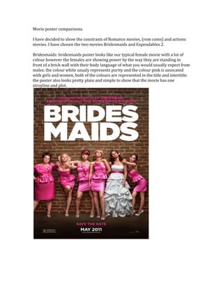
movies. I have chosen the two movies Bridesmaids and Expendables 2.
Bridesmaids: bridesmaids poster looks like our typical female movie with a lot of
colour however the females are showing power by the way they are standing in
front of a brick wall with their body language of what you would usually expect from
males. the colour white usualy represents purity and the colour pink is assocated
with girls and women, both of the colours are represented in the title and intertitle.
the poster also looks pretty plain and simple to show that the movie has one
stroyline and plot.
2. Expendables 2: in the expendables 2 poster there is a dark and explosive feel about
it, with the fire blazes in the background it shows the viewers that it is going to have
guns, explosions and weaponary in the movie which sterotypically interests men.
the stance and build of the men also shows that this movie is targeted towards
males as they are all pretty built and are what most men would call their ideal man.
the facial expressions also show that they are all angry and are ready to fight and
battle. the title is also a metalic type of font which represents steel and power as
steel can not be broken. the font is also a bold but sharp type of writing.