
Recommended
More Related Content
Similar to Rhetorical analysis original and remediated presentations on minimum wage
Similar to Rhetorical analysis original and remediated presentations on minimum wage (20)
Recently uploaded
Recently uploaded (20)
Rhetorical analysis original and remediated presentations on minimum wage
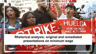
- 1. Rhetorical analysis: original and remediated presentations on minimum wage
- 2. Audience and Purpose The audience for both the Prezi and the remediation are people that have limited information about the issue. Many people believe that this issue doesn’t affect them; perhaps, their jobs are more secure and better paid. Maybe they assume that minimum workers are kids in high school or that minimum wage workers have little or no education. This may have been true years ago, however, changes in the economy, traditional family structure and demographics have shifted minimum wage workers into an older, more educated labor force that are, as likely as not, head of households. In addition, the audience needs to be informed that this issue does affect them directly because we are financially subsidizing employers that through the perpetuation of unfair labor practices increase their already substantial profit margins. My purpose is: ● to debunk assumptions about minimum wage workers ● to show that taxpayers are subsidizing some of the most profitable companies ● that the largest group of minimum wage workers is women over 25 years old and ● to show that half of hourly workers that are paid under $11 an hour have post-secondary education.
- 3. Affordances Prezi ● easy to use / intuitive ● easy to edit content and layout ● good animation features which allow for a more dramatic presentation reveals ● fluidity: nice sense of movement adds to more dramatic presentation ● comprehensive / responsive help forum Brochure (Google Doc) ● easy to post to google docs ● able to make the document public and elicit comments ● producer is able to control distribution ● producer can enable feature which allows the public to download, edit and redistribute document ● comprehensive help forum
- 4. Limitations Prezi ● difficult to manipulate text: font size, color and style married to templates ● platform had some glitchy behavior: after I’d made a frame really small I could no longer edit it or manipulate it ● not very visible: no means of sharing the presentation widely ● can cause motion sickness: the movement can detract from the content Brochure (Google Doc) ● couldn’t edit the document after it was posted: the document was initially created in MS Word after posting the document was posted editing required that the document be downloaded, edited and reposted ● Pdf download was the same as the original but can’t be edited ● MS download was “imperfect”--needed reformatting, color saturation, font size and style were compromised
- 5. Audience Stance Prezi ● limited agency for the audience: the Prezi “appears” interactive because it allows for lot of web links and videos. However, but the producer controls the direction/flow of the discourse by predetermining: the order in which information is revealed; and by choosing links that support the producer’s argument ● the audience can only move forward or backward one slide at a time in the order determined by the producer Brochure (Google Doc) ● provides greater agency for the audience by allowing the audience to choose how they read the information. The six panels are visible all at once--are somewhat self-contained-- and can be viewed in any order ● The document can also be downloaded, edited, commented on and shared by the audience ● more of an RW experience
- 6. Transparency Prezi ● medium/high transparency: the Prezi is text heavy and incorporates other familiar element such as graphs, pie charts, still images, web and video links ● the platform may be a bit unfamiliar to novice users, but the producer makes the platform transparent by determining order and range of motion to make navigation easy Brochure (Google Doc) ● very high transparency: people are very familiar with this format. The brochure uses conventions of graphic design chosen to “sell” the producer’s message. ● The six panel view is also highly transparent because it retains the appearance of a brochure even though all the information can be seen simultaneously. ● There are no “novice” users of this format. ● interactive features are intuitive and symbology is recognizable and supported by pop-up text
- 7. Hybridity Prezi ● use of reveals prioritizes information for the consumer ● use of interactive elements allows text to be supported by outside/supplemental sources ● platforms ability to interact with the web allows for a tremendous amount of information to be accessed during a single presentation ● minimal color/simple text underscores the “no frills” theme ● hyperlinks allow consumers to travel beyond the Prezi Brochure (Google Doc) ● concordance between text and images: the placards held by people in the pictures bolster the purpose of the brochure ● unconventional/smudgy borders lend a feeling of movement/urgency ● information-rich visual elements: pie charts ● draws on cultural knowledge: “list” of worst stores uses store logos, hopefully adding a negative association to other knowledge that consumers may already have
- 8. I tried to present a logical argument for why increasing minimum wage would benefit everyone. People respond better and are more proactive when they have a dog in the fight. ● used statistical information from the Bureau of Labor Statistics to illustrate that taxpayers are ● used resources from McDonald’s employee website to illustrate that these workers can’t ● tried to connect with a diverse population by showing diversity in the ranks of minimum wage Logos subsidizing people that are often working more than one job or over full-time hours. possibly make ends meet on this salary without social service programs--which means financial burden to taxpayers workers with the hope that people would extrapolate the concordance into “this could be me...or my children” Rhetorical Appeals: Logos
- 9. Rhetorical Appeals: Kairos Growing income inequality has been referenced frequently since the market tanked in 2008. The loss of ground by the middle class, mushrooming student loan obligations and skyrocketing healthcare costs are prompting more and more discussions about the difficulties working people face. In addition, there’s growing distrust about corporate entities that are gaming the system by not paying their fair share, avoiding tax burdens and funneling their workers into social programs. Walmart offers their workers a tutorial about how to enroll in public services. Walgreens was recently dissuaded from corporate inversion by a petition, circulated on the web, which promised a boycott of their retail locations if they moved their headquarters out of the country. In addition, many states are starting to raise their minimum wages independently, however, a federal mandate would make a big difference to impoverished red states.
- 10. Multimodal Composition In an increasingly technological world, students need to be experienced and skilled not only in reading (consuming) texts employing multiple modalities, but also in composing in multiple modalities, if they hope to communicate successfully within the digital communication networks that characterize workplaces, schools, civic life, and span traditional, cultural, national and geopolitical borders. (Takayoshi and Selfe 3)
- 11. The brochure posted on Google Docs established a template that was available to be manipulated or customized for different audiences. For example, my brochure targeted women because the majority of minimum wage workers are women, women have higher levels of voter participation and are more likely to do the purchasing for their families. Day to day, they are more likely to be confronted or affected by this issue. The document could, however, be used as a starting point for a composition that targets a different group. The panels can be partially or completely reworked by a third party. The platform allows consumers to edit the piece, share it within their own social circles or print it out for distribution.
- 12. The document can be opened and edited without difficulty and there is a lossless pdf download option available. The imperfections associated with the MS Word download are a good way to promote practice and experimentation with the conventions of graphic design. Students can practice combining images,color, text and font within a set of parameters established by the template. This experimentation would allow them to explore the ways that visual design differs from and complements text only documents.
- 13. Digital postings of the document could contain hyperlinks, audio and visual elements provided they are inserted during the editing process. Again the template allows for experimentation within a set of parameter, in this case promoting opportunities to increase the hybridity of the document.
- 14. Modular collection The brochure posted to the Google platform also reminds me of Eilola’s assertion that texts are moving toward “modular collections of information rather than unified, coherent creative wholes…” (209) The brochure is visually modular -- the parts can be rearranged or rewritten easily for different purposes. In addition, there’s almost no original writing; instead it’s a compilation of statistics, facts and images borrowed from different sources to support a position.
- 15. The most important feature of the Google Docs platform is accessibility and the variety of delivery options. ● The document is public and it can be viewed, commented on, embedded, shared or printed for delivery. ● It uses visual elements heavily (pictures, charts and logos) that allows for comprehension exclusive of the text which allows for greater accessibility by a wider audience.