1. The Dog House
The Carnaby films scene comes in first the font used in
that is simple and the size is a not that large, which
means that the audience can analyze the text without it
disturbing there eyes, where as in the Hanover films
opening there is a simple times new roman text which is
silver, there is also a shining effect which could have
been added with adobe after effects, this makes the
audience look at the text because the light attracts there
eyes, which also means they don’t really look at the lions
head.
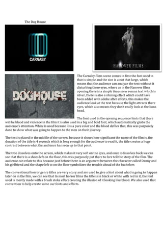
The font used in the opening sequence hints that there
will be blood and violence in the film it is also used in a big and bold font, which automatically grabs the
audience’s attention. White is used because it is a pure color and the blood defiles that, this was purposely
done to show what was going to happen to the men on their journey.
The text is placed in the middle of the screen, because it shows how significant the name of the film is, the
duration of the title is 4 seconds which is long enough for the audience to read it, the title creates a huge
contrast between what the audience has seen up to that point.
The title dissolves onto the screen, which makes it very soft on the eyes, and once it dissolves back we can
see that there is a shoes left on the floor, this was purposely put there to fore tell the story of the film. The
audience can relate to this because just before there is an argument between the character called Danny and
his girlfriend and the shape left to on the floor symbolizes the trouble ahead of the bachelors
The conventional horror genre titles are very scary and are used to give a hint about what is going to happen
later on in the film, we can see that In most horror films the title is in black or white with red in it, the font
used is mostly made with a brush stoke effect creating the illusion of it looking like blood. We also used that
convention to help create some our fonts and effects.