Fonts and Colors Reveal Film Genres
•
1 like•2,247 views

The document analyzes the fonts and colors used in movie posters and how they attract audiences and convey genre. It examines posters for several films, including Burn After Reading, Crash, No Country For Old Men, and Inception. For each poster, it discusses how the fonts, colors, text styles, and imagery attract audiences and provide clues about the genre of the film, such as conveying drama, comedy, action, or sci-fi elements. Overall, the document demonstrates how visual design choices in movie posters communicate information to audiences.

Recommended
More Related Content
What's hot
What's hot (20)
Similar to Fonts and Colors Reveal Film Genres
Similar to Fonts and Colors Reveal Film Genres (20)
More from Matthew Cooper
More from Matthew Cooper (20)
Recently uploaded
Recently uploaded (20)
Fonts and Colors Reveal Film Genres
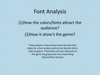
- 1. Font Analysis (1)How the colors/fonts attract the audience? (2)How it show’s the genre? These posters I have chosen have the best font styles for a font analysis and do not directly link in with my genre. These films all have elements of the genre my group and I are researching (Drama/Teen Drama)
- 2. Burn After Reading (Comedy/Drama (1)- The background of the poster is (2)- The genre of the film Burn simple with the pure red background After Reading is a black drama which signals danger and tells the comedy. The poster show’s the audience that there will be violence genre with the red background within the film attracting the action which displays the violence side of the film. within the film. The white text displaying the actor’s Another way in which the and actress’s names at the top of the poster show’s the genre is that poster is attractive as the text takes the text is quite careless and in up a lot of the poster drawing the a sense all over the place, this audience in and allowing them to show’s the genre as within the recognize the actor’s/actress’s and film the characters are quite reference the actor’s/actress’s other careless and hapless which films. Also the small white text of the adds the comedy towards the Director’s names also allows the black nature of the film. audience to recognize the type of film and there previous work. Also the text underneath “Reading” says “Intelligence is The yellow text is a quite weak color Relative” which helps to show but stands out to the audience with the genre as the whole feeling the red background and the white of the film is that the characters text. It allows the audience the within the film are hapless. chance to recognize the title of the film.
- 3. Crash (Drama) (1)- The colors and the style of the fonts used in this poster are very bleak and gritty (2)- The style of the text and font which instantly tell the audience that the film show the genre of the film (Drama) will have a dark tone and the film will involve by having the text surrounded by tragedy. darkness and bleak colours instantly telling the audience that The color and the fonts also attract the the film is a gritty bleak drama. audience as most of the poster is full of dark colors but the title and slogan of the film are The style of the text is also shown in white which implies to the significant as the in each letter of audience that although the film will have a the title Crash has lines which cut lot of dark and bleak moments there will also up and separate the letters into be some lighter and uplifting moments for different parts which implies to the the audience to recognize and emotionally audience that the film has many attach themselves and remember the different elements to the film and positive scenes within the film. that the drama will have a lot of moments which separate the film Another way in which the poster attracts the into specific parts and characters. audience is that the tag line although small The cut up sections within the is placed smartly and put in the white text to letters could also show the genre tell the audience that the tag line is important by showing that there will be many to the story. The slogan reads “Moving at the dark moments within the film which speed of life, we are bound to collide with will shatter the equilibrium between each other”. This text attracts the question the narrative and the characters. and entices them into wanting to watch the film and find out how the slogan links in with the story.
- 4. No Country For Old Men (Western Drama) (2)- The genre of this film is a western (1)- The font and the colors attract the gritty drama. The font and colour audience as the title of the film is in scheme show’s this by using the front of a black background which same method of attracting the instantly draws the audience towards audience by having the text in front of the title of the film and allows them to a black background signalling the remember the name. bleak and extremely dark nature of the film. Another way the font and color attracts the audience is that parts of the title The desert style colour show’s the are enlarged such as “Country and genre as elements of the film are set Old”. This are enlarged to draw in the desert and these scenes are reference to the plot line and narrative pivotal towards the story (Particularly as parts of the film are about older the drug shoot-out). This show’s that men and this allows the audience to the font links in with the genre as it create links between the film poster referencing parts of the film. and the film itself. Another way in which the font show’s the genre is the tag line at the top of The color of the font is also signifcant the poster. The font and colour style to the audience as the color of the text are very simple which allows the links in with part of the background audience to recognize the style of the which attracts the audience as they film. The tag line reads “There are no can make links between the colors and clean getaways”, this instantly tells the make assumptions such as the color audience about the drama side of the could me the film could have a setting genre and the bleak nature of the film of a desert. due to the blunt and bleak tag line.
- 5. Inception (Sci-Fi Drama) (1)- The font and the colours attract the audience as the red coloring of (2)- The font and the text shows the the title of the film is emerging from genre as the text is very much the water and instantly attracts the styled around a sci-fi style theme audience as the bright colour stands with the words fading into the out. water, this could be a connotation confusion which is a key element of The style of the text that the title has sci-fi films as the film is intended to used can also attract the audience get the audience thinking and as the style links in with the style of wondering what's going on. the company SYNCOPY which is The colour of the text also show’s associated with Inception and other the genre as it is red which displays Christopher Nolan films. This allows violence which is often part of the the audience to recognize and sci-fi genre and is a significant part understand what type of film it is within Inception. going to be since they have seen previous work by the director and Another way in which the text the institutions. show’s the genre is the tagline which reads “Your Mind Is The Another way in which the poster Scene Of The Crime”. This adds to attracts the audience is the tagline the thought provoking element into which gets the audience thinking the film and show’s the sci-fi nature while also linking in with genre. of the film as it is challenging the audience for what they know.
- 6. Adulthood/Paranoid Park (Most recognizable towards my genre (Drama/Teen Drama) These films do not have fonts that attract the audience in a specific way nor do they show the genre of the certain films. In these two posters they both focus on the images within the poster which attract the audience more and show off the genre as in many drama films the focus is on one character and this is shown in Paranoid Park poster. Adulthood also incorporates this but has an range of characters. These Teen Drama/Drama films have very simple easily recognizable text which is a simple block white font. This can be also effective as it stands out compared to the different images in the background. I have included these to show the type of posters that my specific genre strive to achieve.
- 7. Elephant/American Beauty (Most recognizable towards my genre (Drama/Teen Drama) Again like the previous slide these films do not have fonts that attract the audience in a specific way nor do they show the genre of the certain films. Like the previous two posters they focus on the images much more than the font to attract the audience. In the poster for Elephant, the emphasis on the girl kissing the boy attracts the audience much more and the white plain font is just there to allow the audience to remember what the title of the film is. In terms of American Beauty there is slightly more emphasis on the text with the Beauty being made bold, possibly being made to link in with awards at the top of the poster.