SlideShare a Scribd company logo
1 of 12
i7
Crystalene Joy Serrano 7- SPSTE
How to make pie graph
Two Methods:Sample Pie ChartMaking Your Own Pie Chart
Pie charts are a form of an area chart that are easy to understand with a quick look.
They show the part of the total (percentage) in an easy-to-understand way. Pie charts
are useful tools that help you figure out and understand polls, statistics, complex data,
and income or spending. They are so wonderful because everybody can see what is
going on. Use them to make excellent visual displays that explain data to other people--
in school projects, work presentations or pitching sales figures to clients.
Sample Pie Chart
i7
Sample Pie Chart About Time
Making Your Own Pie Chart
1.
i7
2.
2
Gather your numerical data and label information and write it down with one data
point per line, in descending order.
i7
3.
i7
3
Add the data all together calculate the total. This number will be your denominator.
4.
i7
4
Calculate the percentage of the total for each data point by dividing each one by
the denominator (total) calculated above.
5.
5
i7
Calculate the angle between the two sides of each pie slice. To do this, multiply
each percentage (still in decimal form) by 360.
 The logic behind this is that there are 360 degrees in a circle. If you know that 14,400 is
30 percent of the whole (or 0.30), then you're calculating 30% of 360 which is 108.
 Check your work. Add up the number of degrees you calculated for each data point.
They should total 360. If not, you've missed something and should double-check your
work.
6.
6
i7
Use a mathematical compass to draw a circle. To draw a pie chart accurately, you
need to start with a perfect circle. This can be done using a compass (and a protractor
to measure the angles). If you don't have a compass, try tracing around a circle
template, using something round such as a lid or a CD.
7.
7
i7
Draw the radius. Start in the exact center of the circle and draw a straight line to the
outside of the circle. (Hint: make a dot with the compass to find the center.)
 The straight line can be vertical (12 or 6 o'clock on the clock face) or horizontal (9 or 3
o'clock on the clock face). The segments you create then follow either a clockwise or
counter-clockwise sequence.
8.
8
i7
Place your protractor on the circle. Position it on the circle so that the 90 degrees
crosshair is situated directly above the center of the circle. The zero point should be
vertically aligned along the vertical plot line.
9.
9
Draw each section division. Draw the sections by marking the first division against the
edge of the protractor at the correct angle, using the angle formulations you got in the
i7
earlier step. Each time you add a section, the radius changes to the line you just drew;
rotate your protractor accordingly.
 When marking the angle lines, make sure they are sharp and fine, to keep them clear
and easy to see.
10.
10
i7
Color each segment. You can use color, patterns or just words, depending on what
meets your purpose best. Add the name of each section and the percent it represents in
the chart.
 Color each section of the pie chart a different color/pattern to easily visualize the results.
 If you drew everything in pencil first, always ink in the circle before coloring in any of the
segments. This is because the circle is the trickiest part to draw accurately.
 Labels or words added to each segment should be written horizontally and centered
(the same visual distance from the edge for each segment). This makes them easier to
read.

More Related Content

What's hot

How to make a good graph
How to make a good graphHow to make a good graph
How to make a good graphrobtownsend
 
How to make a graph
How to make a graphHow to make a graph
How to make a graphdrsayers
 
Week 27 online part 3 recording survey data
Week 27 online part 3 recording survey dataWeek 27 online part 3 recording survey data
Week 27 online part 3 recording survey datavikkis
 
Line of best fit slideshare
Line of best fit slideshareLine of best fit slideshare
Line of best fit slideshareTracy Cap
 
Week 2 recording the survey data
Week 2 recording the survey dataWeek 2 recording the survey data
Week 2 recording the survey datavikkis
 
Ii year question
Ii year questionIi year question
Ii year questionLinga Lgs
 
ABCi Charts - Runcharts Tool user guide
ABCi Charts - Runcharts Tool user guide ABCi Charts - Runcharts Tool user guide
ABCi Charts - Runcharts Tool user guide ABCiABUHB
 
Lecture 7 creating_charts1
Lecture 7 creating_charts1Lecture 7 creating_charts1
Lecture 7 creating_charts1BBAMUMU2014
 
Pareto guide final
Pareto guide finalPareto guide final
Pareto guide finalABCiABUHB
 
New week 8
New week 8New week 8
New week 8nglaze10
 
Engineering Darwing (Isomeric Projection)
Engineering Darwing (Isomeric Projection)Engineering Darwing (Isomeric Projection)
Engineering Darwing (Isomeric Projection)SyedAlamdarulNaqvi
 

What's hot (18)

How to make a good graph
How to make a good graphHow to make a good graph
How to make a good graph
 
How to make a graph
How to make a graphHow to make a graph
How to make a graph
 
Different types of graphs
Different types of graphsDifferent types of graphs
Different types of graphs
 
Week 27 online part 3 recording survey data
Week 27 online part 3 recording survey dataWeek 27 online part 3 recording survey data
Week 27 online part 3 recording survey data
 
Line of best fit slideshare
Line of best fit slideshareLine of best fit slideshare
Line of best fit slideshare
 
Week 2 recording the survey data
Week 2 recording the survey dataWeek 2 recording the survey data
Week 2 recording the survey data
 
Creating a chart in Excel
Creating a chart in Excel Creating a chart in Excel
Creating a chart in Excel
 
Centroids
CentroidsCentroids
Centroids
 
Excel-bar-graph
Excel-bar-graphExcel-bar-graph
Excel-bar-graph
 
Ii year question
Ii year questionIi year question
Ii year question
 
Art technique grid method
Art technique grid methodArt technique grid method
Art technique grid method
 
ABCi Charts - Runcharts Tool user guide
ABCi Charts - Runcharts Tool user guide ABCi Charts - Runcharts Tool user guide
ABCi Charts - Runcharts Tool user guide
 
Using Digimap
Using DigimapUsing Digimap
Using Digimap
 
Tennis court v
Tennis court vTennis court v
Tennis court v
 
Lecture 7 creating_charts1
Lecture 7 creating_charts1Lecture 7 creating_charts1
Lecture 7 creating_charts1
 
Pareto guide final
Pareto guide finalPareto guide final
Pareto guide final
 
New week 8
New week 8New week 8
New week 8
 
Engineering Darwing (Isomeric Projection)
Engineering Darwing (Isomeric Projection)Engineering Darwing (Isomeric Projection)
Engineering Darwing (Isomeric Projection)
 

Similar to Crystalene joy serrano 1

Lesson revolve
Lesson revolveLesson revolve
Lesson revolveMr_Burns
 
TID Chapter 5 Introduction To Charts And Graph
TID Chapter 5 Introduction To Charts And GraphTID Chapter 5 Introduction To Charts And Graph
TID Chapter 5 Introduction To Charts And GraphWanBK Leo
 
isometric drawing (Chapter )
isometric drawing (Chapter )isometric drawing (Chapter )
isometric drawing (Chapter )Junea June
 
PowerPoint Ideas & Hacks: Data
PowerPoint Ideas & Hacks: DataPowerPoint Ideas & Hacks: Data
PowerPoint Ideas & Hacks: DataAshleigh Cote, CMP
 
1.4 revision week session
1.4 revision week session1.4 revision week session
1.4 revision week sessionTaka Geo
 
Graphic representation of technical projects
Graphic representation of technical projectsGraphic representation of technical projects
Graphic representation of technical projectsgabriela-technoteacher
 
Alphabets of Line PPT.pptx
Alphabets of Line PPT.pptxAlphabets of Line PPT.pptx
Alphabets of Line PPT.pptxPauloAngeles2
 
Draw one point perspective
Draw one point perspectiveDraw one point perspective
Draw one point perspectiveDMIS
 
Graphing Using Excel Part Ii 2008 Finished
Graphing Using Excel Part Ii 2008 FinishedGraphing Using Excel Part Ii 2008 Finished
Graphing Using Excel Part Ii 2008 FinishedStephanie
 
Diagrammatic and Graphical Representation of Data in Statistics
Diagrammatic and Graphical Representation of Data in StatisticsDiagrammatic and Graphical Representation of Data in Statistics
Diagrammatic and Graphical Representation of Data in StatisticsAsha Dhilip
 
Engineering Drawing: Chapter 05 pictorial sketching
Engineering Drawing: Chapter 05 pictorial sketchingEngineering Drawing: Chapter 05 pictorial sketching
Engineering Drawing: Chapter 05 pictorial sketchingmokhtar
 
DATA SCIENCE TRAINING IN HYDERABAD
DATA SCIENCE TRAINING IN HYDERABADDATA SCIENCE TRAINING IN HYDERABAD
DATA SCIENCE TRAINING IN HYDERABADRS Trainings
 
Matematica 1 ro sec segundo trimestre
Matematica 1 ro sec segundo trimestreMatematica 1 ro sec segundo trimestre
Matematica 1 ro sec segundo trimestreErickM20
 
FREEHAND SKETCHING-I FREEHAND SKETCHING-I
FREEHAND SKETCHING-I FREEHAND SKETCHING-IFREEHAND SKETCHING-I FREEHAND SKETCHING-I
FREEHAND SKETCHING-I FREEHAND SKETCHING-IARUNPRAKASHS7
 
12 ways to visalize data
12 ways to visalize data12 ways to visalize data
12 ways to visalize dataSisense
 
Technical-Drawing.pptx-for-education-very-important
Technical-Drawing.pptx-for-education-very-importantTechnical-Drawing.pptx-for-education-very-important
Technical-Drawing.pptx-for-education-very-importantLeighJilian
 
Dimensioning (1).ppt
Dimensioning (1).pptDimensioning (1).ppt
Dimensioning (1).pptMarlo Ching
 

Similar to Crystalene joy serrano 1 (20)

Designing stained glass_lamps
Designing stained glass_lampsDesigning stained glass_lamps
Designing stained glass_lamps
 
Unit 5
Unit 5Unit 5
Unit 5
 
Lesson revolve
Lesson revolveLesson revolve
Lesson revolve
 
TID Chapter 5 Introduction To Charts And Graph
TID Chapter 5 Introduction To Charts And GraphTID Chapter 5 Introduction To Charts And Graph
TID Chapter 5 Introduction To Charts And Graph
 
isometric drawing (Chapter )
isometric drawing (Chapter )isometric drawing (Chapter )
isometric drawing (Chapter )
 
PowerPoint Ideas & Hacks: Data
PowerPoint Ideas & Hacks: DataPowerPoint Ideas & Hacks: Data
PowerPoint Ideas & Hacks: Data
 
1.4 revision week session
1.4 revision week session1.4 revision week session
1.4 revision week session
 
Graphic representation of technical projects
Graphic representation of technical projectsGraphic representation of technical projects
Graphic representation of technical projects
 
Alphabets of Line PPT.pptx
Alphabets of Line PPT.pptxAlphabets of Line PPT.pptx
Alphabets of Line PPT.pptx
 
Draw one point perspective
Draw one point perspectiveDraw one point perspective
Draw one point perspective
 
Graphing Using Excel Part Ii 2008 Finished
Graphing Using Excel Part Ii 2008 FinishedGraphing Using Excel Part Ii 2008 Finished
Graphing Using Excel Part Ii 2008 Finished
 
Diagrammatic and Graphical Representation of Data in Statistics
Diagrammatic and Graphical Representation of Data in StatisticsDiagrammatic and Graphical Representation of Data in Statistics
Diagrammatic and Graphical Representation of Data in Statistics
 
Engineering Drawing: Chapter 05 pictorial sketching
Engineering Drawing: Chapter 05 pictorial sketchingEngineering Drawing: Chapter 05 pictorial sketching
Engineering Drawing: Chapter 05 pictorial sketching
 
01 graphic representation
01 graphic representation01 graphic representation
01 graphic representation
 
DATA SCIENCE TRAINING IN HYDERABAD
DATA SCIENCE TRAINING IN HYDERABADDATA SCIENCE TRAINING IN HYDERABAD
DATA SCIENCE TRAINING IN HYDERABAD
 
Matematica 1 ro sec segundo trimestre
Matematica 1 ro sec segundo trimestreMatematica 1 ro sec segundo trimestre
Matematica 1 ro sec segundo trimestre
 
FREEHAND SKETCHING-I FREEHAND SKETCHING-I
FREEHAND SKETCHING-I FREEHAND SKETCHING-IFREEHAND SKETCHING-I FREEHAND SKETCHING-I
FREEHAND SKETCHING-I FREEHAND SKETCHING-I
 
12 ways to visalize data
12 ways to visalize data12 ways to visalize data
12 ways to visalize data
 
Technical-Drawing.pptx-for-education-very-important
Technical-Drawing.pptx-for-education-very-importantTechnical-Drawing.pptx-for-education-very-important
Technical-Drawing.pptx-for-education-very-important
 
Dimensioning (1).ppt
Dimensioning (1).pptDimensioning (1).ppt
Dimensioning (1).ppt
 

Crystalene joy serrano 1

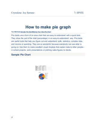
  • 1. i7 Crystalene Joy Serrano 7- SPSTE How to make pie graph Two Methods:Sample Pie ChartMaking Your Own Pie Chart Pie charts are a form of an area chart that are easy to understand with a quick look. They show the part of the total (percentage) in an easy-to-understand way. Pie charts are useful tools that help you figure out and understand polls, statistics, complex data, and income or spending. They are so wonderful because everybody can see what is going on. Use them to make excellent visual displays that explain data to other people-- in school projects, work presentations or pitching sales figures to clients. Sample Pie Chart
  • 2. i7 Sample Pie Chart About Time Making Your Own Pie Chart 1.
  • 3. i7 2. 2 Gather your numerical data and label information and write it down with one data point per line, in descending order.
  • 5. i7 3 Add the data all together calculate the total. This number will be your denominator. 4.
  • 6. i7 4 Calculate the percentage of the total for each data point by dividing each one by the denominator (total) calculated above. 5. 5
  • 7. i7 Calculate the angle between the two sides of each pie slice. To do this, multiply each percentage (still in decimal form) by 360.  The logic behind this is that there are 360 degrees in a circle. If you know that 14,400 is 30 percent of the whole (or 0.30), then you're calculating 30% of 360 which is 108.  Check your work. Add up the number of degrees you calculated for each data point. They should total 360. If not, you've missed something and should double-check your work. 6. 6
  • 8. i7 Use a mathematical compass to draw a circle. To draw a pie chart accurately, you need to start with a perfect circle. This can be done using a compass (and a protractor to measure the angles). If you don't have a compass, try tracing around a circle template, using something round such as a lid or a CD. 7. 7
  • 9. i7 Draw the radius. Start in the exact center of the circle and draw a straight line to the outside of the circle. (Hint: make a dot with the compass to find the center.)  The straight line can be vertical (12 or 6 o'clock on the clock face) or horizontal (9 or 3 o'clock on the clock face). The segments you create then follow either a clockwise or counter-clockwise sequence. 8. 8
  • 10. i7 Place your protractor on the circle. Position it on the circle so that the 90 degrees crosshair is situated directly above the center of the circle. The zero point should be vertically aligned along the vertical plot line. 9. 9 Draw each section division. Draw the sections by marking the first division against the edge of the protractor at the correct angle, using the angle formulations you got in the
  • 11. i7 earlier step. Each time you add a section, the radius changes to the line you just drew; rotate your protractor accordingly.  When marking the angle lines, make sure they are sharp and fine, to keep them clear and easy to see. 10. 10
  • 12. i7 Color each segment. You can use color, patterns or just words, depending on what meets your purpose best. Add the name of each section and the percent it represents in the chart.  Color each section of the pie chart a different color/pattern to easily visualize the results.  If you drew everything in pencil first, always ink in the circle before coloring in any of the segments. This is because the circle is the trickiest part to draw accurately.  Labels or words added to each segment should be written horizontally and centered (the same visual distance from the edge for each segment). This makes them easier to read.