
Recommended
More Related Content
What's hot
What's hot (20)
Similar to Analysis of existing products – media coursework
Similar to Analysis of existing products – media coursework (20)
Recently uploaded
Recently uploaded (20)
Analysis of existing products – media coursework
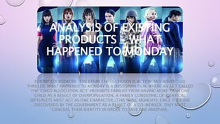
- 1. FOR MY COURSEWORK, THE GENRE I HAVE CHOSEN IS ACTION AND ADVENTURE THRILLER. WHAT HAPPENED TO MONDAY IS A DYSTOPIAN FILM, WHERE AN ACT CALLED THE ‘CHILD ALLOCUTION ACT’ PROHIBITS FAMILIES FROM HAVING MORE THAN ONE CHILD AS A RESULT OF OVERPOPULATION. A FAMILY CONSISTING OF IDENTICAL SEPTUPLETS MUST ACT AS ONE CHARACTER, (THIS BEING MONDAY). ONCE THEY ARE DISCOVERED BY THE GOVERNMENT AS A RESULT OF A CO-WORKER, THEY MUST CONCEAL THEIR IDENTITY IN ORDER TO SAVE ONE ANOTHER. ANALYSIS OF EXISTING PRODUCTS – WHAT HAPPENED TO MONDAY
- 2. TEASER POSTER: • Layout – Graphological features: ‘Strongest’ character (also known as Wednesday) takes spotlight of the poster, standing in a bold, confident position, dominant reading could be that audiences predict that she survives government scrutiny • Other 6 sisters surrounds her, reflecting the sense of unity and protection each sister has for one another, linking to the idea of encode and decode • Background shows 6 people jumping from one building to the next, which can be applied to Barthes Hermeneutic Code as the audience will be left guessing how and why they are jumping from one building to another • Colour scheme – Mostly black and white, in terms of decoding, could suggest lack of happiness due to the co-worker and the government trying to track them down • It is clear that each of the sisters has their own, individual identity, in terms of their clothing and style. The larger image of Wednesday is wearing black, perhaps connotating rebellion, which can be linked nicely into the film as each of the 7 sisters run out into the open world as themselves, a great risk they had been taught not to do by their Grandfather as shown in the exposition/flashback when the sisters were much younger • Fonts – Bold, white font allows text to stand out against the darker images, could represent an element of binary opposition – Dark vs Bright/ Government vs The 7 Sisters • Block text adds tension and helps to build suspense (Barthes – Proairectic Code) Could reflect boldness of characters, especially Wednesday who is looking down at the ‘camera’ • Images – The 7 sisters are all posing in their own way, again reflecting each of their identities , background looks rainy, is an example of pathetic fallacy (in this case, fate). However, the white light connotates that there is hope for the 7 sisters • Mystery – Main title is ‘SEVEN SISTERS’, rather than actual title of the film, forces audiences to figure out what the film is about, and perhaps encourages them to find out for themselves by watching the film when it’s officially out ‘in cinemas this August’ • How the film reaches the desired target audience – • Obvious that the films genre is action/adventure through multiple guns being held in shot, Wednesday’s facial expression, and the bold statement/slogan
- 3. THEATRICAL POSTER: • Layout – Graphological Features: Image of Sunday, indicated by the rather large ‘7’ in the background of the theatrical poster, perhaps representing the idea that the sisters are only recognisable by numbers, perhaps linking to the theory of the Hypodermic Needle as viewers are told an indented message • Image of Wednesday looking down could connotate the shame she feels as a result of the Child Allocation Act. As well as this, the fact that the 6 other sisters are inside Wednesday, reflects their life as they must act as one person/identity • The release date is now visible in relation to the teaser poster, and is placed at the bottom to perhaps encourage an active audience to look at the image/information given, and remember the release date as it is the last piece of information they see • Colour scheme – Again, it is very similar to the teaser poster which is necessary, as audiences will recognise the poster quicker. Again, the contrast between the dark vs light could reflect an us vs them situation, linking this to Levi Strauss’s theory of Binary Opposition. The colours offer a reminder of the previous poster, ensuring that a cohesive link is made between the intended audience and the essential information they will want to know about • Fonts – The use of the white, block capitals has been used again, allowing audiences to recognise the film easier. The only difference is the large • Images – The image of Sunday with her 6 sisters inside of her reflects their lack of escape due to the allocation act, and their ghost-like appearance inside this shot could perhaps foreshadow their death, perhaps linking this to The Proairetic Code, as active audiences are left guessing/on the edge • Mystery – The fact that one of the sisters carries a gun outside of Sunday’s body, connotates rebellion, and a lack of fear. This contributes to the action of the film, and allows us to figure out what each of the 7 twins personalities and identities are • How the target audience is targeted – • In a sense, it is similar to the teaser poster, as the use of guns can be linked to older viewings, the age of the sisters could encourage more female viewings, as it is typically considered that males can only part-
- 4. DVD COVER: • Layout – Graphological Features: • Quite a lot at once, however follows a traditional ‘rule of thirds’ sequence (follow as Z pattern). Allows audiences to follow along with key information easily • Same image is used from the theatrical poster (other sisters inside the body), however, it is an image of Monday, which links nicely into the title of the film as audiences are able to associate ‘Monday’ with Monday before they watch the film. We are given more information about Monday, mainly through the images on both sides of the DVD cover, which differs from the theatrical and teaser poster • Colour Scheme – The use of dark colours such as navy, black and grey helps to set the scene, representing a melancholy atmosphere as a result of the act, which is mentioned in the brief overview of the film • Images – More images of Monday gives us an insight into the film, and perhaps helps to encourage audiences to purchase the film. The flame in the far right hand corner could foreshadow her fate, which was used in the teaser poster, the title of the film, (being a simple question), could be linked to the dominant reading, as the title and flame behind it could indeed reflect her chance of survival as a result of their rebellion • Fonts – Large, red font connotates danger, and can be linked to the colour of the flame/fire. Words highlighted in red on the synopsis could be an element of intertextuality, as it reminds me of highlighting important words like you would at school/college, Genre – It is quite obvious from the DVD cover that the film is action- packed, as shown by the flames, the guns, and most simply, from the synopsis of the film How the audience are targeted – The DVD cover says that the film is officially rated as an 18 by the BBFC, and helps to suit their needs by the amount of action that is shown through a simple DVD cover, and the