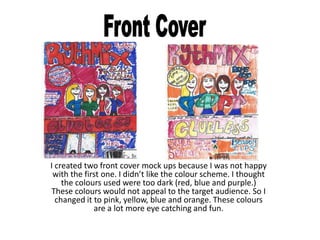
1. I created two front cover mock ups because I was not happy
with the first one. I didn’t like the colour scheme. I thought
the colours used were too dark (red, blue and purple.)
These colours would not appeal to the target audience. So I
changed it to pink, yellow, blue and orange. These colours
are a lot more eye catching and fun.
2. This is my contents page mock up. I am very happy with
it because it is exactly the right colour scheme.
However, it does look slightly different from my final
contents page because the colour scheme is different
on that one. Overall, I am happy with it.
3. This is my double page spread mock up. I like it because it is
near enough exactly the same as my final double page spread.
There is nothing really that I dislike about it.