Q Textual Analysis
•
1 like•110 views

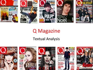
This is my textual analysis of Q’s Febuary 2012 front cover, contents page and double page spread. Click the full screen button to enlarge the presentation:)

Recommended
More Related Content
More from Catherine Baker
Recently uploaded
Recently uploaded (20)
Q Textual Analysis
- 1. Q Magazine Textual Analysis
- 2. The mast head is red and white, as well as being the logo of the magazine. This always appears on the top left hand side of Q magazines. There are a variety of different sized fonts used on the front cover in order to intrigue the reader. By using different coloured fonts, makes the sell lines stand out and the audience can tell which one is the main story. Coverlines are placed all over the magazine, to inform their target audience what is included within this publication. A anchorage/buzzword is included, such as “exclusive” so the reader knows what is in the magazine. A puff has been placed across the top of the page, in bright, bold colours, such a pink and yellow to grab the audiences eye. This is the biggest sell line that is intended to increase sales of the magazine, which is also known as a boost. This is a teaser, which also could be used as a hook , to draw the reader into finding out more. This refers to the central image of Lana Del Rey, as it says “so what’s so bloody good”, referring to the blood running down her face. The mode of address of the cover is rather informal, indicating to the target market aimed at more males than females. A kicker is used as an extra piece of information to influence the audience to buy it. Direct Mode of Address is used here, to involve the reader personally, as well as drawing them into buying it. The main image of Lana Del Rey (mid shot) is positioned central of the front cover, to draw attention of the reader to the magazine. She is wearing a white dress to blend in with the background, helping the writing to be prominent. By having no expression on her face, intrigues the individual to find out more about her. Barcode, price and the date are situated at the bottom as they are at the least importance.
- 3. The use of the third left enables the information to be easy on the eye for the audience to read. The page numbers represent the logo “Q” with the white font standing out on a red background. By including the page numbers, the readers know where to go to find the specific articles. Has one large main image to show this is the most important storyline. The fact it is an extreme close up of Lana Del Rey’s face, suggests her stories are being “exposed” to the audience . The issue number , is usually situated on the front cover, so this is an unconventional feature. “ Discover Great Music” is the tag line , which appears on the front of the magazine too. This is the only piece of text with serif font to show some formality. The contents page sticks to the conventional 3 colour scheme of Red, White and Black, mirrors the magazine house style and they also like to keep continuity through Q. By the menu list set out vertically, it makes the magazine look interesting and unique. The picture again shows Direct Mode of Address, to draw the reader into finding out more. This is the main piece of text on a page, which is also known as a body copy . The simple design used, emphasises that the design is not as important compared to the content of the magazine. The use of the sans serif font , emphasises this is a modern magazine, appealing to their target market. Summative language is used to encapsulate the content of the stories issue. The use of lower case, gives a less formal effect. The use of “140 songs to download now!” suggests that this type of magazine is targeted at a universal market , as it doesn’t always specifically focus on a particular music genre.
- 4. Additionally, we see at the bottom of the page three small white arrows in a red box - a jumper , follows Q’s house colours of Red, white and Black. It also navigates the reader onto the next page of the article. At the top of the piece, there is a kicker, introducing what the article is about: ‘Lana Del Rey’ There is a drop cap included (the letter ‘S’) which takes up half of the page to attract the readers eye. The contrast of the drop cap and column size relates to the artist, as the different sizes are unconventional, like Lana Del Rey herself. Also, the “S” is a serif font adds formality to the page. The letter ‘A’ is smaller than the original drop cap , portraying the letter ‘S’ is at the start of the piece, and is possibly more important in that sense. The caption of ‘She appears bruised and broken. “That,” she says, pointing…”that’s my life”, instantly intrigues the reader wanting to found out more. The main body of text looks like 12 size font, which is conventional for most publications. It is also written in a serif font, which is easier to read and on the eye. The base line at the bottom of the columns end at the same level, showing that they have a consistent, neat style. The main image on the left hand page constructs an interesting representation of the Indie rock genre. The use of the shallow depth of field on the left hand side of the image, creates the idea that we’re looking at the past of Lana Del Rey. There is an element of femininity constructed here, as she has her lips pouted and has a necklace on. This shows her to be quite a womanly character. With the long her nails on her neck, almost seeming to claw herself. This comes across as quite violent. This is also shown with the aggressive flash of red hair on the right of the image, connoting danger. Additionally, by Lana Del Rey eyes being closed, suggests she is keeping some sort of direct address between the reader and her, some sort of connection is quite under whelming and almost distressing. As there is a sense that she is looking as us, as well as us ‘spying’ on her. It also has the logo of “Q”, the page number and issue date at the bottom of each corner, indicating a common house style consisted on each page of the magazine.