

Recommended
Recommended
More Related Content
Similar to Reciprocity
Similar to Reciprocity (20)
Recently uploaded
Recently uploaded (20)
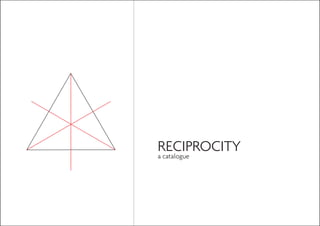
Reciprocity
- 2. Table of Contents: Brand Introduction 5 Inspiration - Artist Introduction 11 The Concept 15 Brand Name & Tagline 19 Logo 21 Products 23 Contact Us 25 3
- 4. RECIPROCITY n. pl. rec·i·proc·i·ties 1. A reciprocal condition or relationship. 2. A mutual or cooperative interchange of favors or privileges 7
- 5. What is Reciprocity? Reciprocity, which has the meaning of mutual and cooperative relationship, is the word we have chosen for this particular brand name. It was derived from the concept of “togetherness” the we came up with based on the artist inspiration that we have chosen; Jen Stark. Reciprocity is essentially a brand, specializing in paper products, who has an aim to capture that true meaning of “togetherness” in the practice. 9
- 6. Our Inspiration Jen Stark Design Philosophy born 1983 in Miami, Florida contemporary artist majority of work involves creating paper sculptures also works with drawing and animation “ Based on replication and infinity, echoing patterns and intelligent designs found in nature draws inspiration from microscopic patterns in nature, wormholes, and sliced anatomy. Using 2D materials to create 3D objects (paper) Why paper? “The fact that it’s so common and universal,” Stark says. “People see it on a daily basis.” And why the obsessive patterns? According to Stark, they were inspired by the anatomical cross sections pictured in the medical textbooks her sister, a doctor, brought home. ” taken from <http://jenstark.com/news/> 11
- 7. Summary of the Artist’s Works Most of Jen Stark’s works consists of the following elements: Layering of the paper Paper is one of the material that is versatile and relatively easy to get. A piece of paper is generally very delicate and easier to manipulate. However, when many pieces of paper are combined together, they became stronger and even though they become harder to manipulate as a pack, they can bring more creative possibilities to the table through many ways, especially through layering. Jen Stark explores a lot of this possibilities in her works. Vibrant colours Colours play an important role in increasing the visual value of an object. Formed because of illusion of light to our eyes, wide ranges of colours have different effects to the spectators. Combination of colours also exists to add more value to the visual. Colour theory exists to study these combinations further and Jen Stark clearly applies this theory to make her works more appealing. Repeated pattern The essence of a pattern is the repeatable elements and the predictability factor. Pattern always involves plural elements since pattern requires more than one elements. Jen Stark’s works have many recurring elements and sometimes the repetition seems endless and infinite. Inspired by nature Most of Jen Stark works are inspired by the nature. By nature, it means everything in our surroundings; the land, the water, the air, the universe and every living beings that live in it. It means everything organic in our environments. It also includes all the natural phenomena, together with all of the physical laws that govern them. Intricacy of the arrangements Lastly, her works involve a very careful planning of complicated and yet detailed arrangement. Given the nature of her layering, elaborate craftmanship is definitely involved. There is also something intriguing about the contrast between the simplicity of the visual and the complexity of the works’ arrangement. 13
- 8. The Concept Designer’s Statement RECIPROCITY comes from the idea of “togetherness” , which was inspired by the layering of the papers. We realised that “layering” is pretty much the essence of Jen Stark’ s works and the concept of “layering” itself brings the idea of “doing things together to achieve great things.” “Layering” always carries the notion of “more than one.” You cannot do a layering with only one sheet of paper, it always requires more than one. More paper means stronger bonds and most of the time, layering more paper results in a more intricate and yet beautiful end products. Hence, we chose to explore this concept of “togetherness” and how we, as the provider, and the consumers can work together hand-in-hand to create a better result at the end of the day. The chosen word “RECIPROCITY” is also carefully picked because it has a strong link to the idea of “togetherness.” Further details on this word would be discuss later on. 15
- 9. The Concept Creative Direction for the Logo We decided to explore more on the creative potential of paper-cut layering. We agreed that paper-cut layering itself could embody the 5 words that explain the works of Jen Stark. First of all, paper is definitely involved in the creative process. Secondly, the layering itself will involve intricate and detailed planning to achieve a desirable outcome. Thirdly, the similar shape of the cuts on the paper could form a pattern. Fourthly, the end result may imitate the shape from the nature, and we intend to go for that direction. Lastly, we envision the logo to be colourful and so coloured paper could always be added later on. The logo-making process started off by experimenting on various paper-cut layering. Consequently, we scanned the paper-cuts and then we tried making some potential logo designs based on this scanned images. 17
- 10. The Brand Name & The Tagline The Brand Name RECIPROCITY As mentioned above, reciprocity is an act of being reciprocal, with reciprocal itself means mutual and cooperative relationship between more than one party. We chose this word because, as a company, we hope to build a reciprocal relationships with our consumers in terms of achieving great things. Perhaps, the name could also open up a possibilty of exchanging ideas between us and the consumers. The Tagline “together we can” SImilar with the brand name, this tagline also illustrates the same idea of “togetherness” and encourages consumers’ participation in two-way relationship of give-and-take. In conjunction with this tagline, we are also thinking of allowing consumers to submit their own designs or customize their own products in our company. 19
- 11. The Logo RECIPROCITY together we can The Meaning The shape of the logo imitates a flower petal or leaves pattern found in the nature. This shape was derived from the triangular patterns formed in the paper-cut layering. The uniform length for most of the shapes signifies the unified vision of achieving greater things together despite the different characteristics of each person, symbolized by the different colours in the logo. The outward direction of the logo also signifies our hope to facilitate the burst of creativities that our consumers can achieved by using our products. 21
- 12. The Products Paper Products Our company promises a good collection of paper products, especially paper for arts-and-crafts purposes. We provide a wide range of paper with different colours, motives, textures, sizes and thickness. Some of the products we have includes: Inkjet papers Coated papers: matte Coated papers: glossy Construction papers Origami Tracing papers Recycled paper Vanguard sheets Customization of Designs Rice papers Wrapping papers Envelopes Notepads Sketchpads Cardboards Mounting boards Customized papers With our vision of “together we can”, we open up opportunities for our consumers to collaborate with us by allowing them to customize their own designs. Submitted designs might have a chance to be permanently featured as our latest products. 23
- 13. Contact Us RECIPROCITY 81 Nanyang Drive, Level 3 Singapore 637458 Tel: X888 1234 / X888 4321 Fax: 8765 4321 Email: admin@reciprocity.com.sg Opening hours Monday-Saturday : 10am-7pm Sunday/Public Holidays: 11am-4pm Designed by Aristo Chandraputra Gunawan Hall of Residence 16 50 Nanyang Walk Singapore 639929 Please direct any further enquiry to Email: aristo.cpg@gmail.com 25