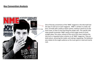
1. Key Convention Analysis
One of the key conventions of the ‘NME’ magazine is the title itself and
the way it’s laid out on each magazine. ‘NME’ is written in a bold, red
font, normally with a white or black outline, making it stand out on the
front cover, so that it’s the first thing the reader sees. This specific title
helps people remember ‘NME’ easily as that image comes to mind
straight away. The colour scheme of the rest of the cover matches the
title and is a repeated colour scheme on all ‘NME’ magazines. They are
bold colours, attracting the reader and making it appealing. The boldness
also relates to the target audience as the music genre is loud and mainly
rock.
2. Like ‘NME’, ‘Vibe’ magazine stands out with a bold font. The title is white
against a black background. The main image is a medium close up
shot, which is a key convention for the majority of magazines, presenting
the music genre straight away.
There are also subheadings used such as ‘Drake’ making it clear to the
audience what kind of information will be included inside the magazine.
Headings and subheadings are important for any magazine as it encourages
or prevents someone from buying the magazine.
3. On every magazine, there will be a barcode, issue number, date and price. This is essential for the magazine to be
published and sold. The price needs to be clear because it is important the customer knows how much they are
paying in advance. The issue number is there to inform the reader how to order magazines and what order to read
them in and the date for similar reasons, so that the reader can keep a note of when the item was purchased and if
they want to store the magazines in a particular order.