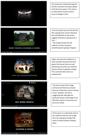
1. This shows the institutional logo for
the film and how it has been edited
to fit the horror genre. The colours
are dark which could connote a
sense of danger or fear.
-From this point you can tell that the
film is going to be a horror because
the intertitle/text on the screen
suggests that there is going to be a
‘but...’.
- This creates tension for the
audience as they can guess
something bad is going to happen.
-Again, this puts the audience in a
tense situation because from first
glance the houses look nice and
welcoming, but when you read the
text you know it’s going to change.
This could also been seen as a
juxtaposition.
-The text on top of this image
contrasts with the house shown
because it looks like a warm inviting
house. However, the text is
suggesting that although this
particular house in the image is not
affected, anyone in any house can
be hurt or killed.
At this point, it is extremely clear to
the audience that the next image
they see is going to change that
sense of houses being a relaxing
place.
2. This still shows where the film turns
darker and sinister. The houses now
shown in the image are much darker
than the houses shown in the
previous images, connoting danger.
The big red cross and the grittiness
suggest danger and the music in the
scene helps to build tension for the
audience, making them nervous and
scared.
The red cross also creates the idea
that someone is specifically
targeting the people living in this
house. This could suggest the idea
that they are going to be killed or
hurt.
This could be seen as a loving scene
that is then disrupted by the people
knocking on the door. At this point
the audience won’t realise how
much danger the couple are actually
in.
The door shown in the still plays a
prominent part in the film as this is
where the terrorising begins. It
suggests the idea that the unknown
is behind it.