
Recommended
More Related Content
What's hot
What's hot (10)
Similar to Ux analysis unacademy
Similar to Ux analysis unacademy (20)
Recently uploaded
Recently uploaded (20)
Ux analysis unacademy
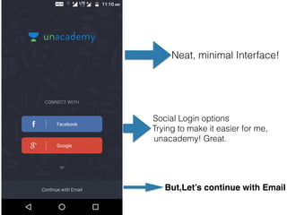
- 1. Neat, minimal Interface! But,Let’s continue with Email Social Login options Trying to make it easier for me, unacademy! Great.
- 2. Let’s Enter Email Id and Click on Continue
- 3. Unacademy, It would have been great had you Specified password rules! A Microcopy could have worked well. Anyway, I am assuming that you have no password rule and I can enter whatever I want. Let’s Click on Continue.
- 4. Ohh, You are asking my name now. It means you accepted the password of four characters. Great. Let’s enter the name. Let’s Go!
- 5. Seriously ? This is what you call UX ? You did not tell me the password rules before and now you want me to go back and change the password and you are not even telling me how to do that! It is the user who has to figure out that he/she needs to go back two steps and Change the password! Truly disappointing! We can expect better from you, UX team at unacademy! Anyway, Let’s go back and Change the password :(
- 6. Okay, I selected two topics CAT and Management. Let’s Click on Continue. Wait, What If I do not select anything and Click on Continue? Let's See. I am excited!
- 7. I suspected something of this sort! Now It sends me to an endless loop And user does not know what to do. UX is also about(mostly) considering what might go wrong with users! Now user has no clue what to do! Anyway, Let’s Go back and select some topics! :(
- 8. Follow Popular Educators! Okay, fair enough Will do that. But, It would have been great had you given me little more Information about these educators. You could have inserted a microcopy just below the profile pic. I don’t know Mr. Rakesh Sud(First educator that you are recommending me to follow) is a CAT Educator or something else! Though I selected(pinned) two topics in the beginning. But I have no clue which educator is subject expert in which topic. Anyway, Let’s follow some educators randomly based on the number of followers. Average Onboarding Experience, so far!. Let’s Continue!
- 9. Okay, then I began exploring course by Mr. Awadesh. After checking out few videos for some seconds, I go back to home screen and find out this : Hold Your breath!
- 10. It is showing that I have completed 30 percent of the course Just in one minute! Serious bug it is! Anyway, Let’s move on to profile page. Let’s see what Unacademy has in store for us!
- 11. Looks Dull! Anyway, I want to Logout . Where is the logout Button. Umm. Let’s click on Edit and see what’s there.
- 12. Logout is Hidden here! Anyway, Logout is not a critical part of this app so I think progressive disclosure makes sense here! Fair Enough, I won’t logout now. Let’s see what is hidden in Security Tab!
- 13. No Clear Explanation!It creates unnecessary Cognitive load. I understand that it is letting me change the password. But some explanation Would not have harmed. Anyway, Let's change the password and Save! WTH! After saving the password no response from the app!(And I checked later password was changed) There is something called Micro-Interaction, Unacademy! A single line stating my password is changed successfully will do wonders! I seriously had better hope from this app when I began testing. Never expected such poor UX.
- 14. There are roughly more than two dozen critical UX issues with Unacademy app which UxMeter will publish next weekend(Apart from those already mentioned) The app is mired with poor Information architecture, lacks essential features and is a Epitome of bad UX. UI is not my area of expertise, therefore, I have not commented about that. But my design acumen says UI is decent . Stay tuned for Unacademy UX analysis part two. Thanks for reading :)