1. All time low, Nothing Personal advert
I made the advert on publisher. I think if I
had used better software my advert
would look as good as ones that are
published in magazines. I think this
because I have a range of colours that
complement each other. I have all the
information I need, different fonts and
bold texts. I have a smaller picture of the
album, so people will know what to look
for when they go out and buy it; also it
looks good and makes it even more
interesting. I say where you can buy the
product and a website.
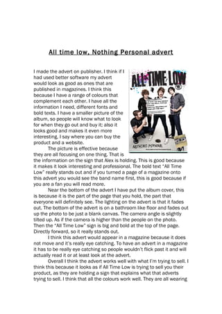
The picture is effective because
they are all focusing on one thing. That is
the information on the sign that Alex is holding. This is good because
it makes it look interesting and professional. The bold text “All Time
Low” really stands out and if you turned a page of a magazine onto
this advert you would see the band name first, this is good because if
you are a fan you will read more.
Near the bottom of the advert I have put the album cover, this
is because it is the part of the page that you hold, the part that
everyone will definitely see. The lighting on the advert is that it fades
out. The bottom of the advert is on a bathroom like floor and fades out
up the photo to be just a blank canvas. The camera angle is slightly
tilted up. As if the camera is higher than the people on the photo.
Then the “All Time Low” sign is big and bold at the top of the page.
Directly forward, so it really stands out.
I think this advert would appear in a magazine because it does
not move and it’s really eye catching. To have an advert in a magazine
it has to be really eye catching so people wouldn’t flick past it and will
actually read it or at least look at the advert.
Overall I think the advert works well with what I’m trying to sell. I
think this because it looks as if All Time Low is trying to sell you their
product, as they are holding a sign that explains what that adverts
trying to sell. I think that all the colours work well. They are all wearing
2. dark clothing and then the All Time Low sign at the top of the page is
black, with bright colours around it. This makes it stand out well and
looks really effective. At the bottom right hand corner of the page I
have made sure the product is there, this is so every reader would see
it. They would hold it as they turn the page so would definitely see the
album cover. So when they are in a shop then see the album cover
they know what it is then buy the product.