1. Evaluation on our music video – Reason to smile
In what ways does your media product use, develop or challenge forms and conventions of real
media products?
Our media video of “Carly Jones – Reason to smile” allows our media product to use and challenge
different forms of conventions that many viewers usually connect with our genre of music video
“POP.” The main story line behind our music video is that a young girl loses her mum to Cancer, with
cancer being in the “ TOP 10 CAUSE OF DEATH,”
(http://www.who.int/mediacentre/factsheets/fs310/en/index.html) This websites shows the statistics of
the most common deaths ( cancer being 1 of them). Having this subject within our music video allows
many members of our audience relate to the young girls emotions and the journey she is taking.
Throughout the production our group had to think of ways to show that our character had cancer. This
became very difficult to think of a way of showing our audience the illness because cancer is an
invisible illness, our group had to think very sterotyical of how people can tell someone has cancer.
After making sure that this convention wasn't offensive to anyone viewing this video. We were able to
link in props as part of a convention to show that the mother had cancer. Our mother with cancer wore
a head scarf to show that she has no hair because one of the effects of cancer treatment is losing your
hair, whilst wearing a head scarf we placed minumal make-up on the character so it was just enough to
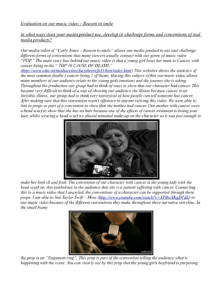
make her look ill and frail. The convention of our character with cancer is the young lady with the
head scarf on, this symbolises to the audience that she is a patient suffering with cancer. Connecting
this to a music video that I anasyled, the conventions of a character can be supported through there
props. I am able to link Taylor Swift – Mine (http://www.youtube.com/watch?v=XPBwXKgDTdE) to
our music video because of the different conventions they make throughout there narrative storyline. In
the small frame
the prop is an “Engament ring”, This prop is part of the convention telling the audience what is
happening with the scene. You can clearly see by this prop that the young girls boyfriend is purposing
2. to her. This is a direct message to the audience what is happening in this scene, it is even identifiable if
there was no sound and we where just watching the video. Relating Taylor swifts video to our
production can be connected in a varitey of different ways. To get to our final production we viewed
Taylor Swifts – Mine over and over again. We came to the conclusion that having a narrative storyline
and occasional clips of the artist singing allows us to put our own thoughts into the narrative storyline
but also promote the artist at the same time. Another music video that we got ideas and inspirations
from was Alicia Keys – Empire state of mind PART 2 ( http://www.youtube.com/watch?
v=QsoojLNW41Y ). We selected a few ideas out of this music video. The first idea was that we have a
shot of our artist “CARLY” on the piano in a black gown, we came to this idea because we wanted our
artist to look sophisticated and formal like Alicia Keys does in this perfomance on C4, having the artist
have a live performance within the music video is promotiing her to her viewing audience and
understand her position in the music video.
Evalutation of the Dijipak
Creating my Dijipak design I did a fair amount of research as I was indesife about what design or
promotion to do. I viewed a variety of different Dijipak designs from Taylor swift to Olly murs. Taylor
swift was the one that stood out to me the the most because we went along the lines of her music video
“MINE” so I decided to look at her Dijipak design. Taylor swifts Dijipak design shows the
sosphistication of her and her music, it also fits in with the style of her music video for “MINE”.
After doing a lot of research into her producion,Dijipak cover and her magazine article I decided
following the same route as what the creators for Taylor Swifts work I decided to create the dijipak and
3. magazine article along the same route as the prodution. For the front and back of my Dijipak I used a
peaceful landscape to connotate the connection of the mood and emotion of the music video.
I turned the image bacl and white in the background because I the idea of death is dark and has a
negative energey so to show my audience the idea of death I have turned the background a dark
colour.However I have changed the beach huts in to a bright colour because at the end our music video
the young girl realises she has lost her mother but there is always a positive outcome and that her
mother isnt suffering no more. So have both no colour and a small scale colour shows the audience the
progression of the music video. On the inside on the Dijipak underneath where the CD sits I have
captured a photograph of Carly Jones and I have edited the lyrics of the song over the top with the title
of the song in the same colours as the beach huts.
Having a image of our artist allows us to promote the artist aswell as her Single. This photograph has
gone by the same route as the front and backcover with the black and white and also colour. This
image links well with the theme of the video and the magazine article. Having all my images with a
mixture of colour almost gives the idea of the character having hope and dreams. The link between the
two of these and the music video shows the progression of emotions and the genre of the video.
4. Magazine Advertisment
To come to the idea of my magazine article I yet again video articles of Taylor Swift because I have
linked her throughout my research and wanted to keep the connection because I believe that our artist
Carly Jones has a similar style to Taylor swift. I viewed what magazines Taylor appeared in and how
they where presented, I discovered that Taylor Swift appeared in mainly Sugar magazine because of
her genere.
The Sugar magaizne is aimed at young girls ( which links into our audience). After the feedback
collected from the intial idea the viewing audience said it didnt fit the genre of music and that it needed
a softer emotion. Playing with the editing software on adobe photoshop I was able to come up with a
idea that magazine article should represent the character of Carly.
The text on this magazine article came from Taylor Swifts album. I was inspired by the idea of italic
writing because it gave it a more feminime feel and also made it softer and fits with the genre of the
music video. As you can see throughout my production I have kept to the idea of the different colours
this allows the emotions to be interpreted the same througout each production and designs. The red
line through the magazine article links in with the photograph of the beach huts. The red line
underneath the name of the artist allows it to stand out and become more individualistic. Throughout
each design I have created I have stuck to the same emotion and mood behind each design, this allows
the audience to easyily adapt to each individual design.