Call Girl Nagpur Roshni Call 7001035870 Meet With Nagpur Escorts
Cd cover reviews
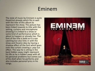
1. Eminem
The style of music by Eminem is quite
theatrical already which fits in well
with the title of this album to
represent the show. The picture has
been linked towards to title with the
setting, curtains and microphone
showing it is linked to a show or
some kind of performance which is
about to happen or already has. The
font of the title is bold so it is eye
catching but also links in with the
show and theatre idea by having a
shadow effect of the font which goes
onto the curtain creating a pop out
effect. The way he is sitting in the
back hidden away might represent
his life as he is hidden away with all
his personal problems but comes out
of his shell when he performs and
also includes personal lyrics in his
songs.
2. Tinie Tempah
With this album cover it shows
that there is a big link with pop
and that it is up to date in time
with the colourful effects and big
font types that are bold and also
because it has a shimmery effect
on the word ‘pass out’. This
creates the effect to someone
who’s looking at the CD cover
that it is a fast moving song as it
creates a vibrating look with the
effect. Also the ‘e’ at the end of
Tinie is wonky which shows that
he crosses the boundary's with
the music as well as the average
‘straight’ title. Also it shows he is
a typical pop artist with the way
he is posing as it looking like he
is dancing.
3. Pegasus Bridge
This CD cover represents the title
of the song ‘while we’re young’ as
it has a young boy in his school
uniform with paper flying free
from his hands showing his youth
and freedom from the adult world.
The colouring is pale and the
background is quite blurry which
may show that his life isn’t clear
yet as he is young. The style of font
for the words ‘While we’re young’
fits in well as it looks like a child
has wrote it as it is all squiggly. The
font for Pegasus Bridge is white
and doesn’t stand out with
colour, but the boldness catches
your eye which gives off a good
effect.
4. Joe Brooks
For this front cover the artist is
dressed to match the name of the
single as he is dressed as
superman wearing a cape. The
font for the word ‘Superman’ is
thin but also sharp which stands
out as a superhero’s name
normally would. Also the artists
name is bold and has block letters
showing he is some sort of
superhero as the font makes it
look like important writing and
superhero’s are important. The
cover is plain but also effective as
the picture is focused in on and he
is looking straight at the camera
which draws you in.
5. Beyonce
This CD cover is very plain but straight to
the point. Her name is set behind her
and you can’t see all the name but
because she is so popular the name is
already known and it also draws you in
because it makes you want to know what
the word says behind her. The font is
black which stands out in the pale
background and round and curvy, just
like the singers body which is shown off a
lot in the picture. It is a also very girly
font which fits in well as Beyonce is a
woman and the way she is standing in
the photo draws you in and its almost
like she is representing women. The
cover is a very good cover as it shows
different things in different ways.