
Recommended
More Related Content
Similar to Portfolio
Similar to Portfolio (20)
Recently uploaded
Recently uploaded (20)
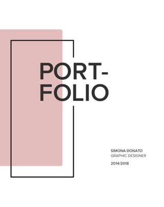
Portfolio
- 2. PROFILE - SIMONA DONATO 10/01/1995 Born in Cosenza, Italy Based in Rome , Italy Graduated in Graphic Design at IED Roma I am young & inventive Graphic Designer with an experience of 1 year in the field of web, brand design and media. I have a strong passion for art, cinema and music. CONTACT - Via Prenestina 369/d 00177 Roma (RM) ITALY simona.donato10@gmail.com +39 3272666390 Simona Donato @simonablues Simona Donato Simona Donato
- 3. BRAN- DING BRAN- DING BRANDING - Branding work done during university for hypothetical companies and during the first work experience for local companies.
- 4. 6 7 Civita is called “the city that dies” because its territory is very unstable as it is destined to disappear over the years due to weather conditions. The research began with the study of the history of the city, the legend and then the logo. After the logo, all the coordinated image, gadgets, merchandising, city map, signage and event advertising were created. Finally I thought of two different types of operations for the sensitization and enhancement of the territory. Its only access point is the bridge that isolates it from all the rest. The bridge has therefore been designed with segmented lines that give the illusion of a crumbling soil. At the top of the logo is represented the city with its predominant forms revisited in a minimalist key, interlocked between them to give the idea of cohesion, characteristic of the city itself. BRANDING BRANDING BELL TOWER San Donato’s Church FRONT San Donato’s Church ENTRANCE Santa Maria’s Door BRIDGE + + + CITY BRANDING Civita di Bagnoregio - This is my thesis project. Is a city branding for a little city in province of Rome, Civita di Bagnoregio. CONCEPT
- 5. 98 BRANDING PANTONE P54-8 U BRANDING 8 BUSINESS CARDLOGO
- 8. 14 15 BRANDING 14 MERCHANDISING The system of signs follows the graphic style of the logo with the addition of characteristic elements that recall the attraction or the service represented. SIGN SYSTEM MUSEO GEOLOGICO E DELLE FRANE PONTECHIESA DI SAN DONATO GIARDINO DEI POETIPORTA SANTA MARIA BAGNI BIGLIETTERIA CENTRO INFORMAZIONIPUNTO RISTORO ATTRACTION SERVICE BRANDING 15
- 9. 16 17 BRANDING 16 CITY MAPCITY MAP BRANDING 17
- 12. 22 23 BRANDING 22 LETTERHEADMARKETING OPERATION BRANDING 23 100cm x28 Ball of wool 1m 30mm 5 12,5cm 12,5cm 12,5cm 100cm 198cm 14cm TRASPARENT PLEXIGLASS ADHESIVE The idea is to locate an installation right before the bridge, when we can see the village from a certain distance, a transparent panel placed where it can frame Civita. The user has to interact with the installation with a simple game, he has to link with a woollen yarn all the adjectives that he thinks are suitable for Civita. The purpose is, at the end of the day, to creat a net that symbolically represents the safeguard of the village, thanks to the feedback left by the tourist that is certainly a main character in the struggle that bothers Civita. This leads to the hashtag #SOStengocivita that will be present on the social medias, and the possibility for the tourist to post a picture of the panel on his own page to get the word out fastly. BRANDING 23 BRANDING 23 MARKETING OPERATION
- 13. 24 25 BRANDING MARKETING OPERATIONMARKETING OPERATION BRANDING 25
- 14. 26 27 BRANDING MARKETING OPERATIONMARKETING OPERATION BRANDING 27 SENSIBILIZZAZIONE 26 BRANDING 27
- 15. 28 29 “DiStudio” is a Italian architecture practice based in Rome. The company principle is the collective conception. From the very beginning, the practice has seen the virtues of exchange, crossing ideas, common effort, shared knowledge and enthusiasm “DiStudio” is the union of the initials of the founders’ names. This logo is the union of two tools, most used by architects before the computer and their initials. BRANDING BRANDING BRANDING DiStudio First proposal - This project is designed for an architecture studio. CONCEPT D I+ +
- 16. 30 31 BRANDING BUSINESS CARDLOGO BRANDING 30 DI STUDIO Via Attilio Benigni, 2 00156 Roma (RM) t. 06/93575462 f. 06/93575463 distudio.contatti@gmail.com www.distudio.it
- 17. 32 33 BRANDING FOLDERLETTERHEAD BRANDING 32 I NOSTRI SERVIZI Lorem ipsum dolor sit a met, consectetuer adipiscing elit, sed diam nonummy nibh euismod tincidunt ut laoreet dolore magna aliquam erat v olutpat. U t wisi enim a d minim veniam, quis nostrud exerci tation ullamcorper suscipit lobortis nisl ut aliquip ex ea commodo consequat. D uis autem v el eum iriure dolor in hendrerit i n vulputate v elit esse molestie consequat.
- 18. 34 35 “DiStudio” is a Italian architecture practice based in Rome. The company principle is the collective conception. From the very beginning, the practice has seen the virtues of exchange, crossing ideas, common effort, shared knowledge and enthusiasm “DiStudio” is the union of the initials of the founders’ names. This logo is the union of the shape of door in architecture paper projects, most used by architects before the computer and their initials. BRANDING BRANDING BRANDING DiStudio Second proposal - This project is designed for an architecture studio. CONCEPT d i+ +
- 19. 36 37 BRANDING BUSINESS CARDLOGO BRANDING 36 Via Attilio Benigni 00156 Roma (RM) t. 06/9357546 f. 06/9357546 Via Attilio Benigni 00156 Roma (RM) t. 06/9357546 f. 06/9357546 distudio.contatti@gmail.com www.distudio.it
- 20. 38 39 BRANDING FOLDERLETTERHEAD BRANDING 38 I NOSTRI SERVIZI Lorem ipsum dolor s it a met, consectetuer adipiscing e lit, sed diam n onummy n ibh euismod tincidunt ut laoreet dolore magna aliquam erat v olutpat. U t wisi enim a d minim veniam, q uis nostrud exerci tation ullamcorper suscipit lobortis nisl ut aliquip ex ea c ommodo c onsequat. D uis autem v el eum i riure dolor i n hendrerit in v ulputate v elit e sse molestie consequat.
- 21. 40 41 The first proposal represents the typical tool of hairdressers, the scissors, which formed a space at the center to emphasize the concept of “cutting”. BRANDING BRANDING BRANDING Unic First proposal - This project is designed for a hair salon academy. CONCEPT “Unic” is an established hairdressing training provider with a wealth of experience in delivering high quality, flexible training to meet the needs of all. Stylish cuts, vibrant colour, outstanding customer service and extremely high standards. + +
- 23. 44 45 The second proposal is very easy. The letter “I” has been distorted to create a shape similar to a hair. BRANDING BRANDING BRANDING Unic Second proposal - This project is designed for a hair salon academy. CONCEPT “Unic” is an established hairdressing training provider with a wealth of experience in delivering high quality, flexible training to meet the needs of all. Stylish cuts, vibrant colour, outstanding customer service and extremely high standards.
- 25. EDIT- ORIAL EDITORIAL - Editorial work done during university for hypothetical magazines.
- 26. The name of the magazine is “lens” because I started from the principle of 3D according to which: two images filtered with two different colors are discriminated with complementary filtering. On this principle I based the entire visual of the magazine. In this issue we will talk about two very important films: “Il sorpasso”, an Italian film directed by Dino Risi and “Easy rider” directed by Denis Hopper. EDITORIAL EDITORIAL MOVIE MAGAZINE Lens - This is my first editorial project. Is a visual magazine that talks about cinema. For a better vision and see more pages click this link: https://www.behance.net/gallery/54620447/ART-DIRECTION- Lens-visual-magazine COVER 5150
- 29. EDITORIAL 56
- 30. It is a document film and retraces the most significant stages of the life of the President most loved by Italians. A cross-section of political and personal life told in different languages, from documentary to fiction, to historical and pedagogical reflection. EDITORIAL EDITORIAL MOVIE POSTER Pertini il combattente - This is a movie poster of italian film released at the cinema on March 15, 2018. It is signed by Sky Cinema and Rai Cinema. https://www.mymovies.it/film/2018/pertini-il-combattente/ CONCEPT 5958
- 33. THANK YOU!