The main class for the top level forms is the base navigation form. Here we have the material commands in the side menu that allow us to navigate to the other top level forms.
The title of the forms is really a text field as it’s editable in place. The trick in making a text field feel like a title is to style it as such which is why we created the NavigationTitle UIID and that style has 0 margin, 1 millimeter of padding with a 5 millimeter white font that’s aligned to the left.
The logo image uses a special rounded scaled logo getter which adapts the logos look to the design of the UI. When we set the property for the logo we automatically
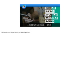
1. Initial UI Mockup - Part II
Lets dive right in to the code starting with base navigation form
2. public class BaseNavigationForm extends Form {
public BaseNavigationForm(AppSettings app, Layout l) {
super(app.name.get(), l);
init(app);
}
private void init(AppSettings app) {
Toolbar tb = getToolbar();
tb.addMaterialCommandToSideMenu("Dishes", FontImage.MATERIAL_RESTAURANT_MENU,
e -> new DishListForm(app).show());
tb.addMaterialCommandToSideMenu("Details", FontImage.MATERIAL_DESCRIPTION,
e -> new DetailsForm(app).show());
tb.addMaterialCommandToSideMenu("Billing", FontImage.MATERIAL_CREDIT_CARD, e -> {});
tb.addMaterialCommandToSideMenu("App", FontImage.MATERIAL_PHONE_IPHONE,
e -> new AppForm(app).show());
TextField title = new TextField(app.name.get());
title.setUIID("NavigationTitle");
TextField tagline = new TextField(app.tagline.get());
tagline.setUIID("Tagline");
BaseNavigationForm
Commands
Side menu navigation
commands common to the
top level form
The main class for the top level forms is the base navigation form. Here we have the material commands in the side menu that allow us to navigate to the other top level
forms.
3. public class BaseNavigationForm extends Form {
public BaseNavigationForm(AppSettings app, Layout l) {
super(app.name.get(), l);
init(app);
}
private void init(AppSettings app) {
Toolbar tb = getToolbar();
tb.addMaterialCommandToSideMenu("Dishes", FontImage.MATERIAL_RESTAURANT_MENU,
e -> new DishListForm(app).show());
tb.addMaterialCommandToSideMenu("Details", FontImage.MATERIAL_DESCRIPTION,
e -> new DetailsForm(app).show());
tb.addMaterialCommandToSideMenu("Billing", FontImage.MATERIAL_CREDIT_CARD, e -> {});
tb.addMaterialCommandToSideMenu("App", FontImage.MATERIAL_PHONE_IPHONE,
e -> new AppForm(app).show());
TextField title = new TextField(app.name.get());
title.setUIID("NavigationTitle");
TextField tagline = new TextField(app.tagline.get());
tagline.setUIID("Tagline");
BaseNavigationForm
UIID
0 Margin
1mm Padding
White 5mm thin font
Left alignment
The title of the forms is really a text field as it’s editable in place. The trick in making a text field feel like a title is to style it as such which is why we created the
NavigationTitle UIID and that style has 0 margin, 1 millimeter of padding with a 5 millimeter white font that’s aligned to the left.
That looks and feels like a title, one important thing to notice is the left align which doesn’t match the iOS convention. Center aligned text fields are flaky across platforms
so we don’t support them properly, that’s why we use left alignment here.
4. public class BaseNavigationForm extends Form {
public BaseNavigationForm(AppSettings app, Layout l) {
super(app.name.get(), l);
init(app);
}
private void init(AppSettings app) {
Toolbar tb = getToolbar();
tb.addMaterialCommandToSideMenu("Dishes", FontImage.MATERIAL_RESTAURANT_MENU,
e -> new DishListForm(app).show());
tb.addMaterialCommandToSideMenu("Details", FontImage.MATERIAL_DESCRIPTION,
e -> new DetailsForm(app).show());
tb.addMaterialCommandToSideMenu("Billing", FontImage.MATERIAL_CREDIT_CARD, e -> {});
tb.addMaterialCommandToSideMenu("App", FontImage.MATERIAL_PHONE_IPHONE,
e -> new AppForm(app).show());
TextField title = new TextField(app.name.get());
title.setUIID("NavigationTitle");
TextField tagline = new TextField(app.tagline.get());
tagline.setUIID("Tagline");
BaseNavigationForm
UIID
Derive NavigationTitle
3mm font
The tagline is similarly a text field with the right styling. Technically the styling derives navigation title so we can be in sync with changes to the title style. It just uses a
smaller 3 millimeter font.
5. public class BaseNavigationForm extends Form {
public BaseNavigationForm(AppSettings app, Layout l) {
super(app.name.get(), l);
init(app);
}
private void init(AppSettings app) {
Toolbar tb = getToolbar();
tb.addMaterialCommandToSideMenu("Dishes", FontImage.MATERIAL_RESTAURANT_MENU,
e -> new DishListForm(app).show());
tb.addMaterialCommandToSideMenu("Details", FontImage.MATERIAL_DESCRIPTION,
e -> new DetailsForm(app).show());
tb.addMaterialCommandToSideMenu("Billing", FontImage.MATERIAL_CREDIT_CARD, e -> {});
tb.addMaterialCommandToSideMenu("App", FontImage.MATERIAL_PHONE_IPHONE,
e -> new AppForm(app).show());
TextField title = new TextField(app.name.get());
title.setUIID("NavigationTitle");
TextField tagline = new TextField(app.tagline.get());
tagline.setUIID("Tagline");
BaseNavigationForm
In case this wasn’t clear these UIID’s map to the title and subtitle of the form right here
6. Button editBackground = new Button("Edit Background", "EditBackground");
int size = Display.getInstance().convertToPixels(10);
Button logoImage = new Button("", app.getRoundedScaledLogo(), "Container");
Container titleContainer = BoxLayout.encloseY(
title,
tagline,
FlowLayout.encloseCenterMiddle(logoImage));
Button menu = new Button("", "NavigationTitle");
Button preview = new Button("", "NavigationTitle");
FontImage.setMaterialIcon(menu, FontImage.MATERIAL_MENU);
FontImage.setMaterialIcon(preview, FontImage.MATERIAL_PLAY_ARROW);
Container titleWithCommands = BorderLayout.centerEastWest(
titleContainer,
FlowLayout.encloseCenter(preview),
FlowLayout.encloseCenter(menu));
menu.addActionListener(e -> tb.openSideMenu());
ScaleImageLabel sl = new ScaleImageLabel(app.titleBackground.get());
sl.setUIID("TitleBottomSpace");
sl.setBackgroundType(Style.BACKGROUND_IMAGE_SCALED_FILL);
if(super.shouldPaintStatusBar()) {
titleWithCommands.getUnselectedStyle().setPaddingUnit(Style.UNIT_TYPE_DIPS);
titleWithCommands.getUnselectedStyle().setPaddingTop(3);
}
tb.setTitleComponent(LayeredLayout.encloseIn(sl,
BorderLayout.south(editBackground), titleWithCommands));
}
BaseNavigationForm
UIID
0 Margin top/right/left
4mm bottom margin
0 Padding
Derive NavigationTitle
Right alignment
thin 2.5mm font
Moving on the edit background UI on the bottom right portion of the form maps to this button which allows us to edit the background image in the title area. You will
notice we use the constructor that accepts the button label and UIID.
The EditBackground UIID is styled to match the navigation title but it also adds padding to the bottom so the text doesn’t appear within the white area. I’ll talk about that
more in the next section… Besides that the other interesting thing about this UIID is the right alignment which we use to make sure it appears to the right of the icon.
7. Button editBackground = new Button("Edit Background", "EditBackground");
int size = Display.getInstance().convertToPixels(10);
Button logoImage = new Button("", app.getRoundedScaledLogo(), "Container");
Container titleContainer = BoxLayout.encloseY(
title,
tagline,
FlowLayout.encloseCenterMiddle(logoImage));
Button menu = new Button("", "NavigationTitle");
Button preview = new Button("", "NavigationTitle");
FontImage.setMaterialIcon(menu, FontImage.MATERIAL_MENU);
FontImage.setMaterialIcon(preview, FontImage.MATERIAL_PLAY_ARROW);
Container titleWithCommands = BorderLayout.centerEastWest(
titleContainer,
FlowLayout.encloseCenter(preview),
FlowLayout.encloseCenter(menu));
menu.addActionListener(e -> tb.openSideMenu());
ScaleImageLabel sl = new ScaleImageLabel(app.titleBackground.get());
sl.setUIID("TitleBottomSpace");
sl.setBackgroundType(Style.BACKGROUND_IMAGE_SCALED_FILL);
if(super.shouldPaintStatusBar()) {
titleWithCommands.getUnselectedStyle().setPaddingUnit(Style.UNIT_TYPE_DIPS);
titleWithCommands.getUnselectedStyle().setPaddingTop(3);
}
tb.setTitleComponent(LayeredLayout.encloseIn(sl,
BorderLayout.south(editBackground), titleWithCommands));
}
BaseNavigationForm
UIID
0 padding sides
1mm padding top/bottom
4mm bottom
The background image is just a scaled image label that stretches all across. We added a 4 millimeter margin to the bottom of this background image and that allows the
icon to “peek” exactly 4 millimeters outside of the bottom portion. This looks decent enough and works well for all resolutions since the size is in millimeters and the icon
is also scaled in millimeters.
8. Button editBackground = new Button("Edit Background", "EditBackground");
int size = Display.getInstance().convertToPixels(10);
Button logoImage = new Button("", app.getRoundedScaledLogo(), "Container");
Container titleContainer = BoxLayout.encloseY(
title,
tagline,
FlowLayout.encloseCenterMiddle(logoImage));
Button menu = new Button("", "NavigationTitle");
Button preview = new Button("", "NavigationTitle");
FontImage.setMaterialIcon(menu, FontImage.MATERIAL_MENU);
FontImage.setMaterialIcon(preview, FontImage.MATERIAL_PLAY_ARROW);
Container titleWithCommands = BorderLayout.centerEastWest(
titleContainer,
FlowLayout.encloseCenter(preview),
FlowLayout.encloseCenter(menu));
menu.addActionListener(e -> tb.openSideMenu());
ScaleImageLabel sl = new ScaleImageLabel(app.titleBackground.get());
sl.setUIID("TitleBottomSpace");
sl.setBackgroundType(Style.BACKGROUND_IMAGE_SCALED_FILL);
if(super.shouldPaintStatusBar()) {
titleWithCommands.getUnselectedStyle().setPaddingUnit(Style.UNIT_TYPE_DIPS);
titleWithCommands.getUnselectedStyle().setPaddingTop(3);
}
tb.setTitleComponent(LayeredLayout.encloseIn(sl,
BorderLayout.south(editBackground), titleWithCommands));
}
BaseNavigationForm
The logo image uses a special rounded scaled logo getter which adapts the logos look to the design of the UI let’s go see how that method works
9. public class AppSettings implements PropertyBusinessObject {
public final Property<String, AppSettings> name = new Property<>("name", "My Restaurant");
public final Property<String, AppSettings> tagline = new Property<>("tagline", "The place to eat");
public final Property<Image, AppSettings> titleBackground = new Property<>("titleBackground", null);
private Image roundedScaledLogo;
private final PropertyIndex idx = new PropertyIndex(this, "AppSettings", name, tagline, logo,
titleBackground);
@Override
public PropertyIndex getPropertyIndex() {
return idx;
}
public Image getRoundedScaledLogo() {
return roundedScaledLogo;
}
AppSettings
The rounded scaled logo is just an image with no setter, so where is this initialized?
10. public final Property<Image, AppSettings> logo = new Property<Image, AppSettings>("logo", null) {
public AppSettings set(Image value) {
if(value != null) {
int mm = Display.getInstance().convertToPixels(2f);
int size = Display.getInstance().convertToPixels(11);
GeneralPath gp = new GeneralPath();
float widthF = size; float heightF = size;
gp.moveTo(x + mm, 0);
gp.lineTo(x + widthF - mm, 0);
gp.quadTo(x + widthF, 0, widthF, mm);
gp.lineTo(x + widthF, heightF - mm);
gp.quadTo(x + widthF, heightF, x + widthF - mm, heightF);
gp.lineTo(x + mm, heightF);
gp.quadTo(x, heightF, 0, heightF - radius);
gp.lineTo(x, mm);
gp.quadTo(x, 0, mm, 0);
gp.closePath();
Image mask = Image.createImage(size, size, 0xff000000);
Graphics g = mask.getGraphics();
g.setColor(0xffffff);
g.setAntiAliased(true);
g.fillShape(gp);
Object m = mask.createMask();
roundedScaledLogo = value.fill(size, size).applyMask(m);
}
return super.set(value);
}
};
AppSettings
When we set the property for the logo we automatically generate this image too by drawing the image in the right place. Let’s go over these steps
11. public final Property<Image, AppSettings> logo = new Property<Image, AppSettings>("logo", null) {
public AppSettings set(Image value) {
if(value != null) {
int mm = Display.getInstance().convertToPixels(2f);
int size = Display.getInstance().convertToPixels(11);
GeneralPath gp = new GeneralPath();
float widthF = size; float heightF = size;
gp.moveTo(x + mm, 0);
gp.lineTo(x + widthF - mm, 0);
gp.quadTo(x + widthF, 0, widthF, mm);
gp.lineTo(x + widthF, heightF - mm);
gp.quadTo(x + widthF, heightF, x + widthF - mm, heightF);
gp.lineTo(x + mm, heightF);
gp.quadTo(x, heightF, 0, heightF - radius);
gp.lineTo(x, mm);
gp.quadTo(x, 0, mm, 0);
gp.closePath();
Image mask = Image.createImage(size, size, 0xff000000);
Graphics g = mask.getGraphics();
g.setColor(0xffffff);
g.setAntiAliased(true);
g.fillShape(gp);
Object m = mask.createMask();
roundedScaledLogo = value.fill(size, size).applyMask(m);
}
return super.set(value);
}
};
AppSettings
We have two important sizes here, mm is the size of the arc in the corner and size is the size of the entire icon. I got these numbers thru trial and error until I got
something that looked satisfactory in the various device densities.
12. public final Property<Image, AppSettings> logo = new Property<Image, AppSettings>("logo", null) {
public AppSettings set(Image value) {
if(value != null) {
int mm = Display.getInstance().convertToPixels(2f);
int size = Display.getInstance().convertToPixels(11);
GeneralPath gp = new GeneralPath();
float widthF = size; float heightF = size;
gp.moveTo(x + mm, 0);
gp.lineTo(x + widthF - mm, 0);
gp.quadTo(x + widthF, 0, widthF, mm);
gp.lineTo(x + widthF, heightF - mm);
gp.quadTo(x + widthF, heightF, x + widthF - mm, heightF);
gp.lineTo(x + mm, heightF);
gp.quadTo(x, heightF, 0, heightF - radius);
gp.lineTo(x, mm);
gp.quadTo(x, 0, mm, 0);
gp.closePath();
Image mask = Image.createImage(size, size, 0xff000000);
Graphics g = mask.getGraphics();
g.setColor(0xffffff);
g.setAntiAliased(true);
g.fillShape(gp);
Object m = mask.createMask();
roundedScaledLogo = value.fill(size, size).applyMask(m);
}
return super.set(value);
}
};
AppSettings
A general path is a shape object, we can fill, stroke or clip based on a shape. Notice that shape operations can sometimes be expensive in terms of graphics processing
power so while they are very powerful you need to be very aware of what you are trying to do. A general path allows us to define an arbitrary shape we can then use in
the drawing primitives.
This raises the question of why not use the builtin round rect methods within graphics, those don’t allow the same level of customizability and power as the shape API.
They aren’t as consistent across platform either.
13. public final Property<Image, AppSettings> logo = new Property<Image, AppSettings>("logo", null) {
public AppSettings set(Image value) {
if(value != null) {
int mm = Display.getInstance().convertToPixels(2f);
int size = Display.getInstance().convertToPixels(11);
GeneralPath gp = new GeneralPath();
float widthF = size; float heightF = size;
gp.moveTo(x + mm, 0);
gp.lineTo(x + widthF - mm, 0);
gp.quadTo(x + widthF, 0, widthF, mm);
gp.lineTo(x + widthF, heightF - mm);
gp.quadTo(x + widthF, heightF, x + widthF - mm, heightF);
gp.lineTo(x + mm, heightF);
gp.quadTo(x, heightF, 0, heightF - radius);
gp.lineTo(x, mm);
gp.quadTo(x, 0, mm, 0);
gp.closePath();
Image mask = Image.createImage(size, size, 0xff000000);
Graphics g = mask.getGraphics();
g.setColor(0xffffff);
g.setAntiAliased(true);
g.fillShape(gp);
Object m = mask.createMask();
roundedScaledLogo = value.fill(size, size).applyMask(m);
}
return super.set(value);
}
};
AppSettings
Building the shape is essentialy about moving a virtual pen around and drawing lines, arcs or curves along the path. This is mostly straight forward.
14. public final Property<Image, AppSettings> logo = new Property<Image, AppSettings>("logo", null) {
public AppSettings set(Image value) {
if(value != null) {
int mm = Display.getInstance().convertToPixels(2f);
int size = Display.getInstance().convertToPixels(11);
GeneralPath gp = new GeneralPath();
float widthF = size; float heightF = size;
gp.moveTo(x + mm, 0);
gp.lineTo(x + widthF - mm, 0);
gp.quadTo(x + widthF, 0, widthF, mm);
gp.lineTo(x + widthF, heightF - mm);
gp.quadTo(x + widthF, heightF, x + widthF - mm, heightF);
gp.lineTo(x + mm, heightF);
gp.quadTo(x, heightF, 0, heightF - radius);
gp.lineTo(x, mm);
gp.quadTo(x, 0, mm, 0);
gp.closePath();
Image mask = Image.createImage(size, size, 0xff000000);
Graphics g = mask.getGraphics();
g.setColor(0xffffff);
g.setAntiAliased(true);
g.fillShape(gp);
Object m = mask.createMask();
roundedScaledLogo = value.fill(size, size).applyMask(m);
}
return super.set(value);
}
};
AppSettings
Here we create a mask from the shape, a mask for the image. We create a solid black image and we fill the shape area with white color then we create a mask. A mask
can be applied to the image to remove the black pieces and leave the white pieces.
This begs the question, why not use shape clipping that I mentioned earlier?
Masking supports anti-aliasing which renders the elements in the corners with a slight alpha channel to make the corner seem smooth. A clip is a binary operation where
a pixel can either be in the clip or it’s outside of the clip so there is no room for interpretation. Using shape clipping won’t look as good!
Furthermore, shape clipping isn’t as portable as masking which is 100% portable to all supported Codename One platforms.
15. public final Property<Image, AppSettings> logo = new Property<Image, AppSettings>("logo", null) {
public AppSettings set(Image value) {
if(value != null) {
int mm = Display.getInstance().convertToPixels(2f);
int size = Display.getInstance().convertToPixels(11);
GeneralPath gp = new GeneralPath();
float widthF = size; float heightF = size;
gp.moveTo(x + mm, 0);
gp.lineTo(x + widthF - mm, 0);
gp.quadTo(x + widthF, 0, widthF, mm);
gp.lineTo(x + widthF, heightF - mm);
gp.quadTo(x + widthF, heightF, x + widthF - mm, heightF);
gp.lineTo(x + mm, heightF);
gp.quadTo(x, heightF, 0, heightF - radius);
gp.lineTo(x, mm);
gp.quadTo(x, 0, mm, 0);
gp.closePath();
Image mask = Image.createImage(size, size, 0xff000000);
Graphics g = mask.getGraphics();
g.setColor(0xffffff);
g.setAntiAliased(true);
g.fillShape(gp);
Object m = mask.createMask();
roundedScaledLogo = value.fill(size, size).applyMask(m);
}
return super.set(value);
}
};
AppSettings
In the last line of this code we do two separate things. The fill method scales the image but it does that while cropping redundant areas. So if we have an image that isn’t
a square the areas outside will be clipped and the center will remain.
We then apply he mask to the clipped image to create that round effect