
Recommended
Recommended
More Related Content
Similar to Creating a Facebook Clone - Part XVI - Transcript.pdf
Similar to Creating a Facebook Clone - Part XVI - Transcript.pdf (20)
More from ShaiAlmog1
More from ShaiAlmog1 (20)
Recently uploaded
Recently uploaded (20)
Creating a Facebook Clone - Part XVI - Transcript.pdf
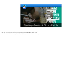
- 1. Creating a Facebook Clone - Part XV The one last form we’ll work on in the mockup stage is the “New Post” Form
- 2. © Codename One 2017 all rights reserved Right now I'll only support simple variations of the new post. I'll deal with image & video posting later. We will discuss some builtin styles and use HTML to display formatted posts. This could allow for logic that implements things such as hashtags etc. in a future implementation.
- 3. public class NewPostForm extends Form { private static final String[] POST_STYLES = { "Label", "PostStyleHearts", "PostStyleHands", "PostStyleBlack", "PostStyleRed", "PostStylePurple" }; public NewPostForm() { super("Create Post", new BorderLayout()); Form current = getCurrentForm(); getToolbar().setBackCommand("Cancel", Toolbar.BackCommandPolicy. WHEN_USES_TITLE_OTHERWISE_ARROW, e -> current.showBack()); getToolbar().addMaterialCommandToRightBar("", FontImage.MATERIAL_DONE, e -> {}); User me = ServerAPI.me(); Container userSettings = BorderLayout.west( new Label(me.getAvatar(6.5f), "HalfPaddedContainer")); Button friends = new Button("Friends", "FriendCombo"); FontImage.setMaterialIcon(friends, FontImage.MATERIAL_PEOPLE); userSettings.add(CENTER, BoxLayout.encloseY( new Label(me.fullName(), "MultiLine1"), FlowLayout.encloseIn(friends))); NewPostForm Unlike the tabs we had until now the new post is a separate Form
- 4. public class NewPostForm extends Form { private static final String[] POST_STYLES = { "Label", "PostStyleHearts", "PostStyleHands", "PostStyleBlack", "PostStyleRed", "PostStylePurple" }; public NewPostForm() { super("Create Post", new BorderLayout()); Form current = getCurrentForm(); getToolbar().setBackCommand("Cancel", Toolbar.BackCommandPolicy. WHEN_USES_TITLE_OTHERWISE_ARROW, e -> current.showBack()); getToolbar().addMaterialCommandToRightBar("", FontImage.MATERIAL_DONE, e -> {}); User me = ServerAPI.me(); Container userSettings = BorderLayout.west( new Label(me.getAvatar(6.5f), "HalfPaddedContainer")); Button friends = new Button("Friends", "FriendCombo"); FontImage.setMaterialIcon(friends, FontImage.MATERIAL_PEOPLE); userSettings.add(CENTER, BoxLayout.encloseY( new Label(me.fullName(), "MultiLine1"), FlowLayout.encloseIn(friends))); NewPostForm The new post form includes styles that can be applied to the editing such as colors, background images etc.
- 5. public class NewPostForm extends Form { private static final String[] POST_STYLES = { "Label", "PostStyleHearts", "PostStyleHands", "PostStyleBlack", "PostStyleRed", "PostStylePurple" }; public NewPostForm() { super("Create Post", new BorderLayout()); Form current = getCurrentForm(); getToolbar().setBackCommand("Cancel", Toolbar.BackCommandPolicy. WHEN_USES_TITLE_OTHERWISE_ARROW, e -> current.showBack()); getToolbar().addMaterialCommandToRightBar("", FontImage.MATERIAL_DONE, e -> {}); User me = ServerAPI.me(); Container userSettings = BorderLayout.west( new Label(me.getAvatar(6.5f), "HalfPaddedContainer")); Button friends = new Button("Friends", "FriendCombo"); FontImage.setMaterialIcon(friends, FontImage.MATERIAL_PEOPLE); userSettings.add(CENTER, BoxLayout.encloseY( new Label(me.fullName(), "MultiLine1"), FlowLayout.encloseIn(friends))); NewPostForm The Form itself uses a BorderLayout to position a title area on the top and the rest of the UI over the entire screen
- 6. public class NewPostForm extends Form { private static final String[] POST_STYLES = { "Label", "PostStyleHearts", "PostStyleHands", "PostStyleBlack", "PostStyleRed", "PostStylePurple" }; public NewPostForm() { super("Create Post", new BorderLayout()); Form current = getCurrentForm(); getToolbar().setBackCommand("Cancel", Toolbar.BackCommandPolicy. WHEN_USES_TITLE_OTHERWISE_ARROW, e -> current.showBack()); getToolbar().addMaterialCommandToRightBar("", FontImage.MATERIAL_DONE, e -> {}); User me = ServerAPI.me(); Container userSettings = BorderLayout.west( new Label(me.getAvatar(6.5f), "HalfPaddedContainer")); Button friends = new Button("Friends", "FriendCombo"); FontImage.setMaterialIcon(friends, FontImage.MATERIAL_PEOPLE); userSettings.add(CENTER, BoxLayout.encloseY( new Label(me.fullName(), "MultiLine1"), FlowLayout.encloseIn(friends))); NewPostForm We save the current form before showing so we can go back to it
- 7. public class NewPostForm extends Form { private static final String[] POST_STYLES = { "Label", "PostStyleHearts", "PostStyleHands", "PostStyleBlack", "PostStyleRed", "PostStylePurple" }; public NewPostForm() { super("Create Post", new BorderLayout()); Form current = getCurrentForm(); getToolbar().setBackCommand("Cancel", Toolbar.BackCommandPolicy. WHEN_USES_TITLE_OTHERWISE_ARROW, e -> current.showBack()); getToolbar().addMaterialCommandToRightBar("", FontImage.MATERIAL_DONE, e -> {}); User me = ServerAPI.me(); Container userSettings = BorderLayout.west( new Label(me.getAvatar(6.5f), "HalfPaddedContainer")); Button friends = new Button("Friends", "FriendCombo"); FontImage.setMaterialIcon(friends, FontImage.MATERIAL_PEOPLE); userSettings.add(CENTER, BoxLayout.encloseY( new Label(me.fullName(), "MultiLine1"), FlowLayout.encloseIn(friends))); NewPostForm The avatar of the user goes on the left side of the title area followed by a button that should let us pick the right visibility mode for the post
- 8. WHEN_USES_TITLE_OTHERWISE_ARROW, e -> current.showBack()); getToolbar().addMaterialCommandToRightBar("", FontImage.MATERIAL_DONE, e -> {}); User me = ServerAPI.me(); Container userSettings = BorderLayout.west( new Label(me.getAvatar(6.5f), "HalfPaddedContainer")); Button friends = new Button("Friends", "FriendCombo"); FontImage.setMaterialIcon(friends, FontImage.MATERIAL_PEOPLE); userSettings.add(CENTER, BoxLayout.encloseY( new Label(me.fullName(), "MultiLine1"), FlowLayout.encloseIn(friends))); add(NORTH, userSettings); TextArea post = new TextArea(3, 80); post.setUIID("Label"); post.setGrowByContent(false); Container postStyles = createPostStyles(post); add(CENTER, LayeredLayout.encloseIn( BorderLayout.north(post), BorderLayout.south(postStyles))); setEditOnShow(post); } private Container createPostStyles(TextArea post) { Container postStyles = new Container(BoxLayout.x()); postStyles.setScrollableX(true); NewPostForm The text of the post is just a standard TextArea with 3 rows and 80 columns. These are just hints for the preferred size of the component
- 9. WHEN_USES_TITLE_OTHERWISE_ARROW, e -> current.showBack()); getToolbar().addMaterialCommandToRightBar("", FontImage.MATERIAL_DONE, e -> {}); User me = ServerAPI.me(); Container userSettings = BorderLayout.west( new Label(me.getAvatar(6.5f), "HalfPaddedContainer")); Button friends = new Button("Friends", "FriendCombo"); FontImage.setMaterialIcon(friends, FontImage.MATERIAL_PEOPLE); userSettings.add(CENTER, BoxLayout.encloseY( new Label(me.fullName(), "MultiLine1"), FlowLayout.encloseIn(friends))); add(NORTH, userSettings); TextArea post = new TextArea(3, 80); post.setUIID("Label"); post.setGrowByContent(false); Container postStyles = createPostStyles(post); add(CENTER, LayeredLayout.encloseIn( BorderLayout.north(post), BorderLayout.south(postStyles))); setEditOnShow(post); } private Container createPostStyles(TextArea post) { Container postStyles = new Container(BoxLayout.x()); postStyles.setScrollableX(true); NewPostForm If we input more than 3 rows the UI shouldn't grow, it might go on top of the the post styles container and it would be hard to differentiate a tap there from a text edit gesture
- 10. BorderLayout.north(post), BorderLayout.south(postStyles))); setEditOnShow(post); } private Container createPostStyles(TextArea post) { Container postStyles = new Container(BoxLayout.x()); postStyles.setScrollableX(true); int size = convertToPixels(8); ButtonGroup bg = new ButtonGroup(); for(String s : POST_STYLES) { Button postStyleButton = RadioButton.createToggle("", bg); postStyleButton.setShowEvenIfBlank(true); postStyleButton.setUIID(s); Style stl = postStyleButton.getAllStyles(); stl.setBorder(RoundRectBorder.create()); stl.setPadding(3, 3, 3, 3); stl.setMarginUnit(Style.UNIT_TYPE_DIPS); stl.setMargin(1, 1, 1, 1); int strokeColor = 0xffffff; if(s.equals("Label")) { stl.setBgTransparency(255); stl.setBgColor(0xffffff); strokeColor = 0; } postStyleButton.getPressedStyle().setBorder(RoundRectBorder. create().strokeColor(strokeColor). NewPostForm This method creates the bar at the bottom of the screen, When we click an entry in the bar the look changes and the post gets a new style
- 11. BorderLayout.north(post), BorderLayout.south(postStyles))); setEditOnShow(post); } private Container createPostStyles(TextArea post) { Container postStyles = new Container(BoxLayout.x()); postStyles.setScrollableX(true); int size = convertToPixels(8); ButtonGroup bg = new ButtonGroup(); for(String s : POST_STYLES) { Button postStyleButton = RadioButton.createToggle("", bg); postStyleButton.setShowEvenIfBlank(true); postStyleButton.setUIID(s); Style stl = postStyleButton.getAllStyles(); stl.setBorder(RoundRectBorder.create()); stl.setPadding(3, 3, 3, 3); stl.setMarginUnit(Style.UNIT_TYPE_DIPS); stl.setMargin(1, 1, 1, 1); int strokeColor = 0xffffff; if(s.equals("Label")) { stl.setBgTransparency(255); stl.setBgColor(0xffffff); strokeColor = 0; } postStyleButton.getPressedStyle().setBorder(RoundRectBorder. create().strokeColor(strokeColor). NewPostForm The bar on the bottom of the form is an X axis box layout that's scrollable on the X axis
- 12. BorderLayout.north(post), BorderLayout.south(postStyles))); setEditOnShow(post); } private Container createPostStyles(TextArea post) { Container postStyles = new Container(BoxLayout.x()); postStyles.setScrollableX(true); int size = convertToPixels(8); ButtonGroup bg = new ButtonGroup(); for(String s : POST_STYLES) { Button postStyleButton = RadioButton.createToggle("", bg); postStyleButton.setShowEvenIfBlank(true); postStyleButton.setUIID(s); Style stl = postStyleButton.getAllStyles(); stl.setBorder(RoundRectBorder.create()); stl.setPadding(3, 3, 3, 3); stl.setMarginUnit(Style.UNIT_TYPE_DIPS); stl.setMargin(1, 1, 1, 1); int strokeColor = 0xffffff; if(s.equals("Label")) { stl.setBgTransparency(255); stl.setBgColor(0xffffff); strokeColor = 0; } postStyleButton.getPressedStyle().setBorder(RoundRectBorder. create().strokeColor(strokeColor). NewPostForm Every icon is 8 millimeter in size
- 13. private Container createPostStyles(TextArea post) { Container postStyles = new Container(BoxLayout.x()); postStyles.setScrollableX(true); int size = convertToPixels(8); ButtonGroup bg = new ButtonGroup(); for(String s : POST_STYLES) { Button postStyleButton = RadioButton.createToggle("", bg); postStyleButton.setShowEvenIfBlank(true); postStyleButton.setUIID(s); Style stl = postStyleButton.getAllStyles(); stl.setBorder(RoundRectBorder.create()); stl.setPadding(3, 3, 3, 3); stl.setMarginUnit(Style.UNIT_TYPE_DIPS); stl.setMargin(1, 1, 1, 1); int strokeColor = 0xffffff; if(s.equals("Label")) { stl.setBgTransparency(255); stl.setBgColor(0xffffff); strokeColor = 0; } postStyleButton.getPressedStyle().setBorder(RoundRectBorder. create().strokeColor(strokeColor). strokeOpacity(255). stroke(0.5f, true)); postStyleButton.addActionListener(e -> changeStyle(post, s)); NewPostForm We loop over the style types, the first style is "Label" which means an unstyled regular post
- 14. private Container createPostStyles(TextArea post) { Container postStyles = new Container(BoxLayout.x()); postStyles.setScrollableX(true); int size = convertToPixels(8); ButtonGroup bg = new ButtonGroup(); for(String s : POST_STYLES) { Button postStyleButton = RadioButton.createToggle("", bg); postStyleButton.setShowEvenIfBlank(true); postStyleButton.setUIID(s); Style stl = postStyleButton.getAllStyles(); stl.setBorder(RoundRectBorder.create()); stl.setPadding(3, 3, 3, 3); stl.setMarginUnit(Style.UNIT_TYPE_DIPS); stl.setMargin(1, 1, 1, 1); int strokeColor = 0xffffff; if(s.equals("Label")) { stl.setBgTransparency(255); stl.setBgColor(0xffffff); strokeColor = 0; } postStyleButton.getPressedStyle().setBorder(RoundRectBorder. create().strokeColor(strokeColor). strokeOpacity(255). stroke(0.5f, true)); postStyleButton.addActionListener(e -> changeStyle(post, s)); NewPostForm We create a radio toggle button for every style and set the style to the button
- 15. private Container createPostStyles(TextArea post) { Container postStyles = new Container(BoxLayout.x()); postStyles.setScrollableX(true); int size = convertToPixels(8); ButtonGroup bg = new ButtonGroup(); for(String s : POST_STYLES) { Button postStyleButton = RadioButton.createToggle("", bg); postStyleButton.setShowEvenIfBlank(true); postStyleButton.setUIID(s); Style stl = postStyleButton.getAllStyles(); stl.setBorder(RoundRectBorder.create()); stl.setPadding(3, 3, 3, 3); stl.setMarginUnit(Style.UNIT_TYPE_DIPS); stl.setMargin(1, 1, 1, 1); int strokeColor = 0xffffff; if(s.equals("Label")) { stl.setBgTransparency(255); stl.setBgColor(0xffffff); strokeColor = 0; } postStyleButton.getPressedStyle().setBorder(RoundRectBorder. create().strokeColor(strokeColor). strokeOpacity(255). stroke(0.5f, true)); postStyleButton.addActionListener(e -> changeStyle(post, s)); NewPostForm For the round corners we use the RoundRectBorder class and apply it manually as the style is designed for the entire entry
- 16. private Container createPostStyles(TextArea post) { Container postStyles = new Container(BoxLayout.x()); postStyles.setScrollableX(true); int size = convertToPixels(8); ButtonGroup bg = new ButtonGroup(); for(String s : POST_STYLES) { Button postStyleButton = RadioButton.createToggle("", bg); postStyleButton.setShowEvenIfBlank(true); postStyleButton.setUIID(s); Style stl = postStyleButton.getAllStyles(); stl.setBorder(RoundRectBorder.create()); stl.setPadding(3, 3, 3, 3); stl.setMarginUnit(Style.UNIT_TYPE_DIPS); stl.setMargin(1, 1, 1, 1); int strokeColor = 0xffffff; if(s.equals("Label")) { stl.setBgTransparency(255); stl.setBgColor(0xffffff); strokeColor = 0; } postStyleButton.getPressedStyle().setBorder(RoundRectBorder. create().strokeColor(strokeColor). strokeOpacity(255). stroke(0.5f, true)); postStyleButton.addActionListener(e -> changeStyle(post, s)); NewPostForm The first entry is a special case because text fields are sometimes transparent and so are labels
- 17. Button postStyleButton = RadioButton.createToggle("", bg); postStyleButton.setShowEvenIfBlank(true); postStyleButton.setUIID(s); Style stl = postStyleButton.getAllStyles(); stl.setBorder(RoundRectBorder.create()); stl.setPadding(3, 3, 3, 3); stl.setMarginUnit(Style.UNIT_TYPE_DIPS); stl.setMargin(1, 1, 1, 1); int strokeColor = 0xffffff; if(s.equals("Label")) { stl.setBgTransparency(255); stl.setBgColor(0xffffff); strokeColor = 0; } postStyleButton.getPressedStyle().setBorder(RoundRectBorder. create().strokeColor(strokeColor). strokeOpacity(255). stroke(0.5f, true)); postStyleButton.addActionListener(e -> changeStyle(post, s)); postStyleButton.setPreferredSize(new Dimension(size, size)); postStyles.add(postStyleButton); } return postStyles; } NewPostForm This implements the selected line border around an entry notice strokeColor can be black when surrounding the white label entry
- 18. Button postStyleButton = RadioButton.createToggle("", bg); postStyleButton.setShowEvenIfBlank(true); postStyleButton.setUIID(s); Style stl = postStyleButton.getAllStyles(); stl.setBorder(RoundRectBorder.create()); stl.setPadding(3, 3, 3, 3); stl.setMarginUnit(Style.UNIT_TYPE_DIPS); stl.setMargin(1, 1, 1, 1); int strokeColor = 0xffffff; if(s.equals("Label")) { stl.setBgTransparency(255); stl.setBgColor(0xffffff); strokeColor = 0; } postStyleButton.getPressedStyle().setBorder(RoundRectBorder. create().strokeColor(strokeColor). strokeOpacity(255). stroke(0.5f, true)); postStyleButton.addActionListener(e -> changeStyle(post, s)); postStyleButton.setPreferredSize(new Dimension(size, size)); postStyles.add(postStyleButton); } return postStyles; } NewPostForm When the user clicks one of these radio buttons we invoke the changeStyle method
- 19. strokeColor = 0; } postStyleButton.getPressedStyle().setBorder(RoundRectBorder. create().strokeColor(strokeColor). strokeOpacity(255). stroke(0.5f, true)); postStyleButton.addActionListener(e -> changeStyle(post, s)); postStyleButton.setPreferredSize(new Dimension(size, size)); postStyles.add(postStyleButton); } return postStyles; } private void changeStyle(TextArea post, String s) { if(s.equals("Label")) { post.setUIID(s); post.getParent().setUIID("Container"); } else { post.setUIID("PostStyleText"); post.getParent().setUIID(s); } revalidate(); } } NewPostForm This brings us directly to the changeStyle method
- 20. strokeColor = 0; } postStyleButton.getPressedStyle().setBorder(RoundRectBorder. create().strokeColor(strokeColor). strokeOpacity(255). stroke(0.5f, true)); postStyleButton.addActionListener(e -> changeStyle(post, s)); postStyleButton.setPreferredSize(new Dimension(size, size)); postStyles.add(postStyleButton); } return postStyles; } private void changeStyle(TextArea post, String s) { if(s.equals("Label")) { post.setUIID(s); post.getParent().setUIID("Container"); } else { post.setUIID("PostStyleText"); post.getParent().setUIID(s); } revalidate(); } } NewPostForm We need a special case for the first entry again as the behavior is slightly different
- 21. strokeColor = 0; } postStyleButton.getPressedStyle().setBorder(RoundRectBorder. create().strokeColor(strokeColor). strokeOpacity(255). stroke(0.5f, true)); postStyleButton.addActionListener(e -> changeStyle(post, s)); postStyleButton.setPreferredSize(new Dimension(size, size)); postStyles.add(postStyleButton); } return postStyles; } private void changeStyle(TextArea post, String s) { if(s.equals("Label")) { post.setUIID(s); post.getParent().setUIID("Container"); } else { post.setUIID("PostStyleText"); post.getParent().setUIID(s); } revalidate(); } } NewPostForm Separate UIID's are needed for the text area and the foreground
- 22. } if(p.comments.size() > 0) { stats.add(EAST, new Label(p.comments.size() + " comments", "SmallLabel")); } return stats; } private Container createPostBar() { Button avatar = new Button(ServerAPI.me().getAvatar(6.5f), "Label"); Button writePost = new Button("What's on your mind?", "NewPostButton"); Button gallery = new Button("Photo", "GalleryButton"); FontImage.setMaterialIcon(gallery, FontImage.MATERIAL_PHOTO_LIBRARY, 2.9f); gallery.setTextPosition(BOTTOM); Container c = BorderLayout. centerEastWest(writePost, gallery, avatar); c.setUIID("HalfPaddedContainer"); writePost.addActionListener(e -> new NewPostForm().show()); return c; } } NewsfeedContainer Before we go into the CSS we need one more thing to get this working. We need the following line in the NewsfeedContainer class in the createPostBar() method.
- 23. FriendCombo { padding: 2mm; margin: 1mm; border-radius: 1mm; border-width: 1px; border-color: gray; background: transparent; color: gray; font-family: "native:MainLight"; font-size: 2.6mm; } PostStyleBase { background-color: black; color: white; padding: 3mm; text-align: center; font-family: "native:MainRegular"; font-size: 4.5mm; } PostStyleHearts { cn1-derive: PostStyleBase; background-image: url(images/hearts.jpg); theme.css There is quite a bit of CSS listed here, lets start with the simple stuff. The FriendCombo. This is the gray round rect border that's applied to the visibility button. This button determines if something is seen only by friends or is public
- 24. FriendCombo { padding: 2mm; margin: 1mm; border-radius: 1mm; border-width: 1px; border-color: gray; background: transparent; color: gray; font-family: "native:MainLight"; font-size: 2.6mm; } PostStyleBase { background-color: black; color: white; padding: 3mm; text-align: center; font-family: "native:MainRegular"; font-size: 4.5mm; } PostStyleHearts { cn1-derive: PostStyleBase; background-image: url(images/hearts.jpg); theme.css This is the base UIID for every one of the UIID's listed in the array it isn't mentioned in the code but it's used in the CSS itself
- 25. color: white; padding: 3mm; text-align: center; font-family: "native:MainRegular"; font-size: 4.5mm; } PostStyleHearts { cn1-derive: PostStyleBase; background-image: url(images/hearts.jpg); cn1-source-dpi: 0; cn1-background-type: cn1-image-scaled-fill; } PostStyleHands { cn1-derive: PostStyleBase; background-image: url(images/hands.jpg); cn1-source-dpi: 0; cn1-background-type: cn1-image-scaled-fit; background: #243761; } PostStyleBlack { cn1-derive: PostStyleBase; } PostStyleRed { cn1-derive: PostStyleBase; background: red; } theme.css Next we have the CSS definitions of the text styles. For this code we'll need hearts.jpg & hands.jpg that represent two of the designs. Notice that all the styles here derive from PostStyleBase. I fill the hearts pattern into place even though it might make sense to tile it in some cases.
- 26. background-image: url(images/hearts.jpg); cn1-source-dpi: 0; cn1-background-type: cn1-image-scaled-fill; } PostStyleHands { cn1-derive: PostStyleBase; background-image: url(images/hands.jpg); cn1-source-dpi: 0; cn1-background-type: cn1-image-scaled-fit; background: #243761; } PostStyleBlack { cn1-derive: PostStyleBase; } PostStyleRed { cn1-derive: PostStyleBase; background: red; } PostStylePurple { cn1-derive: PostStyleBase; background: #c600ff; } PostStyleText { background: transparent; color: white; padding: 1.5mm; theme.css I scale to fit the hands entry, I'm not sure if it's the best way as even in the native app the hands disappear in some cases
- 27. cn1-derive: PostStyleBase; background-image: url(images/hands.jpg); cn1-source-dpi: 0; cn1-background-type: cn1-image-scaled-fit; background: #243761; } PostStyleBlack { cn1-derive: PostStyleBase; } PostStyleRed { cn1-derive: PostStyleBase; background: red; } PostStylePurple { cn1-derive: PostStyleBase; background: #c600ff; } PostStyleText { background: transparent; color: white; padding: 1.5mm; text-align: center; font-family: "native:MainRegular"; font-size: 3.5mm; } theme.css The rest of the styles are pretty trivial and should be easy to understand
- 28. cn1-derive: PostStyleBase; background-image: url(images/hands.jpg); cn1-source-dpi: 0; cn1-background-type: cn1-image-scaled-fit; background: #243761; } PostStyleBlack { cn1-derive: PostStyleBase; } PostStyleRed { cn1-derive: PostStyleBase; background: red; } PostStylePurple { cn1-derive: PostStyleBase; background: #c600ff; } PostStyleText { background: transparent; color: white; padding: 1.5mm; text-align: center; font-family: "native:MainRegular"; font-size: 3.5mm; } theme.css This is the style of the foreground text when another style is applied to the background. With that we are done. You should have a working mockup with a signup wizard and the core functionality we will work on.