SlideShare a Scribd company logo
1 of 2
The magazine Mastheads that I have represented in the mood board, mostly seems to like the idea of the boldest colour to
be red. To me this is nice but it gets annoying that its used repetitively in a magazine also that more than one magazine uses
this idea. I guess they are just following the Forms and Conventions of a magazine. For example; the magazine Q always has
a red square around the letter and is in white, they have chose this colour for the magazine name to stand out when its on
the shelf as it’s a bright colour and catches the eye quickly. On the contrary I think the Masthead of the ‘Billboard’ magazine
is better with the idea of the design, as when the colour of the background is different, the masthead would be either white
or black. Also inside the text on the letters they have a fill in and they are bold colours - red, blue, yellow all the primary
colours, this makes the magazine unique and eye-catching.

Some of the Magazines have outlined the writing of the Mastheads, I do like it a little bit as its unique not everyone follows
this trend however then it doesn’t look great as it does make the text look smaller and tight. Furthermore some have added a
shadow behind the text which does look quite nice as it seems that they are coming of the page. For example ‘Rolling Stones’
magazine has used it, this projects what the genre of the magazine is and what type of reader its applied to.

More Related Content

What's hot (13)

Music Magazine Research
Music Magazine ResearchMusic Magazine Research
Music Magazine Research
 
Evaluation
EvaluationEvaluation
Evaluation
 
evaluated changes
evaluated changesevaluated changes
evaluated changes
 
School Magazine Annotations
School Magazine AnnotationsSchool Magazine Annotations
School Magazine Annotations
 
Detailed analysis
Detailed analysis Detailed analysis
Detailed analysis
 
Magazine analysis 2nd task
Magazine analysis 2nd taskMagazine analysis 2nd task
Magazine analysis 2nd task
 
Stylesheets
StylesheetsStylesheets
Stylesheets
 
Existing research
Existing researchExisting research
Existing research
 
Stylesheets
StylesheetsStylesheets
Stylesheets
 
1) In what ways does your media product use, develop or challenge forms and c...
1) In what ways does your media product use, develop or challenge forms and c...1) In what ways does your media product use, develop or challenge forms and c...
1) In what ways does your media product use, develop or challenge forms and c...
 
Q5
Q5Q5
Q5
 
My plan
My planMy plan
My plan
 
Evaluation
EvaluationEvaluation
Evaluation
 

Viewers also liked

PRINCE2-Practitioner-e-Cert
PRINCE2-Practitioner-e-CertPRINCE2-Practitioner-e-Cert
PRINCE2-Practitioner-e-Cert
Mohamed ElSirsy
 
Aplicacion microbiologia
Aplicacion microbiologiaAplicacion microbiologia
Aplicacion microbiologia
Sofi Chaves
 
PRINCE2-Foundation-e-Cert
PRINCE2-Foundation-e-CertPRINCE2-Foundation-e-Cert
PRINCE2-Foundation-e-Cert
Mohamed ElSirsy
 

Viewers also liked (20)

About Us
About UsAbout Us
About Us
 
CSci.PDF
CSci.PDFCSci.PDF
CSci.PDF
 
αυτo – πορτραίτα
αυτo – πορτραίτααυτo – πορτραίτα
αυτo – πορτραίτα
 
Saul bass
Saul bassSaul bass
Saul bass
 
Mondes et histoires multimédias slide share
Mondes et histoires multimédias slide shareMondes et histoires multimédias slide share
Mondes et histoires multimédias slide share
 
Bancian jumlah pelajar sekolah
Bancian jumlah pelajar sekolahBancian jumlah pelajar sekolah
Bancian jumlah pelajar sekolah
 
PRINCE2-Practitioner-e-Cert
PRINCE2-Practitioner-e-CertPRINCE2-Practitioner-e-Cert
PRINCE2-Practitioner-e-Cert
 
Aplicacion microbiologia
Aplicacion microbiologiaAplicacion microbiologia
Aplicacion microbiologia
 
Taller sistemas
Taller sistemasTaller sistemas
Taller sistemas
 
Pranchas para ordenação de "A cidade e as serras", de Eça de Queiroz
Pranchas para ordenação de "A cidade e as serras", de Eça de QueirozPranchas para ordenação de "A cidade e as serras", de Eça de Queiroz
Pranchas para ordenação de "A cidade e as serras", de Eça de Queiroz
 
alanood cv
alanood cvalanood cv
alanood cv
 
Qué quiere dios de nosotros
Qué quiere dios de nosotrosQué quiere dios de nosotros
Qué quiere dios de nosotros
 
Comenzar
ComenzarComenzar
Comenzar
 
Rail fixing arrangement 50t
Rail fixing arrangement 50tRail fixing arrangement 50t
Rail fixing arrangement 50t
 
fanoe vadhavsfestival concerts poster
fanoe vadhavsfestival concerts posterfanoe vadhavsfestival concerts poster
fanoe vadhavsfestival concerts poster
 
PRINCE2-Foundation-e-Cert
PRINCE2-Foundation-e-CertPRINCE2-Foundation-e-Cert
PRINCE2-Foundation-e-Cert
 
Dot brand what are they ?
Dot brand  what are they ?Dot brand  what are they ?
Dot brand what are they ?
 
ĐÁNH GIÁ TÁC DỤNG CỦA FLUCONAZOLE TRONG ĐIỀU TRỊ VIÊM LOÉT GIÁC MẠC DO NẤM
ĐÁNH GIÁ TÁC DỤNG CỦA FLUCONAZOLE TRONG ĐIỀU TRỊ VIÊM LOÉT GIÁC MẠC DO NẤMĐÁNH GIÁ TÁC DỤNG CỦA FLUCONAZOLE TRONG ĐIỀU TRỊ VIÊM LOÉT GIÁC MẠC DO NẤM
ĐÁNH GIÁ TÁC DỤNG CỦA FLUCONAZOLE TRONG ĐIỀU TRỊ VIÊM LOÉT GIÁC MẠC DO NẤM
 
Resume
ResumeResume
Resume
 
Actividad 1 introduccion a la computacion
Actividad 1 introduccion a la computacionActividad 1 introduccion a la computacion
Actividad 1 introduccion a la computacion
 

Similar to Evaluation of magazines..... (20)

Analysis Of 3 Music Covers
Analysis Of 3 Music CoversAnalysis Of 3 Music Covers
Analysis Of 3 Music Covers
 
Analysis Of 3 Music Covers
Analysis Of 3 Music CoversAnalysis Of 3 Music Covers
Analysis Of 3 Music Covers
 
Magazine Conventions
Magazine ConventionsMagazine Conventions
Magazine Conventions
 
Moodboard
MoodboardMoodboard
Moodboard
 
School Magazine Comparison
School Magazine ComparisonSchool Magazine Comparison
School Magazine Comparison
 
Question 1a
Question 1aQuestion 1a
Question 1a
 
Question 1
Question 1Question 1
Question 1
 
Magazine Idea Generation
Magazine Idea GenerationMagazine Idea Generation
Magazine Idea Generation
 
Evaluation Question 1 - Front Cover
Evaluation Question 1 - Front CoverEvaluation Question 1 - Front Cover
Evaluation Question 1 - Front Cover
 
Evaluation question 1
Evaluation question 1Evaluation question 1
Evaluation question 1
 
Evaluation q1 g
Evaluation q1 gEvaluation q1 g
Evaluation q1 g
 
Assignment 9
Assignment 9 Assignment 9
Assignment 9
 
Evaluation 1
Evaluation 1Evaluation 1
Evaluation 1
 
Evaluation
EvaluationEvaluation
Evaluation
 
Research
ResearchResearch
Research
 
Analysis 3 NME magazine
Analysis 3 NME magazineAnalysis 3 NME magazine
Analysis 3 NME magazine
 
Stylesheet2
Stylesheet2Stylesheet2
Stylesheet2
 
Contents page analysis
Contents page analysisContents page analysis
Contents page analysis
 
Evaluation 1 mg
Evaluation 1 mgEvaluation 1 mg
Evaluation 1 mg
 
Q1
Q1Q1
Q1
 

Evaluation of magazines.....

  • 1.
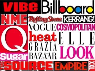
  • 2. The magazine Mastheads that I have represented in the mood board, mostly seems to like the idea of the boldest colour to be red. To me this is nice but it gets annoying that its used repetitively in a magazine also that more than one magazine uses this idea. I guess they are just following the Forms and Conventions of a magazine. For example; the magazine Q always has a red square around the letter and is in white, they have chose this colour for the magazine name to stand out when its on the shelf as it’s a bright colour and catches the eye quickly. On the contrary I think the Masthead of the ‘Billboard’ magazine is better with the idea of the design, as when the colour of the background is different, the masthead would be either white or black. Also inside the text on the letters they have a fill in and they are bold colours - red, blue, yellow all the primary colours, this makes the magazine unique and eye-catching. Some of the Magazines have outlined the writing of the Mastheads, I do like it a little bit as its unique not everyone follows this trend however then it doesn’t look great as it does make the text look smaller and tight. Furthermore some have added a shadow behind the text which does look quite nice as it seems that they are coming of the page. For example ‘Rolling Stones’ magazine has used it, this projects what the genre of the magazine is and what type of reader its applied to.