
Recommended
More Related Content
More from Saeed Moulai
More from Saeed Moulai (15)
Recently uploaded
Recently uploaded (20)
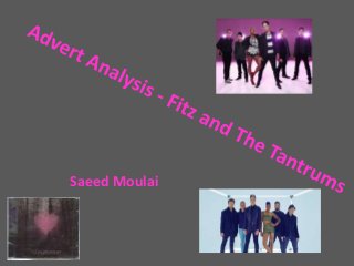
Advert Analysis Fitz And The Tantrums
- 1. Saeed Moulai
- 2. Typical conventions of digipaks in the Indie Pop genre • A simplistic background • A bold image or feature which is prominent • Many feature an image related to the band or the name of the song • Many feature pictures of the actual band, some with and some without instruments • There are usually three main colours that are used, but many albums feature a sepia/dark colour which reduces the amount of colour used
- 4. Bold, clear feature which stands out among everything else. Simplistic, white title which clearly portrays ‘Fitz And The Tantrums’ as the main text with the album name ‘More Than A Dream’ as a secondary Glow from the pink heart shining on the trees gives a mysterious effect Misty background adds to this effect Synergy between the pink logo on the advert, it is on the digipak and CD as well. Mysterious, dark background is typical of the indie pop genre Dark floor filters away into the sky which is becoming lighter the further up it is Three main colours are used. Pink, Navy and White