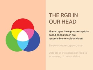
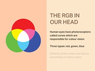
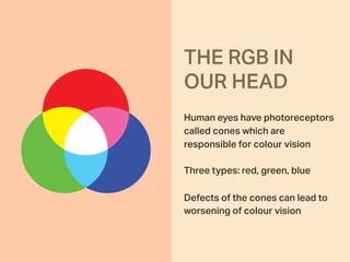
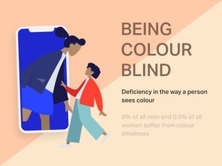
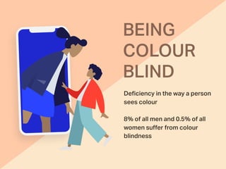
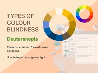
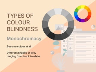
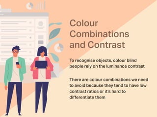
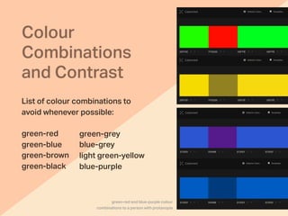
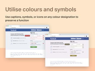
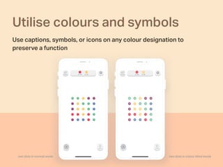
What are the types of color blindness and how to design a beautiful and functional UI that will also allow colorblind people to easily use a website or a mobile app.
3. Human eyes have photoreceptors
called cones which are
responsible for colour vision
Three types: red, green, blue
Defects of the cones can lead to
worsening of colour vision
THE RGB IN
OUR HEAD
4. THE RGB IN
OUR HEAD
Human eyes have photoreceptors
called cones which are
responsible for colour vision
Three types: red, green, blue
Defects of the cones can lead to
worsening of colour vision
5. THE RGB IN
OUR HEAD
Human eyes have photoreceptors
called cones which are
responsible for colour vision
Three types: red, green, blue
Defects of the cones can lead to
worsening of colour vision
19. Colour
Combinations
and Contrast
To recognise objects, colour blind
people rely on the luminance contrast
There are colour combinations we need
to avoid because they tend to have low
contrast ratios or it’s hard to
differentiate them
20. Colour
Combinations
and Contrast
List of colour combinations to
avoid whenever possible:
green-red
green-blue
green-brown
green-black
green-grey
blue-grey
light green-yellow
blue-purple
green-red and blue-purple colour
combinations to a person with protanopia
21. Use patterns
and textures
It’s advisable to add patterns
and textures to emphasise
contrast between objects
Add text labels to make them
even easier to understand
vola app uses pattern for their pie chart
22. Use patterns
and textures
It’s advisable to add patterns
and textures to emphasise
contrast between objects
Add text labels to make them
even easier to understand
vola app uses pattern for their pie chart
23. Utilise colours and symbols
Use captions, symbols, or icons on any colour designation to
preserve a function
24. Utilise colours and symbols
Use captions, symbols, or icons on any colour designation to
preserve a function
25. Utilise colours and symbols
Use captions, symbols, or icons on any colour designation to
preserve a function
two dots in colour blind modetwo dots in normal mode
30. Increase the size of
primary button
Reformation uses colour and size to emphasise primary button
Use icons, borders, or font
weight to differentiate buttons
Make primary
buttons stand out
31. Reformation uses colour and size to emphasise primary button
Increase the size of
primary button
Use icons, borders, or font
weight to differentiate buttons
Make primary
buttons stand out
32. Make primary
buttons stand out Increase contrast
between primary and
secondary buttons
Try different placement
combinations
Firebox presents their primary button in the bottom-right corner and the secondary button in the top-left corner
33. Make primary
buttons stand out
Try different placement
combinations
Firebox presents their primary button in the bottom-right corner and the secondary button in the top-left corner
Increase contrast
between primary and
secondary buttons
34. Mark required
fields on forms
Mark required fields with an
asterisk (*)
Label fields with the word
‘Required’ or ‘Optional’
35. Mark required
fields on forms
Mark required fields with an
asterisk (*)
Label fields with the word
‘Required’ or ‘Optional’
36. Mark required
fields on forms
Mark required fields with an
asterisk (*)
Label fields with the word
‘Required’ or ‘Optional’
37. Mark required
fields on forms
Mark required fields with an
asterisk (*)
Label fields with the word
‘Required’ or ‘Optional’
38. To summarise
Be aware of colour
combinations and contrasts
Use patterns and textures
Utilise colours and symbols
Use text labels
Underline links
Make primary buttons stand out
Mark required fields on forms
39. To summarise
Be aware of colour
combinations and contrasts
Use patterns and textures
Utilise colours and symbols
Use text labels
Underline links
Make primary buttons stand out
Mark required fields on forms
40. To summarise
Be aware of colour
combinations and contrasts
Use patterns and textures
Utilise colours and symbols
Use text labels
Underline links
Make primary buttons stand out
Mark required fields on forms
41. To summarise
Be aware of colour
combinations and contrasts
Use patterns and textures
Utilise colours and symbols
Use text labels
Underline links
Make primary buttons stand out
Mark required fields on forms
42. To summarise
Be aware of colour
combinations and contrasts
Use patterns and textures
Utilise colours and symbols
Use text labels
Underline links
Make primary buttons stand out
Mark required fields on forms
43. To summarise
Be aware of colour
combinations and contrasts
Use patterns and textures
Utilise colours and symbols
Use text labels
Underline links
Make primary buttons stand out
Mark required fields on forms
44. To summarise
Be aware of colour
combinations and contrasts
Use patterns and textures
Utilise colours and symbols
Use text labels
Underline links
Make primary buttons stand out
Mark required fields on forms
45. Color Blind Awareness
Helpful links
How to design (in Sketch,
Photoshop and Web) for colour
blind users
Color blindness: how to design
an accessible user interface
Designing UI with Color Blind
Users in Mind