1. CEO’S HAND WRITING
PERSONABLE - potraying the “Good
bloke factor”
LIFESTYLE IMAGERY
EMPATHIC & RELATABLE
EMPATHIC MESSAGING
EMPATHIC & RELATABLE
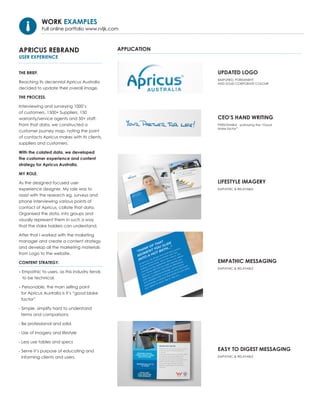
EASY TO DIGEST MESSAGING
EMPATHIC & RELATABLE
UPDATED LOGO
SIMPLIFIED, PORIMINENT
AND SOLID CORPORATE COLOUR
WORK EXAMPLES
Full online portfolio www.rvljk.com
APRICUS REBRAND
USER EXPERIENCE
THE BRIEF.
Reaching its decennial Apricus Australia
decided to update their overall image.
THE PROCESS.
Interviewing and surveying 1000’s
of customers, 1500+ Suppliers, 150
warranty/service agents and 50+ staff.
From that data, we constructed a
customer journey map, noting the point
of contacts Apricus makes with its clients,
suppliers and customers.
With the colated data, we developed
the customer experience and content
strategy for Apricus Australia.
MY ROLE.
As the designed focused user
experience designer. My role was to
assist with the research eg. surveys and
phone interviewing various points of
contact of Apricus, collate that data.
Organised the data, into groups and
visually represent them in such a way
that the stake holders can understand.
After that I worked with the maketing
manager and create a content strategy
and develop all the marketing materials
from Logo to the website.
CONTENT STRATEGY.
- Empathic to users, as this industry tends
to be technical.
- Personable, the main selling point
for Apricus Australia is it’s “good bloke
factor”
- Simple. simplify hard to understand
terms and comparisons
- Be professional and solid.
- Use of imagery and lifestyle
- Less use tables and specs
- Serve it’s purpose of educating and
informing clients and users.
APPLICATION