NO1 Top Black Magic Specialist In Lahore Black magic In Pakistan Kala Ilam Ex...
7_QC.ppt
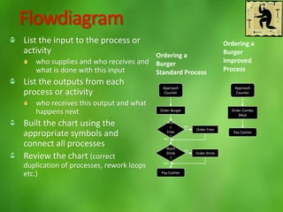
1. Flowdiagram
List the input to the process or
activity
who supplies and who receives and
what is done with this input
List the outputs from each
process or activity
who receives this output and what
happens next
Built the chart using the
appropriate symbols and
connect all processes
Review the chart (correct
duplication of processes, rework loops
etc.)
Approach
Counter
Order Burger
Wan
t
Fries
?
Want
Drink
?
Order Fries
Order Drink
Pay Cashier
YES
YES
NO
NO
Ordering a
Burger
Standard Process
Ordering a
Burger
Improved
Process
Approach
Counter
Order Combo
Meal
Pay Cashier
2. Cause and effect diagram
Define the problem (effect)
Define the major categories of causes
(materials, machines, methods, people, training,measurements
etc.)
Construct the diagram
Brainstorm possible causes
Analyse each cause
Identify the root causes
Gather data to verify the root causes
Problem
Cause 1
Cause 2
Categ. 1 Categ. 2
Categ. 3 Categ. 4
3. Histogram
Collect data
Arrange in ascending order
Determine the range of the
data
Determine the width of each
class interval (column)
Put class interval in the X-
axis
Put frequency scale on the
Y-axis
Draw the height of each
column
4. Pareto diagram
Select the items to be analyzed
Select the unit of measure for analysis
Select the time period to be analyzed
List the items in the order of decreasing
magnitude
Construct two vertical axes. The left scale
should present the units of measures and
the right one should be from 0% to 100%
Draw a rectangle above each item
Construct the the cumulative frequency
line
Identify the most important items
7. Control charts
Select the control chart type
Record measurement data on
the Y-axis
Plot the groups of data (e.g. by
date) on the X-axis
Calculate the average and
control limits
Mark points of x-bar and control
limits on the Y-axis
Plot observations