
Recommended
More Related Content
What's hot
What's hot (20)
More from PlanetKaizen-Stiftung
More from PlanetKaizen-Stiftung (6)
Recently uploaded
Recently uploaded (20)
2009 Cwipp Poster
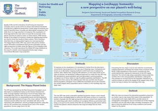
- 1. Centre for Health and Mapping a (un)happy humanity: Well-being a new perspective on our planet’s well-being in Public Benjamin David Hennig, Social and Spatial Inequalities Research Group, Policy. Department of Geography, University of Sheffield Aims Quality of life and the evaluation of well-being are important concepts used in social science to assess international standards of living from a different perspective. A wide range of measures are used to describe these concepts and allow global comparison. But while there is a huge selection of measures, the visualization of these lags behind the main aims to reveal the social state of the planet (and thus to enforce action on these issues). With human beings as the subject of research, traditional mapping approaches are used to show the results of these indices. This is causing a distorted view, as depopulated regions are overrepresented. The Happy Planet Index (HPI) was used in this work to further assess alternative visualisations that put the population into the right perspective to better show the figures of such Quality of life measures. The small map shows the Global HPI map published on the report's website (www.happyplanetindex.org/) using a conventional Mercator map projection. Methods Discussion To improve on the visualization it is necessary to refrain from the idea that a Comparing the two maps it can be seen that the conventional conventional map projection is the only way of drawing maps. Cartograms are mapping approach overdraws the mainly richer countries of the known as an alternative mapping method in which land area is replaced by North. Large populations of the poorer countries are thus another value. Rather than using the HPI indicators (or the index itself) as the underrepresented, making the impression of the HPI hugely value of interest, we developed a different approach to create the new HPI map. distorted. The revised map using a population-based projection We calculated an equal population grid and generated a world population rectifies this to the real population distribution, making this cartogram out of these values to map the global population distribution. The HPI map perhaps an unusual view for the beholder. Indications on values were then used as the defining value that was overlaid onto the grid- country borders as well as the display of the largest cities of the based population cartogram. As an additional orientation aid we also included world can help to deduce the meaning of this map. the world’s largest cities (population above 5 million) in the resulting map (see Background: The Happy Planet Index large map). The HPI was developed by the New Economics Foundation as an alternative to established indices as the Human Development Results Outlook index. It brings together well-being in terms of long, happy and meaningful lives, and the rate of resource consumption, thus The new HPI map using a population-gridded projection draws a more honest With this map we propose the presented population projection having a strong focus on sustainability issues and decreasing the picture of the (un)happy planet on which the HPI wants to focus on: it puts the as a better way to map issues that relate to the population. To supposedly high standard of living in the richer nations. The 2009 number of people into the right perspective and thus reveals how many people most people such maps might still be peculiar pieces of released second edition has been calculated with data on life are really living under which conditions of ecological efficiency and human well- cartographic extravagance, but an increased use of this mapping expectancy, life satisfaction, and the ecological footprint, using data being, or, to put it in the words of the HPI, the real efficiency with which nations technique can not only help to gain a broader acceptance, but sets for 143 countries and covering 99 per cent of the world’s convert the planet’s natural resources into long and happy lives for their also to show the patterns of our living conditions and human population. Scores range from 0 to 100. citizens. impact on the planet.