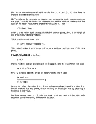
This document is a comprehensive guide to statistical report writing, emphasizing the importance of effectively communicating statistical findings through various methods such as tables, graphs, and structured reports. It covers the types of communication, the scientific format of reports, and practical tips for presenting data accurately and clearly. The content aims to aid students and new researchers in producing well-organized and meaningful statistical reports.


![...as Gyamfi and Adu (1990) demonstrated...
...as has been shown (Gyamfi & Adu, 1990)...
3 - 5 authors
If there are three to five authors, include only the last name of the first author
followed by "et al." and the year:
Alhassan et al. (2003) also noticed that...
Corporate authors
The names of groups that serve as authors (e.g. corporations, associations,
government agencies, and study groups) are usually spelled out each time they
appear in a text citation. If it will not cause confusion for the reader, names may
be abbreviated thereafter:
First citation: (Ghana Education Service [GES], 2005)
Subsequent citations: (GES, 2005)
Citing specific parts (pages, sections, & paragraphs)
To cite a specific part of a source, indicate the page, chapter, figure, table or
equation at the appropriate point in the text:
(Osei & Johnson, 1975, p. 9)
(Aboagye, 1982, Chapter 2)
For electronic sources that do not provide page numbers, use the paragraph
number, if available, preceded by the ¶ symbol or abbreviation para. If neither is
visible, cite the heading and the number of the paragraph following it to direct
the reader to the quoted material.
(Serwaa, 2005, ¶ 5)
(Boateng, 2001, Conclusion section, para. 1)
For electronic sources such as Web pages, provide a reference to the author, the
year and the page number (if it is a PDF document), the paragraph number if
visible or a heading followed by the paragraph number.
Indirect citations
When citing a work which is discussed in another work, include the original
author's name in an explanatory sentence, and then include the source you
actually consulted in your parenthetical reference and in your reference list.
Somed argued that... (As cited in Amankwah, 2000)](https://image.slidesharecdn.com/book-180421032748/85/A-GUIDE-TO-STATISTICAL-REPORT-WRITING-26-320.jpg)
![Zhao, S., Grasmuck, S., & Martin, J. (2008). Identity construction on Facebook:
Digital empowerment in anchored relationships. Computers in Human Behavior,
24(5), 1816-1836. doi:10.1016/j.chb.2008.02.012
2. URL for an online periodical
If there is no DOI for an article found in an online periodical, include the URL for
the journal home page.
Cooper, A., & Humphreys, K. (2008). The uncertainty is killing me: Self-triage
decision making and information availability. E-Journal of Applied Psychology,
4(1). Retrieved from http://ojs.lib.swin.edu.au/index.php/ejap/
5. Multimedia
Television or radio program
MacIntyre, L. (Reporter). (2002, January 23). Scandal of the Century [Television series
episode]. In H. Cashore (Producer), The fifth estate. Toronto, Canada: Canadian
Broadcasting Corporation.
Film, video recording or DVD
Kubrick, S. (Director). (1980). The Shining [Motion picture]. United States: Warner
Brothers.
With author's name and screen name
Apsolon, M. [markapsolon]. (2011, September 9). Real ghost girl caught on Video Tape
14 [Video file]. Retrieved from http://www.youtube.com/watch?v=6nyGCbxD848
With only screen name
Bellofolletti. (2009, April 8). Ghost caught on surveillance camera [Video file]. Retrieved
from http://www.youtube.com/watch?v =Dq1ms2JhYBI&feature=related
Online Lecture Notes and Presentation Slides (such as Module)
Cress, C. M. (2009). Curricular strategies for student success and engaged learning
[PowerPoint slides]. Retrieved from
http://www.vtcampuscompact.org/2009/TCL_post/presenter_powerpoints/Christine%20
Cress%20-%20Curricular%20Strategies.ppt
6. Web pages
Web pages & non-periodical documents on the Internet](https://image.slidesharecdn.com/book-180421032748/85/A-GUIDE-TO-STATISTICAL-REPORT-WRITING-30-320.jpg)
![ Include the author, title of the document, and if available, always include the
date the material was updated or posted online. If the page may be changed or
moved, include the date of retrieval. Include the URL of the document cited.
If there is no author, place the title in the author position.
If there is no date, replace the date with (n.d.) to signify that there is no date for
the material.
Add a description of the source in square brackets after the title, if this is
necessary to clarify the type of source e.g. [Bibliography] [PowerPoint slides]
[Multimedia presentation]
Library and Archives Canada. (2008). Celebrating women's achievements: Women
artists in Canada. Retrieved from http://www.collectionscanada.gc.ca/women/002026-
500-e.html
If the source material is likely to change over time (e.g. wikis), include the
retrieval date.
Geography of Canada. (2009, September 29). In Wikipedia, the free encyclopedia.
Retrieved September 30, 2009, from
http://en.wikipedia.org/wiki/Geography_of_Canada
APPENDICES
An Appendix contains information that is non-essential to understanding of the paper,
but may present information that further clarifies a point without burdening the body of
the presentation. An appendix is an optional part of the paper, and is only rarely found
in published papers.
Headings: Each Appendix should be identified by a Roman numeral in sequence, e.g.,
Appendix I, Appendix II, etc. Each appendix should contain different material.
Some examples of material that might be put in an appendix are
Raw data
Charts (foldout type especially)
Extra photographs
Explanation of formulas, either already known ones, or especially if you have
"invented" some statistical or other mathematical procedures for data analysis.
Specialized computer programs for a particular procedure
Full generic names of chemicals or compounds that you have referred to in an
abbreviated fashion or by some common name in the text of your paper.
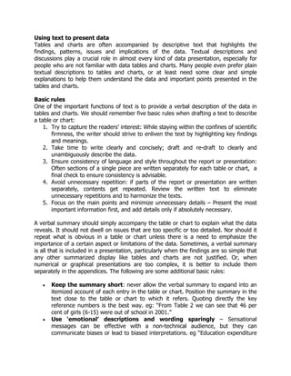
Figures and Tables in Appendices
Figures and Tables are often found in an appendix. These should be numbered in a
separate sequence from those found in the body of the paper. So, the first Figure in the](https://image.slidesharecdn.com/book-180421032748/85/A-GUIDE-TO-STATISTICAL-REPORT-WRITING-31-320.jpg)

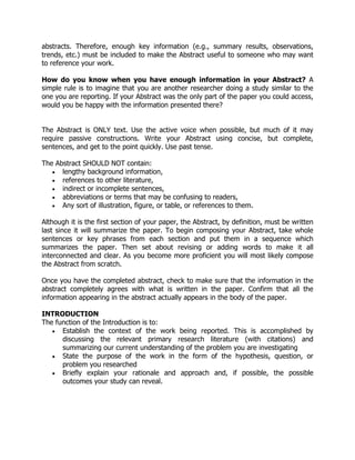
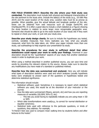
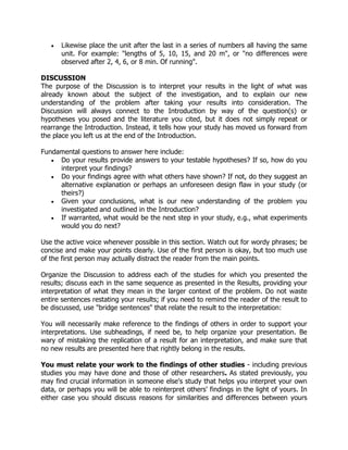
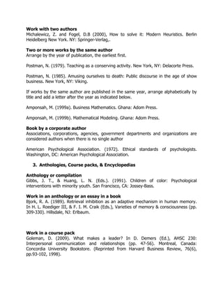
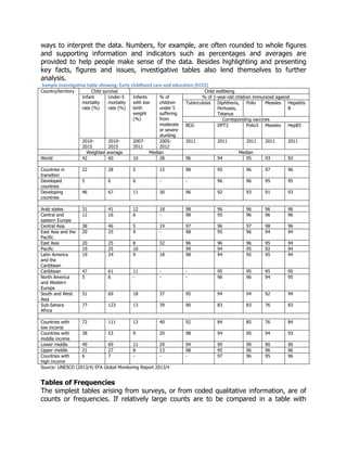
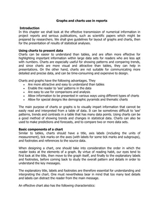
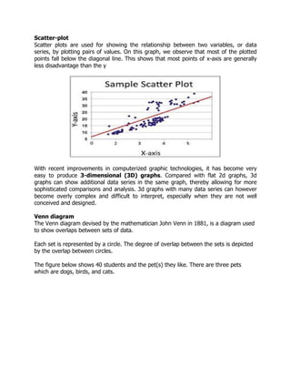
![Reference tables has
• Potentially many values, including appropriate totals and subtotals.
• Unrounded (or less rounded) data.
Below is a reference table that presents the number of students enrolled in a school by
gender, age and class.
Sample reference table (enrolment by age, class and sex)
Age Primary1 Primary2 Primary3 Primary4 Primary5 Primary6 Primary1-6
M F M F M F M F M F M F M F Total
6 years 80 55 34 21 6 2 2 0 0 0 0 0 122 78 200
7 years 63 50 94 104 5 14 1 5 0 0 0 0 163 173 336
8 years 45 34 68 70 78 98 12 21 2 9 0 0 205 232 437
9 years 12 9 30 24 67 63 94 79 9 17 1 0 213 192 405
10 years 4 1 12 4 31 19 16 12 37 41 9 15 109 92 201
11 years 0 0 2 0 12 4 3 5 89 81 21 52 127 142 269
12 years 0 0 0 0 0 0 0 0 21 18 69 78 90 96 186
Above 12 0 0 0 0 0 0 0 0 4 5 42 31 46 36 82
Total
enrolment
208 150 241 224 199 200 128 122 162 171 142 176 1075 1041 2116
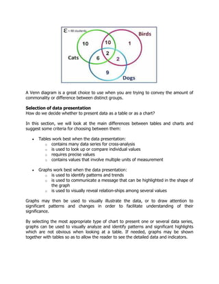
in the above example, we can see that the reference table shows in most cells, absolute
numbers of students detailed by single years of age, class-by-class and separately by
sex (female [f] and male [M]).
This is an important reference table in primary education because it enables in-depth
analysis of the patterns of participation by presenting data about the distribution of
students by age and by class, and the age-class correspondence of students by gender.
The absolute numbers presented in the table can be used to make additional
calculations to derive indicators such as the age-specific and grade-specific enrolment
ratios, and the percentage of over-aged and under-aged students in each class which
are crucial parameters in managing primary education.
By summarizing the calculated indicators and the results of further analysis of detailed
data in the reference tables, we can create investigative tables which present the key
findings for use by non- technical audiences.
Commentary (Exploratory) Tables/ Investigative Tables
Investigative tables like the one below present only the key data and indicators that can
be understood and interpreted by lay persons. They are often accompanied by
descriptions and explanations which highlight the findings, explain the terms used, and](https://image.slidesharecdn.com/book-180421032748/85/A-GUIDE-TO-STATISTICAL-REPORT-WRITING-35-320.jpg)

![2. Take the log (value of interest/nearest lower value decade) multiplied by the
number determined in step one.
3. Using the same units as in step 1, count as many units as resulted from step 2,
starting at the lower decade.
Example: To determine where 17 is located on a logarithmic axis, first use a ruler to
measure the distance between 10 and 100. If the measurement is 30mm on a ruler (it
can vary — ensure that the same scale is used throughout the rest of the process).
[log (17/10)] × 30 = 6.9
x = 17 is then 6.9mm after x = 10 (along the x-axis).
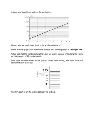
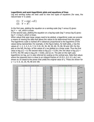
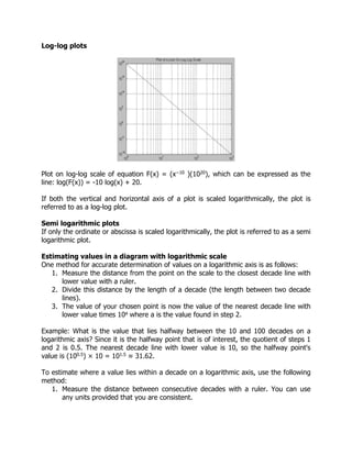
Graphs on Logarithmic and Semi-Logarithmic Paper
In a semi logarithmic graph, one axis has a logarithmic scale and the other axis has a
linear scale.
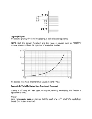
In log-log graphs, both axes have a logarithmic scale.
The idea here is we use semi log or log-log graph paper so that we can more easily see
details for small values of y as well as large values of y.
Semi-Logarithmic Graphs
Example 1: Variable Exponent
Plot the graph of y=5x on normal and then semi logarithmic paper.
Answer we first graph y = 5x using ordinary x- and y- linear scales (the space between
each unit remains fixed for both axes):
We see that the detail for anything less than x = 2 is lost.](https://image.slidesharecdn.com/book-180421032748/85/A-GUIDE-TO-STATISTICAL-REPORT-WRITING-57-320.jpg)