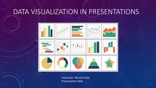
2. WHAT IS DATA VISUALIZATION
Graphical representation of information and data
• Helps see and understand trends and patterns
• Essential to analyze massive amounts of
information
• Helps grab interest and keep eyes on the message
3. APPLICATION OF DATA VISUALIZATION
• Presenting Statistics
• Mapping
• To show change over time
• To compare values
• To show connections
5. • Line charts are usually used to show trends, for instance comparing data over
time or distance.
LINE CHARTS
U.S. Unemployment Rate, 1975–2014.
Altitude–Air-Density Relationship. The thin air at high
altitudes explains why many mountain climbers need
to use oxygen tanks as they reach the top of a
mountain.
7. PIE CHARTS
• Pie charts show proportions of a whole
• circle represents a group as a whole.
• The slices show the relative sizes
of subgroups
Pie Graphs of the U.S. Age Distribution (in millions).
8. 5 Step Approach for Reading Charts and Graphs
Ask these questions when you encounter visual data in your reading:
• What is the topic?
• What is being measured?
• How is it being measured?
• Is color-coding used and if so, how?
• Can I summarize this information in my own words?
SP1: A scatter plot of age and final exam score variables. Notice this scatter plot does not indicate a linear relationship. The points do not appear to follow a trend. In other words, there does not appear to be a relationship between the age of the student and the score on the final exam.
SP2: A scatter plot of cricket chirps vs. temperature. This data does indicate a linear relationship (shown here by the red line), which means that we may be able to guess at chirps-temperature relationships beyond the recorded data we have (a process known as interpolation or extrapolation).
Bar graphs usually compare quantities of different things. So while you might measure the changing population of one country with a line graph, you would compare the populations of different countries with a bar graph:
The graph shows the 12 countries of the world with the largest populations. The height of the bars in the bar graph shows the size of the population for each country.
A circle represents a group as a whole. The slices of this circular “pie” show the relative sizes of subgroups.
Visual data are meant to be “read,” just like text on a page. Images with data often contain crucial information that isn’t available elsewhere in a text.
What is the topic?
Look for the title and reword it in your own words
What is being measured?
Look for labels to get an idea of what the graph is saying
How is it being measured?
Look for units
Ask yourself if the units make sense with what you know about the graph so far
Is color-coding used and if so, how?
Color-coding is often used to add additional information to a graph without taking up extra space
Check for a key that explains the color coding
Can I summarize this information in my own words?
Look for a trend or a piece of information that you find interesting and mentally form a sentence about it
If you are struggling with this step, don’t get frustrated or give up. Instead, start over from Step 1. Each time you investigate the visual data you are building up your knowledge and understanding of the information.
In 2005, the proportion of online sales of food and beverages was 22%, but this rose to 32% in 2010. The percentage for internet sales of video games also went up, by 5% from the 2005 figure of 18%. In contrast, the percentages of the online sales of the other sectors decreased. The most dramatic fall was in the home furnishings retail sector. While this figure was 25% of the total online sales of these four sectors in 2005, it fell to just 15% in 2010. There was also a decrease in the electronics and appliances sector, which saw a fall from 35% in 2005 to 30% in 2010.