

Recommended
More Related Content
What's hot
What's hot (13)
Similar to ¿Who Am I?
Similar to ¿Who Am I? (20)
Recently uploaded
Recently uploaded (20)
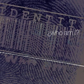
¿Who Am I?
- 1. ¿who am i?
- 3. I am that powerful combination of left-brain detail and right-brain creativity: An organized, deadline-driven, de- tail-oriented and highly-motivated problem solver. For me Design is a constantly evolving and ever-changing ephemera. As a classically trained typographer, I have developed a keen sense of communicating with type. It is not enough to simply put text on a page. The manner in which it is done should be intriguing, inviting, powerful and captivating. I am highly influenced by the Bauhaus and Swiss schools, and I consciously try to counterbal- ance form and function, with the desire to liberate the page by pushing the boundaries of conventional and formal considerations—taking from what works and discarding what does not. Designs are best when they are the fruit of inspirational team collaborations: copywriters, image-makers, strat- egists, developers, clients and audiences. Young, raw talent and old, sage wisdom, are equally capable of asking, “Why?”—As well as deciding, “Why not?” Rules certainly have their place, but “No Left Turn”, does not exclude additional options! As a 20-plus year industry veteran, I have broad-range of experiences in Creative Direction of Marketing Com- munications, Branding Identity, Brand Management, Design and Illustration in corporate and agency envi- ronments. Independently and collaboratively, I have developed Logos, Brand Identities and Corporate Branding Stan- dards for large, multinational concerns, start-up and established, small and mid-sized business. Branding is the most valuable asset in any organization, making it one of the wisest areas for a business to in- vest. Positioning a brand to resonate myriad audiences, creating a memorable experience is what I do. I am pas- sionate about helping corporate decision-makers better understand the value of their brand and the power of a well-executed visual communication strategy. Think. Plan. Execute.
- 4. There are two times in the life- cycle of any company when it considers the importance of its logo: 1. In the beginning, when it has everything to gain 2. In the end, when it has nothing to lose. Some years ago, I came upon a quote concerning the importance of logo design. I can neither remember its exact wording, nor its authorship. I keep it mind when I design logos… I recognize the business truths in these statements.
- 5. From concept, through development—until the public unveiling… to these measures I do abide! Logo design is the most important element in building brand recognition. A logo conveys a message about a company and its product to an intended audience. It should do so without additional explanation or context. simplicity Less is more. Incorporate as many messages about a company and what it does, in as few elements as possible. Overly ornate logos generally have limited versatility because they try to say too much and cover too much territory. memorability Create a unique concept, strip it down to a basic level—and the logo will have more impact. The design should be simple, easy to recall and use imagery or typography that resonates with the intended audience. timelessness Rebranding should not be considered a normal part of busi- ness. To insure brand equity, a logo should withstand the test of time. When designing a logo, I avoid trends, unnecessary effects and gimmicks. flexibility A logo should be scalable to different sizes without losing qual- ity. It should also work in one color and against a dark back- ground without losing integrity. A logo should work across vari- ous media and within different contexts. relevance An integral component of creating an effect logo is understand- ing your target audience. Knowing what is appropriate for a target audience will typically dictate font, color and associated imagery.
- 6. client: artisan medical devices, inc. Cosmetic dentistry tools Each tool has a soft, interchangeable, translucent shaping-tip that is used to apply dental bonding material to the surface of the tooth. The handle is fitted with a UV light source that illuminates the shaping-tip, while hardening the material. In the logo, the tittle has been replaced with a triangular “tip” that alludes to the tip shape. Blue is used to imply the UV light source—with the font, Rotis Semi-serif, suggesting the sculpting technique by which the material is manipulated.
- 7. client: hero house, inc. Artists on the Edge HERO House is a place where people recovering from severe mental illness, come to rebuild their lives and rejoin their commu- nity. Artists on the Edge, is a program offered by HERO House, to facilitate self-therapeutic recovery through artistic expression in various media. The name, Artists on the Edge, and the logo design are intended to convey a deliberately cheeky ambiguity as to the purposes, products and participants of the program.
- 8. client: cannuflow, inc. Flexible arthroscopic cannulas Cannuflow, fabricates flexible arthroscopic cannulas that facil- itate minimally-invasive knee-surgery, while reducing recovery periods. The organic shape, replacing the crossbar, along with the color combination, are meant to invoke the fluidity with which the can- nulas are manipulated, their flexible construction—as well as to reflect the blue color of the silicone device.
- 9. client: hitachi data systems, inc. Channel One Reseller Marketing The logo incorporates Hitachi Red, to provide a direct tie-in to the established, brand identity standards of both Hitachi, Ltd., and Hitachi Data Systems—its wholly-owned subsidiary. The split-complement, violet color has substituted for the secondary Hitachi Grey, to establish the program as separate from, but sup- ported by, both parent-organizations. This logo is featured in the book, Bullet-Proof Logos, by David E. Carter and James R. Higgins.
- 10. client: the company theatre Performing Arts Troupe Letterforms, are utilized to create the visual metaphor for the- atre: with the audience in burgundy-velvet, loge seating, and the stage offset with a neutral-platinum tone. This logo was accepted into the 1990 Print Design Annual.
- 11. client: donald pedersen, aia Architecture The initials of Architect Donald Pedersen, are interwoven in three- dimensionality, and are anchored on an island of soft, neutral green that mimics that of a draftsman’s surface.
- 12. client: the duncan group, inc. High-technology Marketing Services The logo is set in ITC Bodoni, to connote a tempered and tested level of services. Colored in split-complements: orange, distin- guishes the organization’s founder, Len Duncan, while violet rein- forces the timbre of The Duncan Group brand. The ligature of the lowercase “u” and “n” was incorporated to provide an additional nuance of visual interest.
- 13. client: hero house, inc. “A place where people recovering from severe mental illness, come to rebuild their lives and rejoin their community.” This logo redesign maintains the original concept and color- scheme of its predecessor. It has simply been updated to in- crease the sophistication of the original execution.
- 14. client: hitachi data systems, inc. The effort was a collaboration between internal HDS Corporate Marketing Communications group and Craig Frazier Design. Hitachi Data Systems, Inc., is a wholly-owned subsidiary of Hi- tachi, Ltd., dedicated to the sale of mass-storage devices. The company had originally commissioned the design of its own unique identifying logo. In rebranding analysis, it was determined efficacious to capitalize on the significant brand equity of Hitachi, Ltd., by using its existing logo and corporate colors—fitting it with Data Systems to establish the company as a subsidiary.
- 15. client: hot shots A Children’s Hair Salon Big shapes and bold color are meant to be bright, attractive and easily interpreted by adults and children alike.
- 16. client: marketbound Product-launch services Different weights of ITC Futura, and a stark color combination accentuate the purpose, direction and active, imperative nature of this Time-to-Market service organization.
- 17. client: artists’ open studios: san josé, california The icon is derived from the AIGA sign-symbol for access—or ingress. It has been simply, and uniquely modified to serve as a quickly identifiable logoform for each piece of marketing col- lateral, as well as a sign marker for each stop, on the annual tour event.
- 18. client: sancastle technologies, inc. Storage-area network solutions The logoform and its ocher color, establish and solidify the metaphor invoked by the company name. The SAN acronym is emphasized by boldface, all-capped and then, set in x-height to ensure that the company name and its product services, main- tain an integral hierarchy.
- 19. client: worlds, inc. Massively multiplayer online role-playing game The classic engravers display face, Serlio, in a muted earth- tone—with a dual-orb iconography inset, in bright yellow— evoke the anachronism of fantasies-future and fantasies-past.
- 21. Curriculum Vitae Michael A. McCann 425.803.6390 tristanztt@live.com Portfolio education 1987 BS Graphic Design Illustration and Art Direction Minor in Humanities and Literature San José State University certifications 2009 University Tutor Bellevue College, Bellevue, Washington The College Reading and Learning Association 1992 Project Management The Boeing Company 1989 System Administration Macintosh, Windows and UNIX environments. Apple, Inc.
- 22. Curriculum Vitae achievements awards Communication Arts How International Association of Business Communicators Print Printing Industries of America Western Art Directors Club collections American Corporate Identity Bullet Proof Logos Creativity Graphic Design USA Logos 2000 Print Casebooks Average savings on vended print collateral of $1 mil lion annually for Amdahl and Hitachi Data Systems. Effective management of creative staff, vendors and clients. Trained, supervised and evaluated staff, coached im provement project management skills, resulting in successful time-to-market campaigns product launches, under tight deadlines. Experienced Copywriter: Advertising and marketing copy, and in-house newsletters and corporate organs. Accomplished Presenter and Public-speaker: Design presentations, public advocacy and peer training Acceptance by portfolio review into Bachelor of Sci ence Design program. Graduated with distinction.
- 23. Curriculum Vitae clients Any Mountain Artist Publications Bendixen-Redding Café de Flore Cannuflow Cognigine Elemental Records EXAC Corporation The Fine Art of Feelings The Goethe Institute International Association of Business Communicators The Insider HCM Hewlett-Packard KUSF College Radio Mervyn’s California Muccino Design Group Pagliaro-Kuhlman Advertising RV Parts Outlet Ralph Records Randall Crandall Reckless Records SANcastle Technologies San José Institute of Contempo- rary Art San José Art League Tandem Computers The William and Flora Hewlett Foundation Yukon Inflatables
- 24. Curriculum Vitae employment 2008-2014 Marketing Communications Volunteer | Board Member Representative HERO House, Bellevue, WA Specializing in Brand Identity development, General Art Direction and Marketing Communications. 2000-2005 Creative Director Red Circle Communications, Los Gatos/San Francisco, CA Full-spectrum Design, Creative/Art direction; specializing in Brand Identity and Marketing Communications. 1995-2000 Associate Creative Director Hitachi Data Systems, Santa Clara, CA In-house creative overseeing design and development of a broad range of Marketing Communications Collateral, including: product brochures and specification sheets, special-event collateral, posters, Branding Identity and branding standards, packaging and web-media direction. 1990-1995 Senior Art Director Amdahl Corporation, Sunnyvale, CA In-House creative overseeing development of identity standards and implementation, and maintaining integrity over all levels of Corporate Communications media. Design and development of a broad range of Marketing Communications Collateral, including: product brochures and specification sheets, special-events collateral and posters. 1985-1995 Freelance Creative Design: Extremis, Los Gatos and San Francisco, CA Freelance consultant: Art Direction, Design and Illustration for design firms, small studios, corporations, art galleries and arts organizations, and small-business.
- 25. Curriculum Vitae community involvement Mental health advocacy HERO House, Bellevue, WA Homeless advocacy Congregations for the Homeless, Bellevue, WA affiliations AIGA IABC WADC SFADC references Roberta Lyon Past Board Secretary: HERO House 425.898.9993 robertajlyon@comcast.net Abe Kriger Founder, Chair Emeritus: HERO House 425.868.7050 abekriger@aol.com Phil Gerson Past Board Member: HERO House 425.890.8685 pgerson_8@msn.com Annie Holt Public Affairs and Policy: Pfizer 206.920.6240 anna.k.holt@pfizer.com Daya Astor Arts Educator 425.652.9532 art.dba@comcast.net