
Recommended
More Related Content
Viewers also liked
Viewers also liked (19)
Similar to Action for Children website redevelopment
Similar to Action for Children website redevelopment (20)
Recently uploaded
Recently uploaded (20)
Action for Children website redevelopment
- 1. Action for Children website redevelopment – actionforchildren.org.uk
- 2. Before… • Cramped, cluttered, and dated – both in design and content. Not device responsive, and built on a fragile codebase. • Unengaging, with no clear narrative about the organisation or what it does. • Difficult to navigate and not user-centred – far too much content (>5000 pages) and information architecture reflected internal desires and priorities. • Dull donation journey, and the organisation heavily relied on fundraising income.
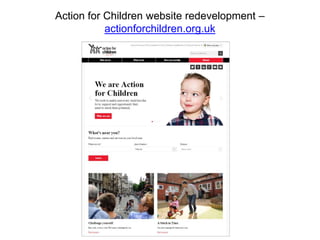
- 4. After… • Bright and modern full-width design, coupled with simple, strong font, leaves content uncluttered and easy to read. • Responsive on tablets and mobile devices. • Simplified navigation built around user insights and top tasks.
- 5. • Ability to create more immersive and engaging stories and factual content. • More prominent calls-to-action help users continue their journey and surface relevant content. • Making better use of strong imagery and video.
- 6. • More compelling fundraising content. • Clear and easy to use donation form.