HealthSimple™ Brand Book
•
2 likes•445 views

Part brand manifesto, part graphic standards for diabetes health and wellness brand HealthSimple, created by Mark Saunders and the team at HartungKemp Design Agency in Minneapolis. The first edition of this document was to released to client marketing and agency teams in 2007.

Recommended
More Related Content
Viewers also liked
Viewers also liked (15)
Similar to HealthSimple™ Brand Book
Similar to HealthSimple™ Brand Book (12)
More from Mark Saunders
Recently uploaded
Recently uploaded (20)
HealthSimple™ Brand Book
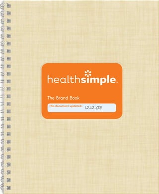
- 1. The Brand Book This document updated: 12.12.08
- 2. This book attempts to illustrate the HealthSimple™ Brand vision. What we’re about. How we relate to others. What we look like. How we present ourselves. So no matter who is communicating on our behalf, we stay true to what makes us who we are. 1
- 3. 3 ********************************************** ********************************************** 2 ********************************************** ********************************************** ********************************************** ********************************************** ********************************************** ********************************************** ********************************************** ********************************************** This sounds pretty, but maybe we should clarify a bit. ********************************************** ********************************************** ********************************************** ********************************************** 50 color formulas ********************************************** ********************************************** 40 legal name style ********************************************** 28 logo usage ********************************************** 9 advocate model ********************************************** ********************************************** Quick reference: ********************************************** ********************************************** ********************************************** a way to be, and to become. an outlook, a unique approach, ********************************************** ********************************************** ********************************************** ********************************************** 80 real examples ********************************************** a resource, an advocate, 68 brand structure a promise, a community, ********************************************** 30 brand look ********************************************** 22 brand mark a name, a brand, ********************************************** 16 brand personality ********************************************** ********************************************** 4 brand story ********************************************** ********************************************** What are we? Contents: ********************************************** ********************************************** ********************************************** ********************************************** ********************************************** ********************************************** ********************************************** ********************************************** ********************************************** ********************************************** ********************************************** ********************************************** ********************************************** ********************************************** ********************************************** ********************************************** ********************************************** **********************************************
- 4. 5 ********************************************** ********************************************** 4 ********************************************** ********************************************** ********************************************** ********************************************** ********************************************** ********************************************** ********************************************** ********************************************** ********************************************** ********************************************** ********************************************** ********************************************** ********************************************** ********************************************** the hope of improving people’s lives. ********************************************** ********************************************** thoughtful design, created with ********************************************** ********************************************** ********************************************** ********************************************** ********************************************** delightful experiences, united by Our world is filled with surprisingly ********************************************** ********************************************** ********************************************** ********************************************** ********************************************** ********************************************** brand story ********************************************** connection to a caring community. section 1: ********************************************** ********************************************** useful tools, and a meaningful that offers unique nutritional products, ********************************************** ********************************************** ********************************************** ********************************************** ********************************************** The HealthSimple™ Brand is an advocate ********************************************** ********************************************** Who we are: ********************************************** ********************************************** ********************************************** ********************************************** ********************************************** ********************************************** ********************************************** ********************************************** ********************************************** ********************************************** ********************************************** ********************************************** ********************************************** **********************************************
- 5. vision We support you • By listening and encouraging. • With experiences that inspire you to eat well and be well. • With tools that help you “get it” and apply what you’ve learned to your daily life. What we do: We connect you • To a community — our community — united by similar We advocate for the people we experiences, needs and desires. serve in [at least] three ways: • To great products, through relevant, trustworthy channels. • To a carefully and thoughtfully edited library of resources. We offer products that help you • Manage your nutrition. • Maintain and improve your health. • Make life easier. • Stay motivated. 6 7
- 6. vision: advocate model The advocate point of view influences every touchpoint and every business decision. nutritionals What does it mean to be an advocate? resources An advocate: support allay fears tools Listens. Puts your concerns first. advocate community connection Motivates you. Helps get you through. educate Doesn’t give you a sales pitch. motivate partnerships inspire Rather, suggests stuff that really works. And helps you find it. channels affiliations advocate experience destination solution 8 9
- 7. vision In case you didn’t know... Why does it matter? This is how it all started. Health problems like diabetes and obesity are epidemics. Yet many who One day, Maya was diagnosed with Type 1 diabetes, and life for the whole family suddenly changed. Her parents, Doug and Lisa, searched high and low for anything that could help make sense of it all — the calculations, live with these health issues have been the monitoring, and all the other stuff there is to learn. They didn’t find anything that really worked. So being designers, they decided to create misunderstood and underserved — some simple tools for themselves: flashcards, cheat sheets, and the like. by the health care system, by the And the concept that would become the HealthSimple™ Brand was born. public at large, and even by their own support networks. 10 11
- 8. vision The people we touch partners/supporters health care professionals The people we seek to reach are a people with... diverse group in lots of ways. Yet there are a few things that unite them: Type 1 Type 2 Diabetes Diabetes They need to eat (and live) differently for better health. They’ve reached a turning point — a new Weight Loss diagnosis, a new treatment plan, or Surgery even a new attitude. Their emotions run a bit like a roller coaster. Confused and overwhelmed one day. Totally in control the next. 12 13
- 9. ********************************************** ********************************************** 15 14 ********************************************** ********************************************** ********************************************** ********************************************** ********************************************** ********************************************** ********************************************** ********************************************** ********************************************** ********************************************** ********************************************** ********************************************** ********************************************** ********************************************** (Flip to page 64 for the lowdown.) ********************************************** ********************************************** is a renewable resource. something as simple as paper choices. ********************************************** ********************************************** products and tools. Because creativity Our sense of “greenability” begins with ********************************************** ********************************************** development and packaging of our ********************************************** ********************************************** ********************************************** much as possible, including research, everyone. Even trees! ********************************************** ********************************************** limiting our environmental impact as sustainability, which is healthy for ********************************************** ********************************************** We encourage creative approaches to for ways to support environmental ********************************************** ********************************************** ********************************************** The HealthSimple™ Brand is always looking ********************************************** ********************************************** and other tough nutritional challenges. ********************************************** The only thing we don’t recycle is ideas. ********************************************** Our simple, sustainable philosophy: ********************************************** brand for people living with diabetes ********************************************** ********************************************** We’re more than just an advocate ********************************************** ********************************************** ********************************************** ********************************************** ********************************************** ********************************************** ********************************************** ********************************************** ********************************************** ********************************************** ********************************************** ********************************************** vision: environment ********************************************** **********************************************
- 10. 17 ********************************************** ********************************************** 16 ********************************************** ********************************************** ********************************************** ********************************************** ********************************************** ********************************************** ********************************************** ********************************************** ********************************************** ********************************************** (But our category can be.) ********************************************** ********************************************** ********************************************** ********************************************** status quo unconventional ********************************************** ********************************************** ********************************************** ********************************************** ********************************************** overwhelming replenishing intimidating motivating ********************************************** ********************************************** misleading positive (But not Pollyanna.) ********************************************** ********************************************** ********************************************** ********************************************** ********************************************** unrealistic authentic ********************************************** brand personality impersonal human ********************************************** section 2: ********************************************** incomprehensible intuitive ********************************************** ********************************************** medicinal inviting ********************************************** ********************************************** We are not We hope to be ********************************************** ********************************************** ********************************************** ********************************************** ********************************************** ********************************************** ********************************************** ********************************************** ********************************************** ********************************************** ********************************************** ********************************************** ********************************************** ********************************************** ********************************************** ********************************************** ********************************************** **********************************************
- 11. personality Your hippest aunt is the quintessential advocate. If our brand were a person, she would be your hippest aunt. The one whose shoulder you cry on. The one who always understands. The one you go to for the most important advice, on the stuff you can’t bring to anyone else. She never judges. Never nags. But tells it like it is in a really caring, wise way. And manages to make you smile at the same time. 18 19
- 12. ********************************************** ********************************************** 21 20 ********************************************** ********************************************** ********************************************** ********************************************** ********************************************** ********************************************** ********************************************** book. They keep things real. And human. ********************************************** ********************************************** or dramatic. (Or just blatantly obvious.) You’ll find little asides throughout this ********************************************** We’re not afraid to call out things which sound overly [if necessarily] intellectual that we’re behind you 100 percent. ********************************************** ********************************************** Be just a bit self-conscious. what you’re going through. And ********************************************** ********************************************** and inspire. But keep in mind, too much cheerleading can be annoying. got to show that we understand ********************************************** Everybody needs a lift once in a while. Our words should motivate, encourage, ********************************************** ********************************************** one-on-one conversation. We’ve ********************************************** Be positive. ********************************************** and invite you into a real live ********************************************** sources when necessary. But let’s do it in a conversational, accessible way. ********************************************** We must always present information with clarity and precision, citing credible “the patient” and “disease,” ********************************************** We are the experts. But experts with a disarmingly humble bedside manner. ********************************************** ********************************************** Be credible. gotta throw out cold terms like ********************************************** ********************************************** communicate in a new way. We’ve “dumbed down” so much as to be condescending. ********************************************** It should be familiar, non-threatening, and free of industry jargon. But not ********************************************** different (and we are), we must ********************************************** who you’re talking to and use language that’s relevant to her experience. ********************************************** The more we can relate to a message, the more we take it to heart. So know ********************************************** If we’re going to signal that we’re ********************************************** ********************************************** Be accessible. ********************************************** clever headlines, subheads, and body copy. They are contextual and narrative. ********************************************** Not them. (Or their, or they.) And another thing: conversations don’t have of the time. ********************************************** talk with someone right there in front of us. Someone specific, meaning you. ********************************************** A conversation is informal oral communication — talk. So let’s write how we’d ********************************************** is pretty uninspiring most ********************************************** ********************************************** Be conversational. Let’s face it. Our category ********************************************** ********************************************** ********************************************** How to speak our language: ********************************************** ********************************************** ********************************************** ********************************************** ********************************************** ********************************************** ********************************************** personality **********************************************
- 13. 23 ********************************************** ********************************************** 22 ********************************************** ********************************************** ********************************************** ********************************************** ********************************************** ********************************************** ********************************************** ********************************************** ********************************************** ********************************************** ********************************************** ********************************************** ********************************************** ********************************************** ********************************************** ********************************************** ********************************************** ********************************************** ********************************************** ********************************************** ********************************************** ********************************************** ********************************************** ********************************************** ********************************************** ********************************************** ********************************************** brand mark ********************************************** section 3: ********************************************** ********************************************** ********************************************** ********************************************** ********************************************** ********************************************** ********************************************** This is our logo. ********************************************** ********************************************** ********************************************** ********************************************** ********************************************** ********************************************** ********************************************** ********************************************** ********************************************** ********************************************** ********************************************** ********************************************** ********************************************** ********************************************** ********************************************** **********************************************
- 14. logo Our name describes what we’ve set out to do, which is this: Our logo is made up of We motivate and encourage you to two basic elements. The name -> improve your health and nutrition by offering smart, yet profoundly simple things that help you do just that. And that help make living with certain health matters easier. Our name also sets a standard. The word simple is in bold because it’s our benchmark. It’s the promise of every product we make. And the foundation for every relationship we build. 24 25
- 15. ********************************************** ********************************************** 27 26 ********************************************** ********************************************** ********************************************** ********************************************** ********************************************** ********************************************** ********************************************** ********************************************** ********************************************** ********************************************** we just need a little help to find it. ********************************************** ********************************************** ********************************************** The spark is within us all. Sometimes ********************************************** ********************************************** ********************************************** ********************************************** to stay on track. ********************************************** ********************************************** ********************************************** to make it happen. And the stamina ********************************************** ********************************************** for the better. It gives us the energy ********************************************** ********************************************** The spark motivates us to change ********************************************** ********************************************** ********************************************** ********************************************** ********************************************** I can do this ! ********************************************** ********************************************** are possible after all. That now, ********************************************** ********************************************** ********************************************** sudden realization that good things ********************************************** ********************************************** of a great new discovery. It’s the ********************************************** ********************************************** ********************************************** surprise — and subsequent relief — ********************************************** ********************************************** The spark is the aha! The delicious And the spark -> ********************************************** ********************************************** ********************************************** ********************************************** ********************************************** ********************************************** ********************************************** ********************************************** logo ********************************************** **********************************************
- 16. logo usage Locating the logo: Use the logo wisely: Upper left is good. Always in a single color. Upper right is preferred. Either HS Orange or white. Usually presented on a field of the opposite (Especially on packaging... color. (Color formulas on page 50, if you just can’t wait.) more on that later.) Always the correct electronic file. The “white” logo artwork has been optimized for reverse applications. Any position on the Please don’t color the orange logo white for this purpose. The two are right side is good. slightly different. Usually placed north and east of center. Our logo seems most at home in the upper right position, but that’s not the only place it can go. So use your judgement. A good rule of thumb is to keep the logo snug with an outside margin of the space it occupies. This off-center position lends a casual, modern feel that suits our brand Of course there will always be instances when another position well. And it plays up the off-center location of the spark. is the best option, like the examples below. There’s no required amount of clear space allowance around the logo, but take care not to “trap” the energy of the spark by placing it too close to the top edge of the format. 28 29
- 17. 31 ********************************************** ********************************************** 30 ********************************************** ********************************************** ********************************************** ********************************************** ********************************************** ********************************************** ********************************************** ********************************************** ********************************************** ********************************************** Have a look -> ********************************************** ********************************************** examples of how they work together. ********************************************** ********************************************** create and apply the elements. And ********************************************** ********************************************** but rather, suggestions on how to ********************************************** ********************************************** ********************************************** ********************************************** ********************************************** You won’t find many rigid guidelines, ********************************************** ********************************************** ********************************************** ********************************************** ********************************************** position to life. ********************************************** brand look ********************************************** look that helps bring our advocate section 4: ********************************************** distinctive and “ownable” brand ********************************************** ********************************************** elements that, together, create a ********************************************** ********************************************** You’ll find a whole array of visual ********************************************** ********************************************** visual expression of our brand. ********************************************** ********************************************** ********************************************** ********************************************** ********************************************** This next section is all about the ********************************************** ********************************************** ********************************************** ********************************************** ********************************************** ********************************************** ********************************************** ********************************************** ********************************************** ********************************************** **********************************************
- 18. look: elements at a glance Here are our visual elements: (We’ll go into more detail on the pages that follow.) Group 1 HSTarzana ABCDEFGHIJKLMNOPQRSTUVWXYZ Usage: always abcdefghijklmnopqrstuvwxyz These elements should appear on 1234567890 pretty much everything that will ever be created. typeface > page 36 logo > page 26 orange > page 35 (What, no copy? Don’t forget that legal line.) Group 2 Usage: almost always Most everything that bears the logo will also have at least one of these. roundtangle > page 52 roundtangle + connector > page 54 supporting colors > page 44 ********************** ********************** ********************** ********************** Group 3 ********************** Usage: often ********************** ********************** These aren’t absolutely mandatory, ********************** ********************** SE? YOU MEAN THE not to use too many at once. ********************** but definitely encouraged! Take care ********************** handwritten notes spark as art ********************** ********************** spark pattern > page 63 photography > page 56 > page 64 > page 63 ********************** 32 33
- 19. look: orange For those of you just joining us... Orange is our color. There’s plenty of reasons why. Orange is invigorating and inviting. It’s upbeat — but not too sweet. Orange is tangy, juicy and mouth- watering. It’s gender neutral, and age indifferent. Orange gets attention. In fact, we like orange so much, we have two: HS Orange HS Light Orange Match PANTONE® 1645C Match PANTONE® 1495C or 0c 65m 100y 0k or 0c 47m 100y 0k or 252r 101g 9b or 252r 149g 23b Check out the rest of our colors on page 42. The colors shown here have not been evaluated by PANTONE. PANTONE® is a registered trademark of PANTONE, Inc. 34 35
- 20. 37 ********************************************** ********************************************** 36 ********************************************** ********************************************** ********************************************** ********************************************** OpenType® is a registered trademark of Microsoft Corporation. ABCDEFGabcdefg1234567 ********************************************** ********************************************** 75 Heavy Fancy ********************************************** ********************************************** ABCDEFGabcdefg1234567 ********************************************** ********************************************** 70 Heavy Simple ********************************************** ********************************************** ABCDEFGabcdefg1234567 ********************************************** ********************************************** 65 Bold Fancy Italic ********************************************** wherever there are words. ********************************************** ABCDEFGabcdefg1234567 ********************************************** ********************************************** typographic need. Use HS Tarzana 65 Bold Fancy ********************************************** ********************************************** and widths to serve just about any ABCDEFGabcdefg1234567 ********************************************** ********************************************** personality. With enough weights 60 Bold Simple Italic ********************************************** ********************************************** ********************************************** conversational tone and sparkling ABCDEFGabcdefg1234567 60 Bold Simple ********************************************** ********************************************** especially for us, to express our ABCDEFGabcdefg1234567 ABCDEFGabcdefg1234567 ********************************************** ********************************************** A set of OpenType® fonts designed 45 Bold Condensed Fancy 55 Roman Fancy Italic ********************************************** ********************************************** ********************************************** It’s a custom typeface, actually. ABCDEFGabcdefg1234567 ABCDEFGabcdefg1234567 ********************************************** ********************************************** 40 Bold Condensed Simple 55 Roman Fancy ********************************************** ********************************************** HS Tarzana is our typeface. ABCDEFGabcdefg1234567 35 Roman Condensed Fancy ABCDEFGabcdefg1234567 50 Roman Simple Italic ********************************************** right now. ********************************************** You’re reading it ********************************************** ********************************************** ABCDEFGabcdefg1234567 ABCDEFGabcdefg1234567 30 Roman Condensed Simple 50 Roman Simple ********************************************** ********************************************** ********************************************** ********************************************** Condensed fonts Normal width fonts ********************************************** ********************************************** ********************************************** ********************************************** ********************************************** ********************************************** look: typeface **********************************************
- 21. look: typeface How to set HS Tarzana: How to get HS Tarzana: Use the widths. You may have noticed the HS Tarzana family offers two different widths. The normal width fonts create the signature look and should be used on pretty much HS Tarzana is actually an updated everything. The condensed set is handy for those situations when you have to say a lot in a little space. version of Tarzana, designed by Use your moods. Zuzana Licko for Emigre in 1998. Moods? Yes, as an added bonus, each font weight comes in Fancy and Simple versions. The Fancy fonts are a bit more playful and work well for headlines and Before you can use HS Tarzana, big type (like the orange text above.) They also feature non-lining, old-style figures. The more understated Simple fonts are intended for body copy (like this you must purchase the original paragraph here.) They have standard lining figures. font’s license at www.emigre.com Be legible. While some designers may beg to differ, type is to be read. Legibility and (or your preferred purveyor of type.) readability are very important matters to us, since we know some of the people we interact with are visually impaired. So avoid setting type at very small point Their lawyers say so. Then you sizes. Be judicious about using all caps. And be wary of long stretches of copy set in a bold weight. can install HS Tarzana, which HK can provide. Set flush left. Flush left, rag right. If you don’t know what this means, you should probably enlist the help of someone who does. FLRR isn’t the only option for setting HealthSimple type. But it’s usually the best one. Hey PC users: If you don’t have these fonts installed on your computer, now would be a good time to ask “Why not?” If you must default to one Avoid ligatures. of the system fonts, Trebuchet is a pretty good choice. No Trebuchet? Normally they’re a good thing. But ligatures in many of the HS Tarzana weights can (Systems do vary.) Another sans serif font will have to work. Got Verdana? be hard to read. So remember to turn off ligatures in your typesetting software. 38 39
- 22. look: legal name style Here’s how it’s done: How to use ™ ® and : initial caps h ealthSimple™ Many of our products and tools are small caps copyrighted and need to be spelled h ealthSimple™ and set in a particular way to be legit. C arbC ulator™ bodybuddy™ For instance, you need to use initial FlaShC arbS ® caps and small caps on all TM’d or ® FlaShC arbS ®m agnetS ’d names. You also have to include ® dataWiSe ® the TM or in copy the first time you C arbWiSe Cheat SheetS™ mention the brand, a product or a tool on a print or online page. After that, you shouldn’t have to worry about it — As new products and tools are developed this list will grow. because we’re not that interested in going on about us. At this point there is no small cap font for HS Tarzana, so if you are setting type in this typeface, we suggest adding a thin stroke around the small capped letters to match the initial caps. 40 41
- 23. look: color system Basic colors Orange is great on its own, but we HS Orange make it aha! [more uniquely ours] Match PANTONE® 1645C or 0c 65m 100y 0k by pairing it with a particular set of supporting colors. Sometimes we or 252r 101g 9b juice up the impact of orange by White HS Light Orange adding another orange hue. Often Match PANTONE® 1495C Preferred type color: HS Medium Gray or 0c 47m 100y 0k or 252r 149g 23b we temper the energy of orange with Match PANTONE® 404C or 0c 5m 20y 55k* a series of quieter, lighter shades. or 129r 121g 106b Keep in mind, the supporting colors specified opposite and on the following Optional type color for HS Light Gray pages are here to support orange. Never to distract from it. So show a little color backgrounds: Match PANTONE® 400C restraint, as we have. Don’t use too many supporting colors together on the HS Dark Gray or 0c 3m 6y 16k same page, or the same piece. Match PANTONE® 425C or 218r 211g 204b or 0c 0m 0y 80k* or 90r 90g 90b Let’s be legible. It’s likely that some of our potential viewers have a degree of visual impairment. So specify type colors that adequately contrast the background. We’ve provided plenty of darker colors to choose from. But please use them for type only, not large fields of color. * Avoid using these process builds for small type. Use the spot (match) color instead. The colors shown here have not been evaluated by PANTONE. PANTONE® is a registered trademark of PANTONE, Inc. 42 43
- 24. look: color system Supporting colors HS Pink range HS Yellow range Match PANTONE® 496C Match PANTONE® 9160C or 0c 16m 9y 0k or 0c 3m 15y 0k or 252r 219g 216b or 255r 244g 218b For type only, when Match PANTONE® 701C For type only, when Match PANTONE® 7403C gray, orange or white or 0c 45m 20y 0k gray, orange or white or 2c 10m 55y 0k type is not feasible. or 236r 151g 158b type is not feasible. or 241r 212g 127b Match PANTONE® 703C Match PANTONE® 110C or 0c 90m 50y 20k or 0c 15m 100y 30k or 206r 70g 82b or 189r 158g 3b The colors shown here have not been evaluated by PANTONE. The colors shown here have not been evaluated by PANTONE. PANTONE® is a registered trademark of PANTONE, Inc. PANTONE® is a registered trademark of PANTONE, Inc. 44 45
- 25. look: color system HS Blue range HS Green range Match PANTONE® 9400C Match PANTONE® 9584C or 11c 1m 0y 0k or 4c 0m 13y 5k or 223r 239g 250b or 230r 235g 215b For type only, when Match PANTONE® 543C For type only, when Match PANTONE® 7492C gray, orange or white or 35c 5m 0y 3k gray, orange or white or 12c 0m 40y 5k type is not feasible. or 143r 192g 223b type is not feasible. or 208r 213g 155b Match PANTONE® 541C Match PANTONE® 7495C or 100c 70m 0y 40k or 30c 0m 100y 50k or 0r 40g 90b or 96r 116g 12b The colors shown here have not been evaluated by PANTONE. The colors shown here have not been evaluated by PANTONE. PANTONE® is a registered trademark of PANTONE, Inc. PANTONE® is a registered trademark of PANTONE, Inc. 46 47
- 26. look: color system HS Purple range HS Beige range Match PANTONE® 9342C Match PANTONE® 9161C or 7c 9m 0y 0k or 0c 2m 13y 4k or 232r 227g 241b or 245r 236g 214b For type only, when Match PANTONE® 7444C For type only, when Match PANTONE® 7502C gray, orange or white or 30c 20m 0y 0k gray, orange or white or 0c 11m 30y 11k type is not feasible. or 164r 178g 215b type is not feasible. or 219r 207g 148b Match PANTONE® 7447C Match PANTONE® 1255C or 60c 70m 0y 30k or 25c 45m 100y 0k or 91r 72g 129b or 163r 127g 57b The colors shown here have not been evaluated by PANTONE. The colors shown here have not been evaluated by PANTONE. PANTONE® is a registered trademark of PANTONE, Inc. PANTONE® is a registered trademark of PANTONE, Inc. 48 49
- 27. look: color formulas Quick reference Basic colors Extra colors Use the colors below when designating PANTONE® 1645C PANTONE® 1495C PANTONE® 177C food categories 0c 65m 100y 0k 0c 47m 100y 0k 0c 55m 35y 0k 252r 101g 9b 252r 149g 23b 255r 130g 140b Dairy/Eggs PANTONE® 7403 PANTONE® 400C PANTONE® 404C PANTONE® 425C PANTONE® 131C Spices/Herbs PANTONE® 9584 0c 3m 6y 16k 0c 5m 20y 55k 0c 0m 0y 80k 5c 50m 100y 0k Baby Foods PANTONE® 9160 218r 211g 204b 129r 121g 106b 90r 90g 90b 210r 142g 0b Fats/Oils PANTONE® 400 Poultry PANTONE® 177 PANTONE® 7515C Soups/Sauces PANTONE® 131 15c 50m 60y 0k Sausages/Cold Cuts PANTONE® 7515 Supporting colors 203r 147g 114b Breakfast Cereals PANTONE® 7502 PANTONE® 687C Fruits & Juices PANTONE® 703 PANTONE® 496C PANTONE® 701C PANTONE® 703C 15c 50m 10y 0k Pork PANTONE® 687 0c 16m 9y 0k 0c 45m 20y 0k 0c 90m 50y 20k 196r 134g 166b Vegetables PANTONE® 7495 252r 219g 216b 236r 151g 158b 206r 70g 82b Nuts & Seeds PANTONE® 9161 PANTONE® 715C Beef Products PANTONE® 703 PANTONE® 9160C PANTONE® 7403C PANTONE® 110C 0c 50m 90y 0k 250r 148g 62b Beverages PANTONE® 543 0c 3m 15y 0k 2c 10m 55y 0k 0c 15m 100y 30k 255r 244g 218b 241r 212g 127b 189r 158g 3b Fish/Shellfish PANTONE® 496 PANTONE® 160C Legumes PANTONE® 7492 PANTONE® 9400C PANTONE® 543C PANTONE® 541C 20c 70m 100y 0k Lamb/Veal/Game PANTONE® 715 11c 1m 0y 0k 35c 5m 0y 3k 100c 70m 0y 40k 162r 80g 24b Baked Products PANTONE® 7444 223r 239g 250b 143r 192g 223b 0r 40g 90b Sweets PANTONE® 701 PANTONE® 624C Cereal/Grains/Pasta PANTONE® 160 PANTONE® 9584C PANTONE® 7492C PANTONE® 7495C 55c 20m 40y 0k 123r 162g 150b Fast Foods PANTONE® 9400 4c 0m 13y 5k 12c 0m 40y 5k 30c 0m 100y 50k 230r 235g 215b 208r 213g 155b 96r 116g 12b Ready to Eat PANTONE® 7502 Vegan PANTONE® 7492 PANTONE® 9342C PANTONE® 7444C PANTONE® 7447C Snacks PANTONE® 9342 7c 9m 0y 0k 30c 20m 0y 0k 60c 70m 0y 30k Supplements PANTONE® 624 232r 227g 241b 164r 178g 215b 91r 72g 129b Ethnic Foods PANTONE® 404 PANTONE® 9161C PANTONE® 7502C PANTONE® 1255C 0c 2m 13y 4k 0c 11m 30y 11k 25c 45m 100y 0k 245r 236g 214b 219r 207g 148b 163r 127g 57b 50 51
- 28. look: shapes Use the roundtangle for... photography logo Introducing the roundtangle — what we call the rounded corner rectangle shape you see on nearly every page of this book. We think content you’ll find it an indispensable tool to add a pop of color (as we’ve How round is the roundtangle? Well, just round enough. We’re leery about imposing a fixed rule or formula Not round enough. done here), contain photography, because every situation is a little different. But here’s a little fuzzy math to get you started: or organize content within a layout. Say you’ve got a 7 x 8.5 page (the size of this one.) Whoa, too round. Take the long side 8.5 and divide by 25 to get a perfectly acceptable corner radius of .34 inches. Then use that same radius for all the roundtangles in the piece and see how it looks. Large formats will require a larger divisor This feels (instead of 25, say, 35, or even larger.) And vice versa. about right. 52 53
- 29. look: shapes The connector shape was inspired The connector can be by the points of our spark. By itself, attached to any corner of the it looks like this: roundtangle, in any direction: Now add a connector. (But let’s not put more than two connectors (But don’t ever use it by itself.) on a roundtangle.) The connector is an inverse rounded corner (a tail, really) that we add to our roundtangle to create a uniquely The connector should always perform a specific layout function, so you HealthSimple™ Look*. It’s a visual metaphor wouldn’t use it on every roundtangle within a piece. You might choose not to use one at all. But here are some instances when it could make sense: for how we integrate nutrition and lifestyle. How we link information to Link a product name with the logo. Link the logo to other elements within a communication. understanding to real-life application. And how we connect a community FlashCarbs™ for people with shared interests A learning tool for people living with Diabetes and experiences. Highlight special content. (We’ve done it below by transforming the white space into a roundtangle.) Illustrate a conceptual link between two different elements. * This awkward capitalization is why we don’t talk about ourselves Ice cream 1 SUGAR CONE AND all the time. Plus, “we” is friendlier. 1 SCOOP OF ICE CREAM 54 55
- 30. look: photography Here’s a few tips on art directing impactful, brand-right images: Subject: Keep it simple. Our images usually have a single subject, a person or a food, centered [more or less] within the frame. It’s a clean, straightforward presentation that delivers on The right photograph can make a the promise of simplicity. If there’s a more complicated story to tell, we try not include too much detail in a single image. Better to use multiple images in visceral, emotional connection with succession, within a row or grid of roundtangles. our audience. (And that’s exactly what we want to do.) But in order to make a connection, the image must be credible — that is to say, believable. Something you can easily relate to. A moment you can put yourself in. 56 57
- 31. look: photography Casting: Keep it real. Mood: Keep it human. Our goal is to depict our audience — real people with health matters that require People get really excited when they achieve something great. People also have them to pay attention to their diet and take an active role in their treatment. bad hair days. Days when they don’t feel quite themselves. It’s okay to show the If you use talent (which is okay), always keep this goal in mind. Also, real people range of these emotions. We’re positive. But we’re also human. are usually acutely aware of a camera lens in their midst. So take care not to show someone unaware of the camera from an unbelievable angle or point of view. 58 59
- 32. look: photography Styling: Keep it intuitive. By intuitive, we mean this: let your styling and wardrobe decisions be guided by the casual nature and calming color palette. Who are these people? Our library of images should reflect a broad range of people (ages, ethnicities, stories), a variety of human emotions, and a complete sampling of background and wardrobe colors from our color palette. 60 61
- 33. look: extras Yes, in orange or white. No, don’t rotate it. But never in another color when It’s just not a good idea. used as a standalone graphic. Been itching to get your mouse Yes, as a pattern. But always in a small grid formation with low color contrast. Sparks in the pattern should never be larger pointer on that spark? Yes, it’s okay than the one in the logo. to take the spark from the logo ********************** ********************** ********************** ********************** ********************** ********************** and apply it as a supporting graphic ********************** ********************** ********************** ********************** ********************** element. But don’t do it willy nilly. ********************** ********************** ********************** *** Use it to highlight content or add ********************** ********************** ********************** ********************** ********************** ********************** visual interest. But keep in mind, *** ********************** ********************** ********************** ********************** ********************** ********************** the complete logo should remain the ********************** ********************** Distance between rows and columns should always equal preeminent expression of the spark the width of a sparklet. and what it represents. Yes, as a device to emphasize text. (Shown opposite.) The spark is not meant to be an asterisk, rather more like a bullet or dingbat. Yes, as a large graphic element. But only when the contrast is very low. If you crop it, make sure all six inside points are still visible. 62 63
- 34. look: extras And what about those littleHESEnotes ? YOU MEAN T that keep popping up? They’re a fun device that provides a human Pizza touch — and a bit of surprise. 1 SLICE OF A LARGE PIZZA Use them just for fun, or to provide light commentary on heavy content. Just keep them short and keep the occurrences to a minimum. Who writes this stuff? The scribbles are meant to express the thoughts of someone — anyone, everyone — interacting with the content. The more diverse the points of view, the better. Avoid using handwritten script fonts to create the notes. Go ahead and have somebody write the thought down, then scan it in. 64 65
- 35. look: paper For those of you interested in the nitty Our paper choices are an important part gritty “green” facts: of our look. They say a lot about us. Coated: • U2:XG is FSC-certified, contains 30% Utopia Two: Extra Green, matte. or U2:XG for short post-consumer recovered fiber and is It’s at the top of the list of “green” manufactured with electricity in the coated stocks. It’s our favorite form of renewable energy. because it’s high in recycled content, it reproduces well and it’s soft to the • Neenah Environment PC100 uses 100% touch. Make it your favorite, too. post-consumer fiber, is FSC-certified, Uncoated: green-e certified and is processed Uncoated stock should be used only for without the use of chlorine. things like letters. Our choice for that is Neenah Environment PC100. Don’t keep it a secret that we’re green! We encourage you to include green certification bugs when you can. Work with your printer. 66 67
- 36. 69 ********************************************** ********************************************** 68 ********************************************** ********************************************** ********************************************** ********************************************** ********************************************** ********************************************** ********************************************** ********************************************** ********************************************** ********************************************** ********************************************** ********************************************** ********************************************** ********************************************** Introducing the rule of 3s. ********************************************** ********************************************** And so it goes with our packaging. ********************************************** ********************************************** ********************************************** ********************************************** ********************************************** ********************************************** rationally — in nearly any situation. ********************************************** ********************************************** seems to work — both aesthetically and ********************************************** ********************************************** ********************************************** packaging structure ********************************************** pleasingly odd yet elegant number that section 5: ********************************************** too much to absorb. But three is a ********************************************** ********************************************** attention. Four or more can be just ********************************************** ********************************************** Two elements compete for our ********************************************** ********************************************** ********************************************** ********************************************** ********************************************** ********************************************** ********************************************** is a magic number. 3 In design terms, ********************************************** ********************************************** ********************************************** ********************************************** ********************************************** ********************************************** ********************************************** ********************************************** ********************************************** ********************************************** **********************************************