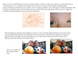
1. My user is 24 year old Christian who has congenital cataract . Cataract, or «grå stær» which it is commonly known as in Norwegian, is an eye condition with various causes. The lens of the eye gets clouded, diminishing sight greatly or leading to complete loss of eyesight. A very common condition – over half og the American popluation will develop cataract by the age of 80. Excessive exposure to both ultraviolet and infrared radiation seem to trigger the condition, alongside physical trauma and genetic disposition. Proteins behaving erratically and clumping on the lens of the eye hinders light reaching the retina and makes focusing difficult. Eyesight becomes blurred, both close-up and at a distance. Some people get sensitive to glare, and halos will appear around single lightsources. If the cataract is brownish, colour vision will be affected, especially with blue and purple colours. This is an example of how cataract affects vision.
2. Christian described his specific field of vision to something more akin to this; objects and figures will get wider than they are and edges distorted. Although seemingly unbothered about moving around in the city, his biggest issue would be corner buildings like this, where the level of distortion seem to be the greatest.
3. Being fond of travelling, Christian has seen his fair share of airports, and their design leaves alot to be desired for people with impaired vision. Especially the endless corridors from gate to gate while in transit, often lacking clear signs and markers if one finds it hard to read 'normal' print. Expansive, high-ceiling building with support columns and furniture scattered, uniform lighting and low-contrast colours is more daunting than a busy city street. On the topic of travel, I wondered how he was able to recognize his luggage from the others on the conveyor belt. Admitting that was a problem, the solution he came up with was a large, bright sticker on the side of his suitcase stating « THIS IS MINE».
4. Complementary colours are directly opposite each other on the colour circle. Juxtapositioned, they make for a high contrast. Contrasts in hue/value of same colour Complementary contrast near each other can create an illusion of movement, and can be very tiresome to look at. Reading text inverted or in a high -contrast colour can be helpful.
5. and Sticky sticker is sticky Decorative (?) Fun A label A statement An identifier