1. Textual Analysis – ‘In Love And War’
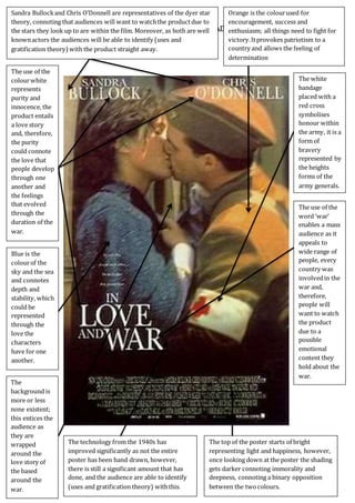
Sandra Bullockand Chris O’Donnell are representatives of the dyer star
theory, connoting that audiences will want to watchthe productdue to
the stars they look up to are within the film. Moreover, as both are well
knownactors the audiences will be able to identify (uses and
gratification theory)with the product straight away.
Orange is the colourused for
encouragement, success and
enthusiasm; all things need to fight for
victory.Itprovokes patriotism to a
country and allows the feeling of
determination
The use of the
colourwhite
represents
purity and
innocence, the
product entails
a love story
and, therefore,
the purity
could connote
the love that
people develop
through one
another and
the feelings
that evolved
through the
duration of the
war.
Blue is the
colourof the
sky and the sea
and connotes
depth and
stability, which
could be
represented
through the
love the
characters
have for one
another.
The
background is
more or less
none existent;
this entices the
audience as
they are
wrapped
around the
love story of
the based
around the
war.
The technology from the 1940s has
improved significantly as not the entire
poster has been hand drawn, however,
there is still a significant amount that has
done, and the audience are able to identify
(uses and gratification theory) withthis.
The top of the poster starts of bright
representing light and happiness, however,
once looking down at the poster the shading
gets darker connoting immorality and
deepness, connoting a binary opposition
between the twocolours.
The white
bandage
placed with a
red cross
symbolises
honour within
the army, it is a
form of
bravery
represented by
the heights
forms of the
army generals.
The use of the
word ‘war’
enables a mass
audience as it
appeals to
wide range of
people, every
country was
involvedin the
war and,
therefore,
people will
want to watch
the product
due to a
possible
emotional
content they
hold about the
war.
2. Textual Analysis – ‘In Love And War’
‘In love and war’ is a product that holds the elements of drama, romance and war, each
aspect we will be focusing on in our product ‘venture’. This product was produces in
1980/early 2000s. From this we are able to gain a clear insight of how far technological
advances had developed and the way in which colours and mise-en-scene have been
used to interpret genres.
The director has been clear to use the dyer star theory,
meaning that the audience will want to watch the product
due to the stars presented within it as they look up to these
people, Sandra Bullock is an oscar winning actor who has
been featured in various amounts of films and, therefore, the
automatically the product has been marketed through her. In
order to interpret the genres of the product, her character
wears the colour blue which is the colour of the sky and the
sea which connotes depth and stability, the stability could be
portrayed and developed as an equilibrium throughout the
film, more over, the depth of the colour could portray the
love she has for the other character in the product. the colour on the characters shirt is
also thematic to the genre of drama as it is conventional to that of a drama product.
Love plays a significant part within the
product and is therefore the main element that
the cinematographers have focued upon, the
entire poster is taken up by two people being
intimate with one another. A bright light
shines through their faces which represents
and connotes the purity and the innocence of
the the love that they share for another, furthermore,
the product will appeal most to those who enjoy
watching films of a love interest, this is evident due to
the prime image and, furthermore, by the use of the
language within the title. However, this is chanllenged
by the use of the word ‘war’, all countries fought in the
war, meaning that the product will appeal to a wide
range of people for various reasons, some may watch
it for the love interest whereas others may watch the product due to the educational
aspect of the war.
The title is contradictory within itself and represents a
binary opposition as war is caused by hurt and betral,
whereas love is the utter opposite. Moreover, the use of
colours portrays a binary opposition challenging the
order of things, for example, the title typography is white
which connotes purity and innocence, however, it is
3. Textual Analysis – ‘In Love And War’
represented on a black background representing immorality and hurt. This portrays an
enigma within the product as the audience begin to wonder what the challenge will be
and potentially how it will be overcome. Furthermore, the binary opposite could
portray the equilibirum, for instance, how it begins off well and then goes wrong but it
manages to find itself at the end.
Technological advances have come a long way from the previous
poster of ‘the world at war’, this has been evidently represented as not
all of the poster has been hand drawn, an effect has been made for the
poster to stay within the conventions of the 1940 posters as that was
when the war began, allowing the audience to identify with the
product. Some parts of the product have been made through the use of
technology, such as photoshop, for example, the typography.
The soldier wears a deep orange which connotes encouragement, success and
enthusiasm; all things need to fight for victory. It provokes
patriotism to a country and allows the feeling of
determination. This has been further evident due to the use
of the arm band with the Red Cross, portraying a form of
bravery, it symbolises the highest honour within the army,
producing an enigma as the audience would like to know
how he managed to achieve this great honour.
Though both characters have a shade of bright
lighting across their faces, both also have a dark
shading which portrays the binary opposition of
although they may be all good there is some
immorality with what they are doing, this could be
represented through the love they have with one
another. Moreover, the darkness could connote the
mercilessness of the war. In order to represent this shading the lighting needs to be
accurate as if placed in the wrong section of their face it could lead to the wrong
intention, something in which needs to be deeply focused upon when filming and
producing our product ‘venture’.
Additionally, the background is more or less non existent within this
poster, representing the singifcance of the love interest that this
product holds. However, the background represents some sort of
building which represents an enigma to the audience as they will
begin to wonder what building they are standing next to and whether
it is a symbolic building of that country. Stereotypically the product
would appeal wo women due to the love interest, however, by
interpretting war within the product men will be enticed to watch
the product due to the element of action, crime and fighting.
4. Textual Analysis – ‘In Love And War’
In addition, with all of the othr posters the main image is that of a couple, represented
within the rule of thirds and more so through the use of it dominating the text. The
layout is signficant as it allows the audience to identify (uses and
gratifcation) with the product. the dyer star theroy has been used
within this poster and therefore entices the audience further.
Furthermore, the institutional information has been represented
at the bottom of the page stereotypical to that of a poster as it is
the last thing that the audience identify with (uses and
gratification theory). Moreover, by the use of the title being at the
bottom of the poster the audience are able to have a long lasting
memeory of the title name and, therefore, will idenitfy with the
poster longer. The audience gain a sense of enigma as they view
the image first and wonder th potential narrative of the product, enticing them within
the product.
The poster stays within stereotypical war conventions due to the image having the
effect of being hand drawn, further allowing the audience to identifying with the
product. Moreover, the use of having the love interest within the product helps the
audience gain perspective of the drama convention, due to the amount of emotion the
poster upholds, linking with the genre of the war as of the emotion unheld by the war,
representing the stereotypical conventions of the war and drama convention.
Conclusively, this product represents significantly on the genre of love, connoting
drama which is what we will be focusing on with war in our product ‘venture’,
technology from the previous poster ‘in the world at war. This product mainly uses
colours to portray its message. The contrast from dark between light portrays the
binary opposition and connotes the challenge the characters may face.