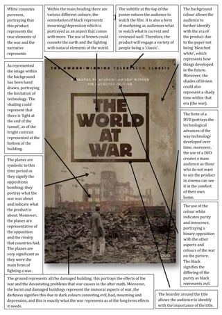
1. White connotes
pureness,
portraying that
this product
represents the
true elements of
the war and the
narrative
represents
accurate meaning.
Within the main heading there are
The subtitle at the top of the
various different colours; the
poster entices the audience to
Textual Analysis - ‘The World At It is also a form
War’
connotation of black represents
watch the film.
mourning/depression which is
of marketing as audiences what
portrayed as an aspect that comes
to watch what is current and
with more. The use of brown could
reviewed well. Therefore, the
connote the earth and the fighting
product will engage a variety of
with natural elements of the world.
people being a ‘classic’.
As represented
the image within
the background
has been hand
drawn, portraying
the limitation of
technology. The
shading could
represent that
there is ‘light at
the end of the
tunnel’, as of the
bright contrast
represented at the
bottom of the
building.
The planes are
symbolic to this
time period as
they signify the
oppositions
bombing; they
portray what the
war was about
and indicate what
the product is
about. Moreover,
the planes are
representative of
the opposition
and the rivalry
that countries had.
The planes are
very significant as
they were the
main form of
fighting a war.
The ground represents all the damaged building; this portrays the effects of the
war and the devastating problems that war causes in the after math. Moreover,
the burnt and damaged buildings represent the immoral aspects of war, the
darkness signifies this due to dark colours connoting evil, bad, mourning and
depression, and this is exactly what the war represents as of the long term effects
it needs.
The background
colour allows the
audience to
further identify
with the era of
the product due
to the paper not
being ‘bleached
white’, which
represents how
things developed
in the future.
Moreover, the
shades of brown
could also
represent a shady
time within that
era (the war).
The form of a
DVD portrays the
technological
advances of the
way technology
developed over
time; moreover,
the use of a DVD
creates a mass
audience as those
who do not want
to see the product
in cinema can see
it in the comfort
of their own
home.
The use of the
colour white
indicates purity
and innocence,
portraying a
binary opposition
with the other
aspects and
colours of the war
on the picture.
The black
signifies the
differing of the
purity as black
represents evil.
The boarder around the title
allows the audience to identify
with the importance of the title.
2. Textual Analysis - ‘The World At War’
In order to interpret the correct codes and conventions of a war time period drama in a
poster, the poster above is of a 1940 product. This allows us as a group to identify (uses
and gratification theory) with the correct interpretation of a war time poster. Moreover,
this allows the audience to fully understand the era that our product is based around.
The title of the poster is of an immense size both in boldness
and in thickness, this allows the audience to identify (uses
and gratification theory) with the product title, ‘the world at
war’. Moreover, they are left with an enigma of what the
product will entail as they begin to wonder what aspects of
war will come across in the product. Furthermore, the
boarder around the edge of the product signifies the
importance of the typography as it allows the typography to stand out. The title is
centred on the rule of thirds, just where the title states ‘war’, this entices the audience as
during the 1940s, the war was what everyone was talking about, it was what took over
the world of the economy, politics and the people’s lives. This enables us to identify
(uses and gratification theory) with the factual accuracy needed to come around within
our product ‘venture’. Moreover, the brown/black colours represent deepness, evil,
mourning and immorality, all the aspects that entail a vicious war. The colours are not
bright and, therefore; do not bring happiness to the audience, complying to the utter
opposite of sadness and potentially guilt to some who may have fought in the war. The
product appeals to a mass audience from the very start of as the title states, ‘the world
at war’, appealing to everyone as there country was a part of this war. Additionally, the
product could also be used for educational purposes (uses and gratification theory). The
typography of the image has been represented as bold and bright; this allows it to
dominate the text, although being proportionally smaller than the image, the audience
are still drawn towards. Moreover, although the typography of the title is large, the
typography above it is a lot smaller and, therefore, represented to be less significant,
though it is still clear in order for the audience to read it and gain institutional an or
promotional facts about the product.
The background has a mixture of colours, for example, the shading has been done in a
delicate way. Parts of the background have been shaded in a deep brown, connoting
earth and the is abundant in nature, this portrays everything
to do with war as the war is fought on earth, unbalancing the
nature of the natural order of things. Moreover, in some parts
of the background the colour is of a lighter brown/white
portraying that war does have innocence and is not just fought
for the sake of fighting, there are clear reasons to go to war,
further presented by the white trying to come out as white
indicates purity. Additionally, the black typography at the top
of the poster and on the ground connotes the mourning that people may have gone
3. Textual Analysis - ‘The World At War’
through after the war, as black represents overpowering and wickedness, emotions
some have towards war.
The planes in the background off the image are very symbolic
to the war as planes were how other countries fought over the
border; various different planes were used in order to bomb
the opposition, during the war planes were a great
technological improvement as they enabled the fighting to
escalate to a different level. Planes were one of the main
forms of fighting as dropping the bomb could cause mass
destruction to the opposition. Furthermore, the ground is
very symbolic of the planes and represents the destruction that the planes and the
fighting have caused. Moreover, within our product we maybe interpreting the
devastating effects of the bombing on the home town, this poster allows us to identify
(uses and gratification theory) with what the actually town looked like after the
bombing and once the war was over due to the amount of rubble on the ground.
Additionally, the poster appeals to a mass audience
due to the use of the writing at the top, the audience
are drawn to the brightness and contrast between
the white and the dark colours on the rest of the
poster, portraying binary opposition. The heading
reads ‘award winning’, representing to the audience that this product has been
reviewed as a very respectable product. Moreover, the use of
the product being about war further entices the audience as
they are able to watch the product for various reasons, some
may want to watch the product for educational or factual
aspects, whereas, others may want to watch the product for
entertainment or escapism, all connoting the theory of uses
and gratification. In addition, the product is also available to
the audience on DVD which portrays an advance in
technology and how it has developed over time, it allows for a mass audience as the
product is available in every possible way, for example, you do not need to go to the
cinema to watch the product.
The background building portrays a significant aspect of
potentially a symbolic building in that country as it is
the only building that has not been damage by the
bombings, however, this may also present ‘the light at
the end of the tunnel’, representing that things will be
built up again after the war. Furthermore, the building is
lighter than the rest of the images within the poster
which further represents that it is of an importance as the lighting is shinnying on to it.
However, this has been challenged by the planes flying towards the building, reinforcing
4. Textual Analysis - ‘The World At War’
the idea of mass destruction that comes with the war. The building only has a base to it,
representing that it may have already been destroyed by the acts of the war and the
bombings. Nonetheless, the building is the prime image due it being centred within the
poster, additionally; the poster is the biggest image on the poster, therefore, enticing the
audience to look at it, creating an enigma as they wonder what the building is and why it
seems to be significant.
Moreover, within the main image there is a male figure standing with his back to the
audience, the dark colours symbolise depression, which after the war
was somewhat of a short term effect. Furthermore, the grey/white
trousers could connote the innocent people who were hurt or injured
by the war and the devastating effects that they had to go through for
others mistakes. As the male figure is standing alone it could connote
the loneliness and sorrow of the emotional feature war leaves behind.
The way in which he stands in the rubble and the burnt down
buildings portrays the long lasting mental effects the war can leave
behind, representing that there is more to war than just the fight.
Most of the images within the poster have been hand drawn, for
example, the building in a background, the rubble on the floor
and the image of the male figure. This represents that
technological advances in the 1940s had not yet come around
and Photoshop were non-existent. In order to portray the
correct codes and conventions of a war time period drama,
aspects of our ancillary task poster should hold elements of a
hand drawn image, this way the audience will be able to identify
with the poster (uses and gratification theory) and, more so, will
be able to gain the correct factual information of how products
were made.
The layout of the poster is very significant in allowing the
audience to see what is most important to the product; it further
allows the audience to gain an enigma as they may assume the
narrative of the product. For example, within this product ‘The
world at war’, the most dominating aspect is the primary image of
knocked down buildings, due to it being centred within the rule of
thirds. The image holds great importance and stays within the
stereotypical conventions of a war time period drama as it
evidently portrays the damage a war can cause and the effect it
has on the society of the country, intertwining both the war and
drama conventions of a product. Furthermore, the title has been placed at the top of the
product, this allows the audience to identify with the image as, the majority of the time
5. Textual Analysis - ‘The World At War’
the title has a relation with the image and the product portrayed, for example, by the
use of the word ‘war’ the audience are able to gain a perspective of what the product is
about and allows them to understand why there are damaged buildings on the image.
Various drama and war conventions have been portrayed through this product, for
instance, the use of having the man standing alone looking at the damaged area,
represents a sense of isolation and, therefore, portrays elements of drama within the
product, more so, the damaged area and buildings represent the impairment that the
war causes. In addition the product represents a great deal of emotion that is
represented through the drama genre, this is done by the use of positioning of the image
and more so, due to the colours used as each colour represents a sense of loneliness.
Furthermore, the narrative of the product has been represented through the use of the
typography and image placement, the title of the product is called, ‘the world at war’,
this allows the audience to identify with the fact that the product will be about the ‘war’
and, they therefore gain a sense of enigma as they may start to wonder what the
product entails and the elements within it. Additionally, the colours allow the audience
to identify (uses and gratification theory) with the idea that the product will not be a
‘happy go lucky’ film due to the dark shading and the stereotypical connotations of them
being of sorrow and death-things experienced through war.
Conclusively, this poster holds a significant amount of detail in putting across all the
emotions needed to entice an audience. Moreover, the audience appeal is important in
order to gain a mass audience, this poster does so as it enables all aspects of different
audiences to watch the product, for example, people can use this product for
educational, factual and entertainment purposes.