Call Girl Service In Dubai #$# O56521286O #$# Dubai Call Girls
FIFA World Cup 2018 campaign feedback and evaluation
1. Feedback and evaluation
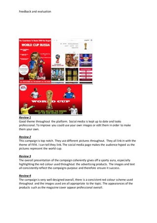
Review 1
Good theme throughout the platform. Social media is kept up to date and looks
professional. To improve you could use your own images or edit them in order to make
them your own.
Review 2
This campaign is top notch. They use different pictures throughout. They all link in with the
theme of FIFA. I can tell they link. The social media page makes the audience hyped as the
pictures represent the world cup.
Review 3
The overall presentation of the campaign coherently gives off a sporty aura, especially
highlighting the red colour used throughout the advertising products. The images and text
all consistently reflect the campaigns purpose and therefore ensure it success.
Review 4
The campaign is very well designed overall, there is a consistent red colour scheme used
throughout and the images used are all appropriate to the topic. The appearances of the
products such as the magazine cover appear professional overall.
2. Feedback and evaluation
Evaluation
Fromthe reviews that I havemanaged to gather I can come to the conclusion
that I have successfully and cohesively linked together all my products.
Due to the reviews fromthe target audience there is a clear and successfuluse
of colour *and fonts used across thethree platforms. My products link
together because of the colour scheme. Over the three platforms (billboard,
magazine and social-media) there is a continuous flow of the color “RED”. The
colour “RED” is used in football to representmeaning. Many different football
clubs use the colour “RED” within either their kits or club badge. This is
because the colour “RED” is a popular colour. This is because the colour “RED”
represents strength, power, determination, desire and mostof all passion for
the sport. This is why this colour is popular as the club wants to show their
passion for the footballing sport. Their players get on the pitch wearing “RED”
showing their desire and passion for the sport. Images areused to a successful
extent. Fromthe audience’s feedback the images were great but still could
have been improved to someextent. One review said “to improve, you could
edit the images more to make them morelike your own”. This shows that the
images are made well enough to be my own but a little moreediting and they
would be perfect. Images wereused successfully to keep up with the theme of
FIFA. Thereviews said that the images get the audience hyped as the images
representthe FIFA WORLD CUP 2018.
There is different timing for when these three platforms will be released. Here
are the releasing of times for different products:
Billboard - 12th
May 2018
Magazinefront cover - 23rd
July 2018
Social media - 24th
September 2018
All of these differentaspects are appealing to the target audience. The images
are appealing for the target audience as the get them excited for the World
Cup. The social media page according to the reviews “get the audience hyped
for the World Cup 2018” this clearly shows thatthe target audience are
appealed by the products I have produced. The colour scheme is appealing to
3. Feedback and evaluation
the audience as it shows them how much passion, desireand love the players
have for football. This shows thetarget audience how serious the footballing
world actually is. Fonts are also another aspect that is appealing to the target
audience as the fonts used are bold and meaningful. They catch the audience’s
attention as they are bold and meaningful. This is because they get the
audience happy and joyful. The timing of the products is also another essential
appeal to the target audience as the audience are provided with dates and
times these products will be open to the public. All the hypeand seriousness
will be over as soon as these products come out. This is because they will be
able to see how good these magazines, socialmedia page and billboard will be.