Is This Why So Many Americans Feel Uneasy About The U.S. Economy?
•
0 likes•145 views

An illustration as to why so many Americans still have an uneasy feeling about the U.S. economy

Recommended
More Related Content
What's hot
What's hot (19)
Similar to Is This Why So Many Americans Feel Uneasy About The U.S. Economy?
Similar to Is This Why So Many Americans Feel Uneasy About The U.S. Economy? (20)
Recently uploaded
Recently uploaded (20)
Is This Why So Many Americans Feel Uneasy About The U.S. Economy?
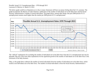
- 1. Possible Actual U.S. Unemployment Rate – 1970 through 2015 Lawrence D. Morriss, Jr. March 19, 2016 Page 1 of 2 The below graph could be an illustration as to why so many Americans still have an uneasy feeling about the U.S. economy. The graph incorporates the Bureau of Labor Statistics’ publication of the number of individuals not in the labor force and the Social Security Administration’s number of retired individuals. The graph shows, among other things, that post 2008 period of U.S. unemployment remains much higher than the similar pre 2008 period of U.S. unemployment. 21.50% 23.00% 24.50% 26.00% 27.50% 29.00% 30.50% 32.00% 33.50% 35.00% 36.50% 1970 1971 1972 1973 1974 1975 1976 1977 1978 1979 1980 1981 1982 1983 1984 1985 1986 1987 1988 1989 1990 1991 1992 1993 1994 1995 1996 1997 1998 1999 2000 2001 2002 2003 2004 2005 2006 2007 2008 2009 2010 2011 2012 2013 2014 2015 Rates YEARS Possible Annual U.S. Unemployment Rates 1970 Through 2015 Possible Unemployment Rate Lawrence D. Morriss, Jr. March 19, 2016 The “official” explanations for excluding the number of individuals not in the labor force from the U.S. unemployment rate may be plausible. But one of the most often explanations for the significant growth of the number of individuals not in the labor force is the retirement of the baby boomers. Okay, so the graph above subtracts the number of retired individuals from the number of individuals not in the labor force, which results in net individuals not in the labor force. The number of retired individuals is from the Social Security Administration’s U.S. Presidential Election of 2008
- 2. Possible Actual U.S. Unemployment Rate – 1970 through 2015 Lawrence D. Morriss, Jr. March 19, 2016 Page 2 of 2 publication of the number of retired individuals receiving benefits.1 I added the net individuals not in the labor force to the number of unemployed individuals that is also published by the Bureau of Labor Statistics,2 which resulted in the number of possible unemployed individuals. The possible unemployment rate is the result of the number of possible unemployed individuals divided by the sum of the number of possible unemployed individuals and the total number of employed individuals. The total of employed individuals is also published by the Bureau of Labor Statistics.3 1 Social Security Administration: Number of beneficiaries receiving benefits on December 31, 1970-2015 (https://www.ssa.gov/oact/STATS/OASDIbenies.html). 2 Bureau of Labor Statistics Household Data Annual Averages 1 - Employment Status of Civilian Non-institutional 1970 through 2015. 3 Ibid.