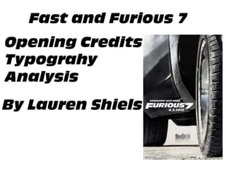
SlideShare a Scribd company logo
1 of 16
The Film starts with the Universal Company title sequence at
lasts from 0 to 24 seconds. It is the first writing that the
audience sees in the film because the company is the film’s
distributor and these often start the film running.
From 24 to 34 seconds it shows the production
company which just like ‘Universal’ is in their own
format which is used for all of the films that they
produce.
This shows the audience who owns the film, being the
distributor, and lasts from 35 to 38 seconds on the
screen. This is the first typography of the film’s opening
credits which feature its famous font ‘ Antique Olive
Compact Italic’ which embraces modern day with the
shapes of vehicles. The writing comes and goes on the
screen through mirror transitions on each letter.
This writing lasts rom 39 seconds to 42 seconds and features
another of the films production companies. It is white to
correspond with the black background and uses mirror
transitions to come onto and off of the screen.
This is another of the production companies and comes on
the screen at 43 seconds but leaves 2 seconds later, again
using the mirror transitions. It is in white font to correspond
well with the black background.
This is the last of the production companies to feature in the
opening credits. It is shown on screen from 46 seconds to 49
seconds, once again in white font and with mirror
transitions.
This is the first camera shot of the film and uses high key lighting
to capture the landmarks of London, which helps to set the
scene for the audience. Again this uses the franchises font and is
displayed in the bottom left corner in view for the audience but
out of the way enough for the audience to see the key sights of
the capital. It begins to come on screen at 50 seconds but comes
off on 53 seconds. It comes on the screens one letter at a time
from left to right like a typewriter and comes off right to left.
This comes on the screen at 2 minutes and 42 seconds and goes
off screen 3 seconds later. It shoots onto the screen from the
left, stays in the middle of the screen for the audience to read it
and then exits by going underneath the camera. It is white font
to correspond with the darkness of the scene and has a 3D effect
to it.
This shoots on the screen from the left and exits by going
underneath the screen to allow the audience to read the name.
It comes on the screen at 2 minutes and 46 seconds but leaves 4
seconds later. This names gets 1 seconds longer on the screen
than any other of the actors names to respect Paul’s death.
The writing is in white font to correspond with the low key
lighting used in the scene. It shoots onto the screen from
the left on 2 minutes and 51 seconds, stays in the middle of
the screen and exits 3 seconds later via going underneath
the camera.
This comes on the screen on the left on 2 minutes and 55
seconds and leaves on 2 minutes and 57 seconds. Unlike
past actors names, this typography exits through
manipulation of the screen because as the lift doors opens
the name breaks into two and tracks the movement of the
door to leave the screen. This helps to engage the audience
as they are seeing something different than the past names.
This name enters the screen on 2 minutes and 58 seconds
on the left and leaves 2 seconds later by dropping off the
screen in synch but in individual letters. It is again in white
font to correspond with the low key lighting used within the
scenes.
The typography here is in white font to parallel with the low
key lighting used in the scene. The name shoots onto the
screen from the left side and exits by dropping down the
screen individually but at the same time. This comes on the
screen at 3 minutes and 1 second and goes off the screen 3
seconds later.
This actor’s name comes on the screen from 3 minutes and 5
seconds until 3 minutes and 7 seconds. The font is in white to
correspond with the relatively low key light lighting in the
scene however the background is beginning to get lighter. The
writing shoots onto the screen from the left and drops off the
screen with each letter falling.
The writing is white to correspond with the low key lighting
and comes to the view of the audience on 3 minutes and 8
seconds and leaves 2 seconds later. Once again the writing
enters the screen via the left and exits via dropping the letters
dropping down off the screen.
The writing enters on the left hand side of the screen and exits via
the right side; however it stays in the middle of the screen for a
second in order for the audience to read the actors name. The
typography enters on 3 minutes and 12 seconds and leaves on 3
minutes and 14 seconds.
The actors name appears on the screen on 3 minutes and 15
seconds from the left hand side and leaves on 3 minutes and 18
seconds by the letters dropping down. Again, the writing is in white
font to correspond with the low key lighting used in the scene.
The writing is in white font to create some light within the lift scene
as it is dark and also so that they audience are able to read the
actresses name. The typography appears on 3 minutes and 19
seconds and leaves on 21 seconds. It comes onto the screen via the
left side and departs by the letters falling down off the screen
The writing is in white font in order for the audience to read the
content as well as the fact it corresponds with the lighting used
within the hospital which is both low and high key lighting. It enters
the screen from the left on 3 minutes and 22 seconds and leaves by
the letters independently dropping out of the cameras view on 3
minutes and 25 seconds. The actor’s name is in capital letters where
the job role is in lower case and a smaller size because the name is
more important for the audience to understand.
The typography enters the screen on 3 minutes and 27 seconds and
leaves on 3 minutes and 30 seconds. The transitions used on the
writing are shooting onto the screen from the left and leaving by the
letters falling down out of sight. Again, the writing is in white to
correspond with the high key lighting used in the hospital scenes.
The writing is in white font so that the audience can see it against the
rather low key background. The two actor’s name enter the screen on
3 minutes and 32 seconds and leave 2 seconds later. The writing
appears on the screen from the left hand side and leave via the right
side.
This typography appears from the left hand side of the screen
and leaves by the letters dropping down. The actor’s names
arrive on the screen on 3 minutes and 39 seconds and leave 4
seconds later. This writing lasts a second more than recent
names because there is more than one actors name on the
screen therefore the audience needs time to read them. The
transitions used for this is shooting on from the left and
departing by going underneath the camera and out of view.
This writing comes on the screen 3 minutes and 40 seconds
and leaves on 3 minutes and 43 seconds. Again, the writing is
in white to correspond with the rather low key lighting. The
writing comes on the screen from the left and leaves by going
below the camera.
The writing is in white font to parallel with the darkness of
the scene in the background. The names are in capital letters
and in a bigger size than the job role because they are more
important to the audience. Just like previous texts, the writing
enters the screen from the left side and leaves via underneath
the camera. It comes on the screen on 3 minutes and 44
seconds and leaves on 3 minutes and 47 seconds.
The writing enters the screen on 3 minutes and 48 seconds
and leaves 3 seconds later. The writing is similar with its entry
in by coming from the left direction however is manipulated
by the scene’s content when it disappears of screen. This is
because after a second of coming on screen it tracks a
particular spot in the left corner and is essentially ‘demolished’
by the falling hospital balcony walkway, so as it falls the letters
in the text vanish once the building has collapsed over them.
The typography here comes on the screen via the left side of
the screen and leaves by shooting off the right side. It comes
on the screen on 3 minutes and 52 seconds and leaves on 3
minutes and 54 seconds. The writing is in white to correspond
with the dark elements of the background and also to fit in
with the rest of the typography in the opening credits.
The writing enters from the left side of the screen but like
several texts in the opening credits is influenced by the scene
when it leaves the screen. Deckard gets into his car and drives
off the left side of the screen. As he does this the car travels
over the writing so it disappears. Once more, the writing is in
white font to correspond with the dark aspects of the scenes.
The writing comes on the screen on 3 minutes and 57 seconds
and leaves 3 seconds later.
The writing appears on 4 minutes and 6 seconds after a change
in scenery where the scene goes from a hospital on fire to a tilt
of the sky to the roads, and leaves 5 seconds later. The writing
comes on and off the screen by mirror transitions on each
individual letters which was used at the very start of the
credits. The writing is in white to match the high key lighting
used in the scenes.
The writing comes on and off the screen via mirror transitions
and is in white to match the brightness of the scenery. This
typography arrives on the screen at 4 minutes and 12 seconds
and leaves 2 seconds later. It continues to use white font to tie
with the brightness of the roads and surroundings within the
scenes.
The writing enters the screen on 4 minute and 14 seconds and
leaves 3 seconds later. The transitions used when the writing
enters and exits the screen is the mirror change which has been
used in the texts before the actors names appeared and after
the change in scenery.
The writing enters and exits the screen by mirror transitions
on the individual letters. The typography comes on the
screen on 4 minutes and 18 seconds and leaves 4 seconds
later. Again, this is in white font to match the high key
lighting used in the background.
This typography enters the screen on 4 minutes and 23
seconds and leaves on 4 minutes and 25 seconds. The names
of the crew are in bigger font as well as in capital letters
because they are more important for the audience to read
rather than their job roles. The writing enters the screen via
the mirror transitions and leaves in the same manner.
The writing enters the screen via the mirror transitions on
each letter however continuing with the manipulation theme
on some texts leaves the screen by being driven over by the
car. The typography appears on the screen on 4 minutes and
26 seconds and leaves 3 seconds afterwards.
The typography enters the screen on 4 minutes and 30 seconds
and leaves 4 seconds. Once more, the writing uses the mirror
transitions and the white font to match the surroundings of the
scene. The departing of this writing, however, is like others
influenced by the surroundings as the car drives over the
writing.
The typography is in white font to match the high key lighting
used in the scene with mirror transitions used on both the
entry and exit of the writing. This writings arrives on the screen
on 4 minutes and 34 seconds and leaves 2 seconds later.
The title is a brown colour (different to the white font on the
rest of the credits as this is the most important credit of them
all) which replicates the desert-like scenery behind which is
often used for drag racing. The writing is unveiled when the car
drives by, revealing each letter as it goes. The letter is the same
font as the rest (Antique Olive Compact Italic) however is
bigger as it is the title and is in 3D effects to also reinforce the
use of the road for drag racing. The writing comes on the
screen on 4 minutes and 36 seconds and leaves 5 seconds
later.
All of the writing in the opening credits uses ‘Antique Olive Compact Italic’ font because this is
used in all films within the ‘Fast and Furious’ Franchise.
The range of transitions used in the opening credits allows the audience to remain attracted and
drawn to the film so that they will not turn the film off. The range used includes: mirror/barn
doors in each letter, shooting on and off the screen and being manipulated by the scene. The
manipulation on some of the typography maintains the interest of the audience as this is
something they have not seen before where the scene and typography are connected together.
The placement of the typography when it was stationary differed throughout the credits from the
middle of the screen, to the corners of the screen; however every typography always went
through the middle of the screen to capture the attention of the audience as the middle is where
they most often look when watching films.
I will use aspects of the manipulation within my thriller opening sequence by doing motion
tracking. I liked the way the title was unveiled by the car driving because it was an original unique
idea and reinforced the plot and platform that the franchise involves e.g. cars and racing. For my
opening sequence I will use motion tracking as this uses modern technology which is what
audiences are interested in watching now and like ‘Furious 7’ moulds the scenery and titles
together. I can develop and adapt the idea of something unveiling the titles in my work by using a
still shot of Ella running and have the title unravelled when she runs on screen. This is something
different and will help to maintain the focus on the screen.
During the opening credits for ‘Furious 7’ there are 2 songs that are played: ‘Payback’ by Juicy J
and Kevin Gates as well as ‘Off Set’ by T.I. & Young Thug. The first song was played during the
scenes where Deckard is in the hospital until the screen goes black; after this ‘Off Set’ begins
playing when the car drives through the desert.
The chorus for ‘Payback’ is sung during the hospital and the lyrics are the following:
Don't act like you don't know
Know what I came for
Too late to turn back
This is the payback
You take one, I take one
You can't hide you can't run
Too late to turn back
This is the payback
This illustrates the situation between Deckard as he breaks into the secure hospital where Owen is
being held in and swears revenge against Dom. Revenge is another word for payback so the lyrics
can be seen as the thoughts inside his head as he is plotting punishment for him. The song is
upbeat and contains drums and synthesizers to replicate the high speed use of the cars in the
film’s plot.
‘Off Set’ by T.I. and Young Thug is based around the use of synthesizers. This maintains
the attraction of the audience because synthesizers are part of modern technology
today (though were first invented in 1960s) and are used in a majority of songs in the
charts so are very popular and recognisable. The use of synthesizers attracts a huge
audience because it is something that people are drawn to when listening to music and
also because as it is part of modern technology it reflects the use of cars within the
film as they are modern racing cars that have been influenced through the technology
of today.
Just like ‘Payback’ the song maintains the eyes of the audience because the song is
upbeat so keeps their eyes switched onto the screen and also reflects the speed of cars
in the film as the high speed tempo replicates the high speeds used in drag racing. The
song refers to the foreign cars (whips) that have not been released to the world yet.
One of the lines that illustrates this meaning is the following:
You can't be riding foreign s**t Off-set
Car ain't even out yet

More Related Content

What's hot

Reservoir dogs trailer analysis
Reservoir dogs trailer analysisReservoir dogs trailer analysis
Reservoir dogs trailer analysis
JoeHabben
 
You're Next Detailed Trailer Analysis
You're Next Detailed Trailer AnalysisYou're Next Detailed Trailer Analysis
You're Next Detailed Trailer Analysis
KyleMediaCoursework
 
Dark Knight
Dark KnightDark Knight
Dark Knight
bobsled
 
Final evaluation.1
Final evaluation.1Final evaluation.1
Final evaluation.1
harps123
 
Evaluation
EvaluationEvaluation
Evaluation
harps123
 
Film trailer the dark knight screen shots
Film trailer the dark knight screen shotsFilm trailer the dark knight screen shots
Film trailer the dark knight screen shots
emzy_95
 
Treatment
Treatment Treatment
Treatment
TanishaB
 
The butterfly effect opening analysis
The butterfly effect opening analysisThe butterfly effect opening analysis
The butterfly effect opening analysis
hma1
 

What's hot (20)

Script.
 Script. Script.
Script.
 
Textual Analysis on my own music video
Textual Analysis on my own music videoTextual Analysis on my own music video
Textual Analysis on my own music video
 
Thriller film research media
Thriller film research  mediaThriller film research  media
Thriller film research media
 
Thriller film research media
Thriller film research  mediaThriller film research  media
Thriller film research media
 
Reservoir dogs trailer analysis
Reservoir dogs trailer analysisReservoir dogs trailer analysis
Reservoir dogs trailer analysis
 
You're Next Detailed Trailer Analysis
You're Next Detailed Trailer AnalysisYou're Next Detailed Trailer Analysis
You're Next Detailed Trailer Analysis
 
Dark Knight
Dark KnightDark Knight
Dark Knight
 
Kingsman film opening analysis - Regan
Kingsman film opening analysis - ReganKingsman film opening analysis - Regan
Kingsman film opening analysis - Regan
 
Final evaluation.1
Final evaluation.1Final evaluation.1
Final evaluation.1
 
Textual analysis of a teaser trailer - Get Out
Textual analysis of a teaser trailer - Get OutTextual analysis of a teaser trailer - Get Out
Textual analysis of a teaser trailer - Get Out
 
Evaluation Task: Question 1
Evaluation Task: Question 1Evaluation Task: Question 1
Evaluation Task: Question 1
 
Shooting Schedule
Shooting ScheduleShooting Schedule
Shooting Schedule
 
Yves robinson breezeblocks
Yves robinson breezeblocksYves robinson breezeblocks
Yves robinson breezeblocks
 
Evil dead opening sequence analysis
Evil dead opening sequence analysisEvil dead opening sequence analysis
Evil dead opening sequence analysis
 
Evaluation
EvaluationEvaluation
Evaluation
 
Hairspray opening sequence
Hairspray opening sequenceHairspray opening sequence
Hairspray opening sequence
 
Film trailer the dark knight screen shots
Film trailer the dark knight screen shotsFilm trailer the dark knight screen shots
Film trailer the dark knight screen shots
 
Treatment
Treatment Treatment
Treatment
 
Similar Product Analysis - The Sixth Sense
Similar Product Analysis - The Sixth Sense Similar Product Analysis - The Sixth Sense
Similar Product Analysis - The Sixth Sense
 
The butterfly effect opening analysis
The butterfly effect opening analysisThe butterfly effect opening analysis
The butterfly effect opening analysis
 

Similar to AS Media Coursework- Furious 7 Typography and Sound Analysis (6)

Film titles
Film titlesFilm titles
Film titles
 
Opening Sequence Style Model Analysis- Lost In Translation
Opening Sequence Style Model Analysis- Lost In TranslationOpening Sequence Style Model Analysis- Lost In Translation
Opening Sequence Style Model Analysis- Lost In Translation
 
Research of editing and sound
Research of editing and soundResearch of editing and sound
Research of editing and sound
 
Finished
FinishedFinished
Finished
 
Shot list template 2017
Shot list template 2017Shot list template 2017
Shot list template 2017
 
Thriller conventions - Keera
Thriller conventions - KeeraThriller conventions - Keera
Thriller conventions - Keera
 

Recently uploaded

The basics of sentences session 3pptx.pptx
The basics of sentences session 3pptx.pptxThe basics of sentences session 3pptx.pptx
The basics of sentences session 3pptx.pptx
heathfieldcps1
 
Call Girls in Uttam Nagar (delhi) call me [🔝9953056974🔝] escort service 24X7
Call Girls in  Uttam Nagar (delhi) call me [🔝9953056974🔝] escort service 24X7Call Girls in  Uttam Nagar (delhi) call me [🔝9953056974🔝] escort service 24X7
Call Girls in Uttam Nagar (delhi) call me [🔝9953056974🔝] escort service 24X7
9953056974 Low Rate Call Girls In Saket, Delhi NCR
 

Recently uploaded (20)

The basics of sentences session 3pptx.pptx
The basics of sentences session 3pptx.pptxThe basics of sentences session 3pptx.pptx
The basics of sentences session 3pptx.pptx
 
Understanding Accommodations and Modifications
Understanding  Accommodations and ModificationsUnderstanding  Accommodations and Modifications
Understanding Accommodations and Modifications
 
This PowerPoint helps students to consider the concept of infinity.
This PowerPoint helps students to consider the concept of infinity.This PowerPoint helps students to consider the concept of infinity.
This PowerPoint helps students to consider the concept of infinity.
 
Basic Intentional Injuries Health Education
Basic Intentional Injuries Health EducationBasic Intentional Injuries Health Education
Basic Intentional Injuries Health Education
 
Wellbeing inclusion and digital dystopias.pptx
Wellbeing inclusion and digital dystopias.pptxWellbeing inclusion and digital dystopias.pptx
Wellbeing inclusion and digital dystopias.pptx
 
80 ĐỀ THI THỬ TUYỂN SINH TIẾNG ANH VÀO 10 SỞ GD – ĐT THÀNH PHỐ HỒ CHÍ MINH NĂ...
80 ĐỀ THI THỬ TUYỂN SINH TIẾNG ANH VÀO 10 SỞ GD – ĐT THÀNH PHỐ HỒ CHÍ MINH NĂ...80 ĐỀ THI THỬ TUYỂN SINH TIẾNG ANH VÀO 10 SỞ GD – ĐT THÀNH PHỐ HỒ CHÍ MINH NĂ...
80 ĐỀ THI THỬ TUYỂN SINH TIẾNG ANH VÀO 10 SỞ GD – ĐT THÀNH PHỐ HỒ CHÍ MINH NĂ...
 
Philosophy of china and it's charactistics
Philosophy of china and it's charactisticsPhilosophy of china and it's charactistics
Philosophy of china and it's charactistics
 
Call Girls in Uttam Nagar (delhi) call me [🔝9953056974🔝] escort service 24X7
Call Girls in  Uttam Nagar (delhi) call me [🔝9953056974🔝] escort service 24X7Call Girls in  Uttam Nagar (delhi) call me [🔝9953056974🔝] escort service 24X7
Call Girls in Uttam Nagar (delhi) call me [🔝9953056974🔝] escort service 24X7
 
Details on CBSE Compartment Exam.pptx1111
Details on CBSE Compartment Exam.pptx1111Details on CBSE Compartment Exam.pptx1111
Details on CBSE Compartment Exam.pptx1111
 
Accessible Digital Futures project (20/03/2024)
Accessible Digital Futures project (20/03/2024)Accessible Digital Futures project (20/03/2024)
Accessible Digital Futures project (20/03/2024)
 
Google Gemini An AI Revolution in Education.pptx
Google Gemini An AI Revolution in Education.pptxGoogle Gemini An AI Revolution in Education.pptx
Google Gemini An AI Revolution in Education.pptx
 
General Principles of Intellectual Property: Concepts of Intellectual Proper...
General Principles of Intellectual Property: Concepts of Intellectual  Proper...General Principles of Intellectual Property: Concepts of Intellectual  Proper...
General Principles of Intellectual Property: Concepts of Intellectual Proper...
 
Mehran University Newsletter Vol-X, Issue-I, 2024
Mehran University Newsletter Vol-X, Issue-I, 2024Mehran University Newsletter Vol-X, Issue-I, 2024
Mehran University Newsletter Vol-X, Issue-I, 2024
 
Towards a code of practice for AI in AT.pptx
Towards a code of practice for AI in AT.pptxTowards a code of practice for AI in AT.pptx
Towards a code of practice for AI in AT.pptx
 
Food safety_Challenges food safety laboratories_.pdf
Food safety_Challenges food safety laboratories_.pdfFood safety_Challenges food safety laboratories_.pdf
Food safety_Challenges food safety laboratories_.pdf
 
On_Translating_a_Tamil_Poem_by_A_K_Ramanujan.pptx
On_Translating_a_Tamil_Poem_by_A_K_Ramanujan.pptxOn_Translating_a_Tamil_Poem_by_A_K_Ramanujan.pptx
On_Translating_a_Tamil_Poem_by_A_K_Ramanujan.pptx
 
dusjagr & nano talk on open tools for agriculture research and learning
dusjagr & nano talk on open tools for agriculture research and learningdusjagr & nano talk on open tools for agriculture research and learning
dusjagr & nano talk on open tools for agriculture research and learning
 
FSB Advising Checklist - Orientation 2024
FSB Advising Checklist - Orientation 2024FSB Advising Checklist - Orientation 2024
FSB Advising Checklist - Orientation 2024
 
Basic Civil Engineering first year Notes- Chapter 4 Building.pptx
Basic Civil Engineering first year Notes- Chapter 4 Building.pptxBasic Civil Engineering first year Notes- Chapter 4 Building.pptx
Basic Civil Engineering first year Notes- Chapter 4 Building.pptx
 
Jamworks pilot and AI at Jisc (20/03/2024)
Jamworks pilot and AI at Jisc (20/03/2024)Jamworks pilot and AI at Jisc (20/03/2024)
Jamworks pilot and AI at Jisc (20/03/2024)
 

AS Media Coursework- Furious 7 Typography and Sound Analysis

  • 1.
  • 2. The Film starts with the Universal Company title sequence at lasts from 0 to 24 seconds. It is the first writing that the audience sees in the film because the company is the film’s distributor and these often start the film running. From 24 to 34 seconds it shows the production company which just like ‘Universal’ is in their own format which is used for all of the films that they produce. This shows the audience who owns the film, being the distributor, and lasts from 35 to 38 seconds on the screen. This is the first typography of the film’s opening credits which feature its famous font ‘ Antique Olive Compact Italic’ which embraces modern day with the shapes of vehicles. The writing comes and goes on the screen through mirror transitions on each letter.
  • 3. This writing lasts rom 39 seconds to 42 seconds and features another of the films production companies. It is white to correspond with the black background and uses mirror transitions to come onto and off of the screen. This is another of the production companies and comes on the screen at 43 seconds but leaves 2 seconds later, again using the mirror transitions. It is in white font to correspond well with the black background. This is the last of the production companies to feature in the opening credits. It is shown on screen from 46 seconds to 49 seconds, once again in white font and with mirror transitions.
  • 4. This is the first camera shot of the film and uses high key lighting to capture the landmarks of London, which helps to set the scene for the audience. Again this uses the franchises font and is displayed in the bottom left corner in view for the audience but out of the way enough for the audience to see the key sights of the capital. It begins to come on screen at 50 seconds but comes off on 53 seconds. It comes on the screens one letter at a time from left to right like a typewriter and comes off right to left. This comes on the screen at 2 minutes and 42 seconds and goes off screen 3 seconds later. It shoots onto the screen from the left, stays in the middle of the screen for the audience to read it and then exits by going underneath the camera. It is white font to correspond with the darkness of the scene and has a 3D effect to it. This shoots on the screen from the left and exits by going underneath the screen to allow the audience to read the name. It comes on the screen at 2 minutes and 46 seconds but leaves 4 seconds later. This names gets 1 seconds longer on the screen than any other of the actors names to respect Paul’s death.
  • 5. The writing is in white font to correspond with the low key lighting used in the scene. It shoots onto the screen from the left on 2 minutes and 51 seconds, stays in the middle of the screen and exits 3 seconds later via going underneath the camera. This comes on the screen on the left on 2 minutes and 55 seconds and leaves on 2 minutes and 57 seconds. Unlike past actors names, this typography exits through manipulation of the screen because as the lift doors opens the name breaks into two and tracks the movement of the door to leave the screen. This helps to engage the audience as they are seeing something different than the past names. This name enters the screen on 2 minutes and 58 seconds on the left and leaves 2 seconds later by dropping off the screen in synch but in individual letters. It is again in white font to correspond with the low key lighting used within the scenes.
  • 6. The typography here is in white font to parallel with the low key lighting used in the scene. The name shoots onto the screen from the left side and exits by dropping down the screen individually but at the same time. This comes on the screen at 3 minutes and 1 second and goes off the screen 3 seconds later. This actor’s name comes on the screen from 3 minutes and 5 seconds until 3 minutes and 7 seconds. The font is in white to correspond with the relatively low key light lighting in the scene however the background is beginning to get lighter. The writing shoots onto the screen from the left and drops off the screen with each letter falling. The writing is white to correspond with the low key lighting and comes to the view of the audience on 3 minutes and 8 seconds and leaves 2 seconds later. Once again the writing enters the screen via the left and exits via dropping the letters dropping down off the screen.
  • 7. The writing enters on the left hand side of the screen and exits via the right side; however it stays in the middle of the screen for a second in order for the audience to read the actors name. The typography enters on 3 minutes and 12 seconds and leaves on 3 minutes and 14 seconds. The actors name appears on the screen on 3 minutes and 15 seconds from the left hand side and leaves on 3 minutes and 18 seconds by the letters dropping down. Again, the writing is in white font to correspond with the low key lighting used in the scene. The writing is in white font to create some light within the lift scene as it is dark and also so that they audience are able to read the actresses name. The typography appears on 3 minutes and 19 seconds and leaves on 21 seconds. It comes onto the screen via the left side and departs by the letters falling down off the screen
  • 8. The writing is in white font in order for the audience to read the content as well as the fact it corresponds with the lighting used within the hospital which is both low and high key lighting. It enters the screen from the left on 3 minutes and 22 seconds and leaves by the letters independently dropping out of the cameras view on 3 minutes and 25 seconds. The actor’s name is in capital letters where the job role is in lower case and a smaller size because the name is more important for the audience to understand. The typography enters the screen on 3 minutes and 27 seconds and leaves on 3 minutes and 30 seconds. The transitions used on the writing are shooting onto the screen from the left and leaving by the letters falling down out of sight. Again, the writing is in white to correspond with the high key lighting used in the hospital scenes. The writing is in white font so that the audience can see it against the rather low key background. The two actor’s name enter the screen on 3 minutes and 32 seconds and leave 2 seconds later. The writing appears on the screen from the left hand side and leave via the right side.
  • 9. This typography appears from the left hand side of the screen and leaves by the letters dropping down. The actor’s names arrive on the screen on 3 minutes and 39 seconds and leave 4 seconds later. This writing lasts a second more than recent names because there is more than one actors name on the screen therefore the audience needs time to read them. The transitions used for this is shooting on from the left and departing by going underneath the camera and out of view. This writing comes on the screen 3 minutes and 40 seconds and leaves on 3 minutes and 43 seconds. Again, the writing is in white to correspond with the rather low key lighting. The writing comes on the screen from the left and leaves by going below the camera. The writing is in white font to parallel with the darkness of the scene in the background. The names are in capital letters and in a bigger size than the job role because they are more important to the audience. Just like previous texts, the writing enters the screen from the left side and leaves via underneath the camera. It comes on the screen on 3 minutes and 44 seconds and leaves on 3 minutes and 47 seconds.
  • 10. The writing enters the screen on 3 minutes and 48 seconds and leaves 3 seconds later. The writing is similar with its entry in by coming from the left direction however is manipulated by the scene’s content when it disappears of screen. This is because after a second of coming on screen it tracks a particular spot in the left corner and is essentially ‘demolished’ by the falling hospital balcony walkway, so as it falls the letters in the text vanish once the building has collapsed over them. The typography here comes on the screen via the left side of the screen and leaves by shooting off the right side. It comes on the screen on 3 minutes and 52 seconds and leaves on 3 minutes and 54 seconds. The writing is in white to correspond with the dark elements of the background and also to fit in with the rest of the typography in the opening credits. The writing enters from the left side of the screen but like several texts in the opening credits is influenced by the scene when it leaves the screen. Deckard gets into his car and drives off the left side of the screen. As he does this the car travels over the writing so it disappears. Once more, the writing is in white font to correspond with the dark aspects of the scenes. The writing comes on the screen on 3 minutes and 57 seconds and leaves 3 seconds later.
  • 11. The writing appears on 4 minutes and 6 seconds after a change in scenery where the scene goes from a hospital on fire to a tilt of the sky to the roads, and leaves 5 seconds later. The writing comes on and off the screen by mirror transitions on each individual letters which was used at the very start of the credits. The writing is in white to match the high key lighting used in the scenes. The writing comes on and off the screen via mirror transitions and is in white to match the brightness of the scenery. This typography arrives on the screen at 4 minutes and 12 seconds and leaves 2 seconds later. It continues to use white font to tie with the brightness of the roads and surroundings within the scenes. The writing enters the screen on 4 minute and 14 seconds and leaves 3 seconds later. The transitions used when the writing enters and exits the screen is the mirror change which has been used in the texts before the actors names appeared and after the change in scenery.
  • 12. The writing enters and exits the screen by mirror transitions on the individual letters. The typography comes on the screen on 4 minutes and 18 seconds and leaves 4 seconds later. Again, this is in white font to match the high key lighting used in the background. This typography enters the screen on 4 minutes and 23 seconds and leaves on 4 minutes and 25 seconds. The names of the crew are in bigger font as well as in capital letters because they are more important for the audience to read rather than their job roles. The writing enters the screen via the mirror transitions and leaves in the same manner. The writing enters the screen via the mirror transitions on each letter however continuing with the manipulation theme on some texts leaves the screen by being driven over by the car. The typography appears on the screen on 4 minutes and 26 seconds and leaves 3 seconds afterwards.
  • 13. The typography enters the screen on 4 minutes and 30 seconds and leaves 4 seconds. Once more, the writing uses the mirror transitions and the white font to match the surroundings of the scene. The departing of this writing, however, is like others influenced by the surroundings as the car drives over the writing. The typography is in white font to match the high key lighting used in the scene with mirror transitions used on both the entry and exit of the writing. This writings arrives on the screen on 4 minutes and 34 seconds and leaves 2 seconds later. The title is a brown colour (different to the white font on the rest of the credits as this is the most important credit of them all) which replicates the desert-like scenery behind which is often used for drag racing. The writing is unveiled when the car drives by, revealing each letter as it goes. The letter is the same font as the rest (Antique Olive Compact Italic) however is bigger as it is the title and is in 3D effects to also reinforce the use of the road for drag racing. The writing comes on the screen on 4 minutes and 36 seconds and leaves 5 seconds later.
  • 14. All of the writing in the opening credits uses ‘Antique Olive Compact Italic’ font because this is used in all films within the ‘Fast and Furious’ Franchise. The range of transitions used in the opening credits allows the audience to remain attracted and drawn to the film so that they will not turn the film off. The range used includes: mirror/barn doors in each letter, shooting on and off the screen and being manipulated by the scene. The manipulation on some of the typography maintains the interest of the audience as this is something they have not seen before where the scene and typography are connected together. The placement of the typography when it was stationary differed throughout the credits from the middle of the screen, to the corners of the screen; however every typography always went through the middle of the screen to capture the attention of the audience as the middle is where they most often look when watching films. I will use aspects of the manipulation within my thriller opening sequence by doing motion tracking. I liked the way the title was unveiled by the car driving because it was an original unique idea and reinforced the plot and platform that the franchise involves e.g. cars and racing. For my opening sequence I will use motion tracking as this uses modern technology which is what audiences are interested in watching now and like ‘Furious 7’ moulds the scenery and titles together. I can develop and adapt the idea of something unveiling the titles in my work by using a still shot of Ella running and have the title unravelled when she runs on screen. This is something different and will help to maintain the focus on the screen.
  • 15. During the opening credits for ‘Furious 7’ there are 2 songs that are played: ‘Payback’ by Juicy J and Kevin Gates as well as ‘Off Set’ by T.I. & Young Thug. The first song was played during the scenes where Deckard is in the hospital until the screen goes black; after this ‘Off Set’ begins playing when the car drives through the desert. The chorus for ‘Payback’ is sung during the hospital and the lyrics are the following: Don't act like you don't know Know what I came for Too late to turn back This is the payback You take one, I take one You can't hide you can't run Too late to turn back This is the payback This illustrates the situation between Deckard as he breaks into the secure hospital where Owen is being held in and swears revenge against Dom. Revenge is another word for payback so the lyrics can be seen as the thoughts inside his head as he is plotting punishment for him. The song is upbeat and contains drums and synthesizers to replicate the high speed use of the cars in the film’s plot.
  • 16. ‘Off Set’ by T.I. and Young Thug is based around the use of synthesizers. This maintains the attraction of the audience because synthesizers are part of modern technology today (though were first invented in 1960s) and are used in a majority of songs in the charts so are very popular and recognisable. The use of synthesizers attracts a huge audience because it is something that people are drawn to when listening to music and also because as it is part of modern technology it reflects the use of cars within the film as they are modern racing cars that have been influenced through the technology of today. Just like ‘Payback’ the song maintains the eyes of the audience because the song is upbeat so keeps their eyes switched onto the screen and also reflects the speed of cars in the film as the high speed tempo replicates the high speeds used in drag racing. The song refers to the foreign cars (whips) that have not been released to the world yet. One of the lines that illustrates this meaning is the following: You can't be riding foreign s**t Off-set Car ain't even out yet