More Related Content
Similar to 8697351 tys.mag tips
Similar to 8697351 tys.mag tips (20)
More from Long-Road Applied-Media Diploma
More from Long-Road Applied-Media Diploma (20)
8697351 tys.mag tips
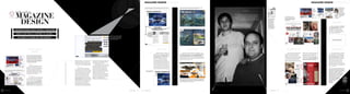
- 1. MAGAZINE DESIGN BY TYSALL MAGAZINE DESIGN BY TYSALL
As an editorial designer one of your main goals is to get the reader to engage Understanding the way people interact with any product allows graphic This feature was
with the words on the page, so try to include as many entry points as you can… designers to use it to their advantage with creative solutions… designed with the
iPad in mind.
Notice how the
HUMANS
inside guide to chain connects
MAGAZINE
each page of
editorial, turning
it into a navigation
Homo-sapiens are a social bunch, we gravitate to others and are device for page
swiping left to
interested in their stories. Portraits of people (illustrated or
Understanding what is at the right
photographed) in a magazine can really convey the sense the reader
DESIGN
heart of your magazines design
is getting a personal, intimate experience. Using photos of your If you’re using a lot of language means you can always
portrait photography design new editorial elements
readers can also echo the community feel of your product.
throughout your with confidence
magazine, supplied
from several sources,
it’s a good idea to
INTERACTION
convert them all to
monochrome. Black
and white images are
not only flattering, but Start to think digitally too. How will
also very forgiving of my page layout translate to other formats
poor image quality
like the iPad? Will the design make
UN D E R S TA N D I NG W H AT MAKES A MAGAZ INE navigation fun or frustrating on other
e-formats? Can I animate my graphics for
the app version of this feature?
G RE AT CA N TAKE A L IFETIME TO L EARN…
Locking body copy to the baseline helps
keep type neat and tidy, but ultimately
S O H E RE ’ S 5 PAGES ON TH E SU BJ EC T. easier to read. The value you assign is
based on the body copy height and the
amount of leading required Use your own imagination and
picture something pretty in here…
COLUMNS, GRIDS AND ENTRY POINTS FUN-CTIONALITY VISUAL VERNACULAR BREAK THE RULES
BASELINES
All editorial design is a vehicle for the Remember to use the functionality - or limitations - of your Once you've nailed the design of your It helps to look at the design that is used by Then take everything I’ve mentioned,
words printed on the page. Your job as an magazine in interesting ways, the more a product involves us in a magazine - through the use of type and others in the arena your magazine has and do the opposite. It helps to break the
Grids, columns and baselines all help to editorial designer is to engage readers at fun and stimulating way the more rewarding the experience. graphics - let this inform your visual assumed its role. Don't just look to other rules now and then - go off grid, run your
maintain a cohesive feel to your pages, every opportunity, so don’t overlook the Change the page orientation, or as in the Terryl Whitlatch example language. In the same way the journalism in magazines but consider advertising and body text at acute angles, or put a Black
ensure that the foundations are solid and devices you can deploy. Captions for from ImagineFX, try running a panoramic image over consecutive your magazine will consider elements like product design - does your magazine feel headline on a Black page (use different ink
the design work you layer over them - no pictures are one great way to engage a pages to create a dramatic ‘reveal’ … 'tone' and 'slant', so should your use of like a natural extension of this world? values though, so people can see the
matter how varied in style and approach image layout solutions - ideal for Interviews Light. Giovanni is 8pt in height, but Gotham reader flicking through your magazine. design, typography and illustrative devices. difference). Sometimes it’ll work and
- will always feel grounded. and Features? Or does it ‘lock down’ the is 7pt. Both sit on a 10.5pt baseline which Extracted quotes made larger than the main sometimes it won’t, but at least you’re
© All ImagineFX examples are copyright ImagineFX, Future Publishing Ltd and used with kind permission
amount of permutations available, building can accommodate each choice. copy and treated with a bit of typographic pushing the boundaries and experimenting.
Grids in a very static (or consistent) page layout? With all of the above you want to keep love are called pull-quotes. A pull-quote is Which is the only way we can develop and
These will vary depending on which all the measurements you settle on the same not only a good entry point, but also serves grow our creations…
section of the magazine they have been Baseline throughout the magazine - gutter, page as a great device for breaking up columns of
assigned to, and it is good working practice If several columns of flowing text, margins, type styles etc. It helps to work copy, so the page isn’t too dense with words. I hope you found this an informative and
The seven column grid in ImagineFX, used for features and to set up Master Pages for Spreads and placed next to each other, don’t align it can them all out on one simple DPS InDesign worthwhile read. If you have an queries on
interviews, helps break up the copy with floating columns used Single (left and right) pages; which should look messy. The eye is very clever at picking document, and use this document to create This is a caption about the opinions I’ve expressed in this article
below to place a caption a caption. Weird, non?
include regular page furniture i.e. section up on inconsistencies like this - even if the the Master Grids for each section. please do not hesitate to email me at:
branding, page tints and folios. brain doesn’t always understand what’s Consistency is the key to solid design work, tysall@sky.com. For more future brain
going wrong. Locking text to a baseline try not to get seduced by too many options pouring head along to my blog Not
Columns ensures this is never a problem. Your very early on. Allow the graphic design you Saved: tysall.com, you can also
Some sections of your magazine might baseline settings (located under InDesign’s paint over your canvass to be the find me amongst the pages of
only ever use 3 columns, others might use Preferences//Grids) should be based on the expressive part of your magazine design. Magazine features and interviews are the primary areas of a magazine where future editions of Computer
up to 7 or 8 with ‘measures’ going across amount of leading - the space between each you can really flex your creative muscles. It is important you understand the Arts and Practical
‘slant’ of the feature to really do it justice, so read the article and get to know
two (or more) column widths. Experiment line of body text - you have settled on for the visual material before you start designing Photoshop
with your column set up early on in the your main body copy. For example, in magazine
design process to see how flexible the grid ImagineFX there are two alternative body-
becomes, does it offer you several text and type styles: ITC Giovanni Book and Gotham
1 November 2011 November 2011 2 3 November 2011 November 2011 4 November 2011 5