1. Analysing Typography.
Typography;
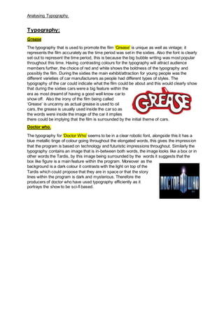
Grease
The typography that is used to promote the film ‘Grease’ is unique as well as vintage; it
represents the film accurately as the time period was set in the sixties. Also the font is clearly
set out to represent the time period, this is because the big bubble writing was most popular
throughout this time. Having contrasting colours for the typography will attract audience
members further, the choice of red and white shows the boldness of the typography and
possibly the film. During the sixties the main exhibit/attraction for young people was the
different varieties of car manufacturers as people had different types of styles. The
typography of the car could indicate what the film could be about and this would clearly show
that during the sixties cars were a big feature within the
era as most dreamt of having a good well know car to
show off. Also the irony of the film being called
‘Grease’ is uncanny as actual grease is used to oil
cars, the grease is usually used inside the car so as
the words were inside the image of the car it implies
there could be implying that the film is surrounded by the initial theme of cars.
Doctor who.
The typography for ‘Doctor Who’ seems to be in a clear robotic font, alongside this it has a
blue metallic tinge of colour going throughout the elongated words, this gives the impression
that the program is based on technology and futuristic impressions throughout. Similarly the
typography contains an image that is in-between both words, the image looks like a box or in
other words the Tardis, by this image being surrounded by the words it suggests that the
box like figure is a main feature within the program. Moreover as the
background is a dark colour it contrasts with the light on top of the
Tardis which could propose that they are in space or that the story
lines within the program is dark and mysterious. Therefore the
producers of doctor who have used typography efficiently as it
portrays the show to be sci-fi based.