
Recommended
More Related Content
What's hot
What's hot (16)
Viewers also liked
Viewers also liked (18)
Similar to Deciding and Designing my Title.
Similar to Deciding and Designing my Title. (20)
Recently uploaded
Recently uploaded (20)
Deciding and Designing my Title.
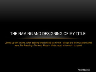
- 1. Coming up with a name. When deciding what I should call my film I thought of a few my earlier names were; The Presiding – The Knox Ripper – Whitechapel, all in which I scrapped. THE NAMING AND DESIGNING OF MY TITLE Kevin Ntueba
- 2. DESIGNING THE TITLE • Once I had decided what to call my film I went about designing what the title should look like in terms of font. I figured since my film was referencing Jack the Ripper I should explore texts that were used to relate to him. • The fonts that were commonly used to portray Jack the Ripper were Serif. I found the image (on the right) of a newspaper cutting which I liked, I decided to use the idea of a bold fold which is also commonly used in posters,
- 3. FINAL IDEA FOR TITLE I decided on a final idea for my Title, the font is Arial Bold. I felt that the ‘The’ in the title when separated like in the title on the top right of the page, looked less appealing to the audience. I decided that the “THE” would be inside the R like the words THE is in the title in The Town Film Poster.