Find Your Twizz-piration with Flexible Candy
•Download as DOCX, PDF•
1 like•386 views


Recommended
More Related Content
Viewers also liked
Viewers also liked (16)
Similar to Find Your Twizz-piration with Flexible Candy
Similar to Find Your Twizz-piration with Flexible Candy (20)
More from Katherine Grudens
Find Your Twizz-piration with Flexible Candy
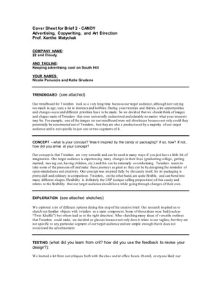
- 1. Cover Sheet for Brief 2 - CANDY Advertising, Copywriting, and Art Direction Prof. Xanthe Matychak COMPANY NAME: 22 and Cloudy AND TAGLINE: Keeping advertising cool on South Hill YOUR NAMES: Nicole Panuccio and Katie Grudens TRENDBOARD (see attached) Our trendboard for Twizzlers took us a very long time because ourtarget audience, although not varying too much in age, vary a lot in interests and hobbies.During your twenties and thirties, a lot opportunities and changes occurand different priorities have to be made. So we decided that we should think of images and shapes made of Twizzlers that were universally understood and relatable no matter what your interests may be. For example, one of the images on our trendboard were red shoeleaces because not only could they potentially be constructed out of Twizzlers, but they are also a product used by a majority of our target audience and is not specific to just one or two segments of it. CONCEPT - what is your concept? Was it inspired by the candy or packaging? If so, how? If not, how did you arrive at your concept? Our concept is that Twizzlers are very versatile and can be used in many ways if you just have a little bit of imagination. Our target audience is experiencing many changes in their lives (graduating college, getting married, moving out, having children, etc.) and this can be extremely overwhelming. Twizzlers wants to take some of the pressure off and make these journeys as great as they can be by designing the reminder of open-mindedness and creativity. Our concept was inspired fully by the candy itself, for its packaging is pretty dull and ordinary in comparison. Twizzlers, on the other hand,are quite flexible, and can bend into many different shapes.Flexibility is definitely the USP (unique selling proposition) of this candy and relates to the flexibility that our target audience should have while going through changes of their own. EXPLORATION (see attached sketches) We explored a lot of different options during this step of the creative brief. Our research inspired us to sketch out familiar objects with twizzlers as a main component. Some of these ideas were bad (such as “Twiz Khalifa”) but others lead us in the right direction. After sketching many ideas of versatile outlines that Twizzlers could make, we decided on glasses because not only does it relate to our tagline, but they are not specific to any particular segment of our target audience and are simple enough that it does not overcrowd the advertisement. TESTING (what did you learn from crit? how did you use the feedback to revise your design?): We learned a lot from our critiques both with the class and at office hours.Overall, everyone liked our
- 2. choice of a target market and our big idea (using Twizzlers as a craft tool to “find twizz-piration”) but not that many people liked and/or understood ourexecution. Originally, we created a vertical advertisement that looked half like a scrapbookpage and half like a collage. However, through multiple feedback processes,it came to our attention that this design was very old-fashioned and did not cater to the needs of our target market very well. There were way too many ideas in one advertisement and so many colors that not one aspect of the design stood out.Hearing all of these critiques was a lot to take in at first, but after listening intently and taking notes,we were able to refocus and gain the confidence to go through the brainstorming and researching processes yet again.We used this feedback to decide to start from scratch with our execution but continue using our original tagline. We brainstormed new ideas with the critiques in mind, and finally made an advertisement that we can be proud of (and hope others will enjoy as well). __________________________________________________________________ EXECUTION (see attached) For our final execution, we decided on a lot of things.First of all, we decided that, unlike our first attempt at a craft execution for Twizzlers, this final advertisement had to be simplistic and easy to understand,with one color standing out among the rest.We chose red to be this color because not only does it contrast well with black and white, but it is also the color of the candy itself as well as its packaging. Second of all, we decided that we wanted to outline an object with Twizzlers and have this object as the main focus of our advertisement. We decided that this would be our final idea (rather than the photograph of a DIY craft that we had originally) because the USP of Twizzlers is its flexibility and we wanted to showthat through our execution. Also,we decided that the outlined object should be a pair of glasses for many reasons.Glasses are versatile and therefore do not single out any segments of our target audience. Everyone in that audience feels included in the advertisement and can see it as relatable (whereas if we outlined, let’s just say,a soccerball, athletes would be the segment of the target audience that is being focused on). The otherreason why we decided to outline a pair of glasses with Twizzlers is because it correlated with our tagline perfectly. Our tagline, “Find Your Twizz-piration” is stating a call of action for all those that see the advertisement, encouraging consumers to go out there and search for versatile and unique ways to use their candy. The idea of searching and the idea of eyes go hand in hand, making this overall the best object that we could have chosen to outline.