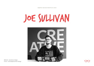
1. JOE SULLIVAN
Website - joesullivan.design
Email - contact@joesullivan.design
G R A P H I C D E S I G N P O R T F O L I O 2 O 2 0
2. I am a recent graduate from the University of Gloucestershire with a First Class
Honours Degree in Graphic Design. Whilst carrying out my full-time studies, I
worked as a retail shift manager and during my two years in this role, I have acquired
extensive team leadership, management and organisation skills.
My interest in art and design stemmed from a cultured childhood and upbringing,
and since then, my respect and passion for the creative industry has blossomed
and I could not imagine myself as part of any other field. Since my first educational
experience with Graphic Design in school, my interests have only expanded whilst
being at university and I have also grown to love Illustration and Photography.
My design approach is usually hands-on and typically focuses on the use of multi-
media. Nevertheless, I’m always growing as a creative, and enjoy experimenting
with different techniques and software; this is only the beginning of my journey in
the world of art and design.
ABOUT ME!
- JOE SULLIVAN
3. Brand Creation
La Familia is a an authentic modern Mexican street-
food range which aims to rival Old El Paso. However,
the recipes were based off of actual Mexican street-
food which has not been altered for a western palate,
therefore it was essential that my research was thorough
and not based off stereotypical gimmicks. My packaging
concept takes inspiration from the traditional Mexican
tunic and enabled me to experiment with mixed media
and different printing techniques.
4. B r a n d R e f e r e n c e & T e x t u r e
Pica De Gallo
CMYK 0/37/96/0
RGB 226/179/41
HEX #e2b329
Salsa Roja
CMYK 0/90/98/0
RGB 195/57/39
HEX #e10e1d
Salsa De Calantro
CMYK 29/1/41/0
RGB 199/219/175
HEX #c7dbaf
Guacamole
CMYK 76/27/100/38
RGB 63/97/43
HEX #3f612b
Garlic Alioli
CMYK 0/4/44/0
RGB 227/170/189
HEX #e3aabd
Primary Logo Green
CMYK 84/21/75/5
RGB 78/139/102
HEX #4e8b66
C o l o u r P a l e t t e
A a B b C c D d E e F f G g H h
I i J j K k L l M m N n O o P p Q q R r
S s T t U u V v W w X x Y y Z z
0 1 2 3 4 5 6 7 8 9 & ( : ; ) %
A a B b C c D d E e F f G g H h
I i J j K k L l M m N n O o P p Q q R r
S s T t U u V v W w X x Y y Z z
0 1 2 3 4 5 6 7 8 9 & ( : ; ) %
T y p o g r a p h y S e l e c t i o n
L o g o D e s i g n
B R A N D B O A R D
5. B R A N D B O A R D
I n i t i a l C o n c e p t s
F l a v o u r I c o n sP r i n t M a r k s
13. Brand Creation & Marketing
I was challenged to act as a creative entrepreneur for
this project; the success of this assignment was heavily
reliant on my independent research so I started to look
for gaps and trends in the current market. From this, I
learnt that alcoholic spirits, particularly gin, is a growing
and “trendy” industry. However, I felt that gin had been
exhausted and that vodka would be a refreshing and less
saturated market. The concept behind Lawless Vodka
was that it is a no compromise competitor to Smirnoff
and other ordinary vodkas. The tone of voice is a vital
part of Lawless and lets consumers know that it is not a
faceless conglomerate.
14. B R A N D B O A R D
B l u e , w h i t e a n d b l a c k . . . t h e o n l y c o l o u r s
y o u ’ l l e v e r n e e d w i t h L a w l e s s .
B r a n d C o l o u r P a l e t t e
P r i m a r y & S e c o n d a r y L o g o s
A a B b C c D d E e F f G g H h
I i J j K k L l M m N n O o P p Q q R r
S s T t U u V v W w X x Y y Z z
0 1 2 3 4 5 6 7 8 9 & ( : ; ) %
A a B b C c D d E e F f G g H h
I i J j K k L l M m N n O o P p Q q R r
S s T t U u V v W w X x Y y Z z
0 1 2 3 4 5 6 7 8 9 & ( : ; ) %
T y p o g r a p h y S e l e c t i o n
Blue
CMYK 100/79/0/0
RGB 12/0/255
HEX # 0c00ff
White
CMYK 0/0/0/0
RGB 255/255/255
HEX #ffffff
Black
CMYK 63/52/51/100
RGB 0/0/0
HEX #000000
15. I n i t i a l C o n c e p t s
W e a r e “ l a w l e s s ” b u t w e d o n ’ t l i k e t o s h o u t a b o u t i t . W e u s e p h r a s e s
l i k e “ p r o b a b l y n o t w a t e r ” b e c a u s e l e t ’ s b e h o n e s t , i t ’ s p r o b a b l y n o t
g o i n g t o b e . W e a r e f u n n y a n d s a r c a s t i c - a t l e a s t t h a t w h a t w e ’ v e
h e a r d . B u t m o s t o f a l l w e d o n o t c o m p r o m i s e .
T o n e o f V o i c e
B R A N D B O A R D
22. L A W L E S S V O D K A - C O C K T A I L B O O K
23. Brand Creation
Spill & Tea is a premium but accessible product which
aims to empower women with its on-trend phrases and
disrupt the stagnant iced tea market. As a designer, this
brand creation had me out of my comfort zone - but
this was exactly what I wanted. Inspiration was taken
from cosmetic and beauty packaging which led to
experimentation with playful illustrations and a feminine
colour palette and tone of voice.
24. T y p o g r a p h y S e l e c t i o n
C o l o u r P a l e t t e
A a B b C c D d E e F f G g H h
I i J j K k L l M m N n O o P p Q q R r
S s T t U u V v W w X x Y y Z z
0 1 2 3 4 5 6 7 8 9 & ( : ; ) %
A a B b C c D d E e F f G g H h
I i J j K k L l M m N n O o P p Q q R r
S s T t U u V v W w X x Y y Z z
0 1 2 3 4 5 6 7 8 9 & ( : ; ) %
S W E E T T O T H E
C O R E
Y O U ’ R E T H E
Z E S T
P E R F E C T M A T C H A S L A Y Y A L L D A Y T H R I S T T H I N G S
F I R S T
B R A N D B O A R D
25. B R A N D B O A R D
T y p o g r a p h i c A s s e t sC h a r a c t e r s
I n i t i a l C o n c e p t s
33. Brand Creation & Social Media Campaign
This start-up company needed a distinct voice and
character that made it stand out in a crowded market.
The role of social media plays a significant part in the
advertising of this brand, therefore needed an extensive
campaign that showed the brand in action. It’s not just
a black and white brand - the identity of the badger
combined with the humorous tone of voice gives this
toffee vodka company a unique personality.
34. B r a n d M a s c o tL o g o D e s i g n
I n i t i a l C o n c e p t s
B R A N D B O A R D