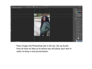
1. Place image into Photoshop tab in A4 size. Set up Guide
lines to have an idea as to where you will place your text in
order to keep a neat presentation.
4. Add issue number and date/ month. I have only added the month since
my magazine is published monthly. Also, I have added the magazine’s
website discretely at the sides of the images, below the masthead so
that it doesn’t interrupt the main image.
5. Add the rectangles and circles that will contain your
main sell lines using the shapes tool.
6. Then I begun to add the sell lines into the
shapes.
7. I used the injecting tool to inject the main blue colour from my
contents page so that the magazine has the same house style.
8. Add the plus symbol to indicate that the
following articles are included in the magazine.
11. I then added the name of the artist in the main image which would draw
their focus to her mainly.
12. I continued to be creative with this idea, and make some sort of logo out of her name. I
zoomed in really close to the letters, and added an extra rectangle onto the letter ‘Y’.
13. I proceeded to extend the rectangle since it was coming across quite nicely.
14. I then put the name of her new album within the rectangles.