
Recommended
Recommended
More Related Content
Similar to What Does Mobile-First Mean.docx
Similar to What Does Mobile-First Mean.docx (20)
More from HariNarayanDas4
More from HariNarayanDas4 (20)
Recently uploaded
Recently uploaded (20)
What Does Mobile-First Mean.docx
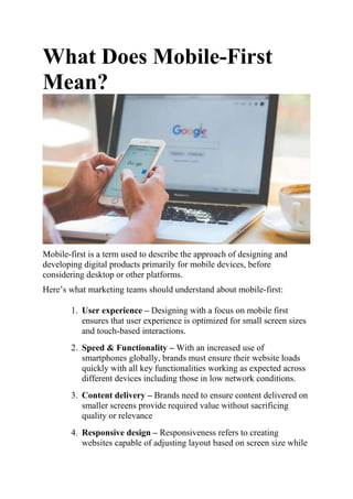
- 1. What Does Mobile-First Mean? Mobile-first is a term used to describe the approach of designing and developing digital products primarily for mobile devices, before considering desktop or other platforms. Here’s what marketing teams should understand about mobile-first: 1. User experience – Designing with a focus on mobile first ensures that user experience is optimized for small screen sizes and touch-based interactions. 2. Speed & Functionality – With an increased use of smartphones globally, brands must ensure their website loads quickly with all key functionalities working as expected across different devices including those in low network conditions. 3. Content delivery – Brands need to ensure content delivered on smaller screens provide required value without sacrificing quality or relevance 4. Responsive design – Responsiveness refers to creating websites capable of adjusting layout based on screen size while
- 2. ensuring functionality remains intact regardless of device being used. Adopting a mobile-first mindset can lead to numerous benefits such as improved engagement rates, conversions and customer satisfaction among others. For example, Google has implemented “mobile-first indexing” which means they prioritize crawling the mobile version of websites over desktop versions when ranking search results. In conclusion, having a “mobile first” approach involves prioritizing development and design around smartphone users’ needs while also maintaining functionality across different platforms. By adopting this strategy businesses can increase revenue potential by delivering seamless experiences tailored specifically towards audience expectations leading them into deeper level engagement.