
Recommended
More Related Content
Recently uploaded
Recently uploaded (20)
Featured
Featured (20)
Analysis Of Front Cover 2
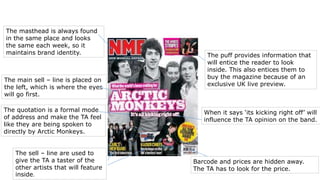
- 1. The masthead is always found in the same place and looks the same each week, so it maintains brand identity. The quotation is a formal mode of address and make the TA feel like they are being spoken to directly by Arctic Monkeys. The sell – line are used to give the TA a taster of the other artists that will feature inside. The puff provides information that will entice the reader to look inside. This also entices them to buy the magazine because of an exclusive UK live preview. When it says ‘its kicking right off’ will influence the TA opinion on the band. Barcode and prices are hidden away. The TA has to look for the price. The main sell – line is placed on the left, which is where the eyes will go first.