
Recommended
More Related Content
What's hot
What's hot (14)
Viewers also liked
Similar to George Silke's Magazine Evaluation: How Inspiration from Empire Helped Craft a Film Magazine for Males 20-30
Similar to George Silke's Magazine Evaluation: How Inspiration from Empire Helped Craft a Film Magazine for Males 20-30 (20)
Recently uploaded
Recently uploaded (20)
George Silke's Magazine Evaluation: How Inspiration from Empire Helped Craft a Film Magazine for Males 20-30
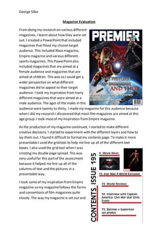
- 1. George Silke Magazine Evaluation Fromdoing my research on various different magazines, I learnt about how they were set out. I created a PowerPointthat included magazines that fitted my chosen target audience. This included Xbox magazine, Empire magazine and various different sports magazines. This PowerPointalso included magazines that are aimed at a female audience and magazines that are aimed at children. This was so I could get a wider perspective on whatdifferent magazines did to appeal to their target audience. I took my inspiration frommany different magazines that were aimed at a male audience. The ages of the males in this audience were twenty to thirty. I made my magazine for this audience because when I did my research I discovered that most film magazines are aimed at this age group. I took mostof my inspiration fromEmpire magazine. As the production of my magazine continued, I started to makedifferent creative decisions. I started to experiment with the different layers and how to lay them out. I found it difficult to formatmy contents page. To make it more presentable I used the grid tool to help me line up all of the different text boxes. I also used the grid tool when I was creating my double page spread. This was very usefulfor this partof the assessment because it helped me line up all of the columns of text and the pictures in a presentable way. I took someof my inspiration fromEmpire magazine so my magazinefollows the forms and conventions of film magazines quite closely. The way my magazine is set out and
- 2. George Silke formatted is similar to various issues of empire magazine. I also took some inspiration from empire magazine when I was creating my double page spread. The way I organised the text and the pictures is similar to how it’s set out in Empire magazine. The way I organised the different columns of text is similar to how all genres of magazines do it. I think that my finished magazine turned out well. Out of the three aspects of the magazinethat I created, I think that the front cover turned out the best. I used my knowledgeof magazine cover conventions and applied it well to the front cover of my magazine. I used a wide variety of different fonts and colours to make the front cover of my magazine stand out. The magazine frontcover focuses on Iron Man and Thor. These two characters would appeal to males aged 20-30 becausethey are in the Marvel movies. The Marvel movies are mainly action/sci-fi movies. These movie genres mainly appeal to male audiences. This is why I believe that I have achieved my goal of making a magazinecover that fits my chosen target audience.